
VIS-101 · Lesson 2 of 12 · 28 min
Line, shape, texture and pattern
Lesson 1 introduced the elements of visual design as a list. This lesson looks closely at four of them, line, shape, texture and pattern, because they do most of the structural work in a composition. Before a viewer recognizes a face or reads a sign, the visual system has already detected edges, lines and shapes, and these early impressions shape how the whole image feels. A photograph of a city can feel calm or chaotic, a film frame elegant or aggressive, a poster playful or authoritative, largely because of the lines and shapes it is built from. Learning to see these underlying structures, separately from the subject matter, is the single most useful habit a beginning image maker can develop.
Seeing structure instead of subject
Experienced photographers and designers often describe looking at a scene "abstractly": ignoring what things are and attending only to their lines, shapes, values and colors. A street scene becomes a set of verticals (buildings and lamp posts), a strong diagonal (the curb), a dark triangle (a shadow) and a small bright circle (a red umbrella). Seen this way, it becomes obvious which elements dominate, which compete, and which could be removed by moving a step to the side.
Three simple exercises build this habit:
- Squint at the scene or the screen. Squinting blurs detail and reduces the image to its main value shapes, revealing the composition's skeleton.
- Turn the image upside down or view it mirrored. Familiar subjects become unfamiliar, so you see their shapes rather than what they represent. Painters have used this trick for centuries.
- Trace the main lines and shapes of a finished image on a sheet of tracing paper or a layer in an editing program. The sketch shows whether the structure is simple and clear or tangled.
Line
A line is any mark or edge that leads the eye in one direction more than another. Real lines include roads, cables, horizons, the edges of buildings and the outlines of objects. Implied lines are created without any drawn mark: the direction of a gaze, a pointing arm, a row of separate objects, or the path of a moving subject. Implied lines are often stronger than real ones because the viewer actively completes them (the Gestalt principle of continuity, Lesson 1).
The character of line direction
| Direction | Typical feeling | Examples |
|---|---|---|
| Horizontal | calm, stable, restful, expansive | horizon, lake shore, a reclining figure |
| Vertical | strength, dignity, growth, aspiration | trees, towers, a standing figure |
| Diagonal | movement, energy, instability, tension | a ramp, a leaning figure, a slanting shadow |
| Curved | grace, flow, softness, natural rhythm | a river, a dancer's arm, rolling hills |
| Zigzag or jagged | excitement, conflict, danger | lightning, mountain ridges, stairs seen from the side |
| Converging | depth, focus, a destination | railway tracks, a corridor, rows of trees |
These associations come partly from physical experience. Horizontal things are at rest; vertical things stand against gravity; diagonals look as if they are falling or moving. A composition dominated by horizontals feels peaceful, which is why many landscape photographs of calm water use a low, level horizon and wide format. A strong diagonal across the frame can turn a static subject into a dynamic one, which is why sports and action photographers often tilt the frame or choose an angle that places the main lines diagonally (Lesson 5 discusses tension).
Line weight and quality
Lines also differ in weight and quality. Thick, dark, sharp lines are bold and assertive; thin, light or broken lines are delicate or tentative. In photography and film, line quality comes from the subject and the light: hard light produces crisp shadow edges, soft light gentle gradients. Graphic designers choose line weights deliberately to create hierarchy: a heavy rule separates sections, a hairline guides the eye without drawing attention.
Worked problem
Changing the mood with line
A photographer is assigned to photograph a new public library for two clients: the architect wants the building to feel "dynamic and forward-looking", and the city wants it to feel "welcoming and calm". How should the line structure differ in the two images?
Show solution
- For dynamic: shoot from a low angle near a corner so that the roof line and facade edges converge as strong diagonals; consider a slight upward tilt and a wide lens to exaggerate the convergence.
- For calm: shoot from farther away at eye level, with the camera level so verticals stay parallel, emphasizing the building's horizontal bands and a horizontal path or lawn in the foreground.
- Add people appropriately: a figure striding along a diagonal for the first; people sitting or reading near the entrance for the second.
Answer: The same building reads as energetic when its lines are diagonal and converging, and as calm and welcoming when its horizontals and level verticals dominate. The subject is the same; the line structure changes the message.
Shape
A shape is a two-dimensional area enclosed by an edge, which may be an outline or simply a change in value, color or texture. The visual system detects shapes very quickly and recognizes many objects from their outline alone, which is why a silhouette against a bright sky can be instantly readable.
Geometric and organic shapes
Geometric shapes, such as circles, squares, rectangles and triangles, are regular and usually human-made. Organic shapes are irregular and flowing, typical of nature and the human body. Each carries associations:
- Circles and curves feel complete, protective, soft and harmonious; they also draw the eye inward and are hard to look away from.
- Squares and rectangles feel stable, solid, orderly and dependable, which is why many institutions use them in logos and buildings.
- Triangles feel dynamic and directional. A triangle on its base is very stable, like a pyramid; an inverted triangle is precarious and tense. Triangles also point, leading the eye toward their apex.
- Organic shapes feel natural, spontaneous and alive, and soften compositions dominated by architecture.
Contrast between shape types creates interest: a single organic figure against a grid of windows, or a round sun above jagged mountains. Repetition of a shape across the frame unifies a composition (see pattern below).
Implied shapes and triangles in composition
Just as lines can be implied, so can shapes. Three people's heads, three bright objects, or a face and two hands form an implied triangle that the eye travels around. Painters of the Renaissance arranged figures in pyramidal or triangular groups to give stable, unified compositions, and portrait and group photographers still do (Lesson 4). Implied circles, such as people standing in a ring or objects arranged around a center, enclose and focus attention.
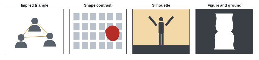
Figure and ground
Every shape is seen against something: the figure is the shape we attend to, the ground is everything else. Clear figure-ground separation, through value contrast, color, focus or edge, makes an image easy to read. Ambiguous figure-ground relationships, such as the famous vase that is also two faces, create visual puzzles. Designers use them deliberately in logos (the arrow hidden in the negative space between two letters of a well-known delivery company's wordmark is a classic case), and photographers use them to create images that reward a second look. Usually, though, the goal is clarity: if the viewer cannot tell figure from ground quickly, the image fails at thumbnail size.
Negative space is the ground considered as a shape in its own right. Skilled composers shape the negative space as carefully as the subject, so that the gaps between a figure's arm and body, or between two people, form clean, readable shapes rather than awkward slivers. A useful check is to look at the negative space alone: if it forms interesting, balanced shapes, the composition usually works.
Texture
Texture is the surface quality of things: rough bark, smooth glass, soft fabric, cracked paint. In a two-dimensional image, texture is visual rather than tactile, but it can be so strong that viewers almost feel it. Texture adds realism, detail and sensory richness, and it can carry meaning: weathered wood and peeling paint suggest age and history, polished metal suggests precision and luxury.
Texture is revealed by light. Light that skims across a surface at a low angle, called raking light, casts tiny shadows from every bump and makes texture vivid; light from the camera direction flattens it. Landscape photographers shoot sand dunes and snowfields early or late in the day for this reason, and product photographers use a low side light to show the weave of a fabric or the grain of leather. Sharp focus and high resolution also reveal texture, while soft focus, motion blur and shallow depth of field suppress it (Lesson 7).
Texture also works as a compositional tool. A smooth subject stands out against a textured background and vice versa: a smooth-skinned face against rough brick, or a rough-hewn tool against a plain backdrop. Too much texture everywhere, however, becomes visual noise, competing with the subject for attention.
Pattern and rhythm
A pattern is a repetition of lines, shapes, colors or textures. Patterns are everywhere in the made world (windows, bricks, tiles, rows of seats) and in nature (leaves, waves, scales, ripples in sand). The eye enjoys patterns because they are predictable and orderly, and it is strongly drawn to anything that breaks one. Three strategies for using patterns:
- Fill the frame with the pattern, cropping out everything else, so it extends beyond the edges and seems infinite. The pattern itself becomes the subject.
- Break the pattern: include one element that differs, such as a single red chair in rows of blue, one lit window in a dark facade, or one person facing the other way. The break becomes a powerful focal point (Lesson 9).
- Use perspective to make the pattern recede, so that repeated elements shrink into the distance and create depth and rhythm.
Rhythm is pattern experienced over time or distance, as the eye moves across the frame. Regular rhythm (equal spacing) feels steady and formal; alternating rhythm (two elements repeating) feels lively; progressive rhythm (elements growing or shrinking in steps) suggests movement and depth; and flowing rhythm (repeated curves) feels organic. Lesson 5 returns to rhythm as a source of balance and tension.
Worked problem
Breaking a pattern
A designer is photographing a stadium's empty blue seats for a poster about an upcoming match. The image of identical seats is orderly but lifeless. Suggest two ways to create a focal point, and say where to place it.
Show solution
- Introduce a break: a single fan in team colors sitting among the empty seats, or one seat in a contrasting color.
- Fill the frame with the seats so that the pattern extends beyond every edge and nothing else competes.
- Place the break on or near a third (Lesson 3) rather than in the exact center, leaving room for the poster's headline in the larger area of pattern.
Answer: A single contrasting element in a frame-filling pattern draws the eye immediately and tells a story (anticipation, loyalty). Placing it off-center gives the composition energy and leaves space for type, a combination common in sports and event marketing.
Simplifying the structure
The most common weakness in beginners' compositions is too many competing lines, shapes and textures: a tree growing out of someone's head, power lines crossing the sky, a busy patterned background behind a patterned shirt. The fix is usually simplification:
- Move the camera, often only a step or two, to separate the subject's outline from background lines and shapes. Watch the edges where the subject meets the background.
- Change the camera height to put the subject against a simpler background, such as the sky (from below) or the ground (from above).
- Use a longer focal length to narrow the background, or a wider aperture to blur it.
- Wait for light that hides clutter in shadow, or for distracting elements to move.
- Crop tighter, removing elements that do not support the main idea.
A good test is the thumbnail test: shrink the image to the size of a postage stamp (or the size it will appear in a social media feed). Only the strongest lines and shapes remain visible. If the image still reads clearly, its structure is sound.
Common mistakes
MistakeSeeing only the subject and not the lines and shapes around it.
InsteadSquint, flip or trace the image to see its abstract structure.
MistakeLetting background lines cross through the subject's head or body.
InsteadMove the camera to separate the subject's outline from background lines.
MistakeIgnoring the shape of the negative space.
InsteadTreat the gaps around and between subjects as shapes to be composed.
MistakeLighting textured subjects from the camera position.
InsteadUse raking side light to reveal texture.
MistakeShowing a pattern with no focal point or edge-to-edge fill.
InsteadFill the frame with the pattern or include a deliberate break.
Summary and key terms
- Seeing a scene abstractly, as lines, shapes and values, reveals its compositional structure.
- Line direction carries feeling: horizontal calm, vertical strength, diagonal energy, curves grace.
- Implied lines from gaze, gesture and rows of objects are often stronger than real ones.
- Geometric and organic shapes carry different associations; implied triangles unify groups.
- Clear figure-ground separation makes images readable; negative space should be shaped deliberately.
- Raking light reveals texture; texture contrast separates subject and background.
- Patterns can fill the frame or be broken to create a focal point; rhythm guides the eye.
- Implied line
- A line suggested by gaze, gesture or aligned objects rather than drawn.
- Line weight
- The thickness and boldness of a line.
- Geometric shape
- A regular, usually human-made shape such as a circle or square.
- Organic shape
- An irregular, natural shape.
- Implied shape
- A shape formed by separate elements, such as three heads forming a triangle.
- Figure-ground
- The relationship between the shape attended to and its surroundings.
- Negative space
- The empty area around and between subjects.
- Raking light
- Light skimming a surface at a low angle, revealing texture.
- Pattern
- Repetition of visual elements.
- Rhythm
- Pattern experienced as the eye moves across an image.
Practice problems
Work each problem on paper first, then reveal the answer to check.
Which line direction most suggests calm?
Show answer
Horizontal.
Give two examples of implied lines.
Show answer
A gaze, a pointing arm, a row of objects, a path of motion.
What feeling does an inverted triangle tend to give?
Show answer
Instability or tension.
Name a quick way to see an image's structure.
Show answer
Squint, flip it, or trace its main lines.
What light best reveals texture?
Show answer
Raking light at a low angle.
What is figure-ground ambiguity?
Show answer
When it is unclear which area is the subject and which is background.
Two ways to use a pattern?
Show answer
Fill the frame with it, or break it with a contrasting element.
What is progressive rhythm?
Show answer
Elements that grow or shrink in steps, suggesting movement or depth.
What does the thumbnail test check?
Show answer
Whether the main lines and shapes still read at small size.
How can you fix a pole growing out of a subject's head?
Show answer
Move the camera sideways or change height to separate them.
Lesson quiz · 5 questions
Score 60% or more to complete this lesson.
Create a free account to save your progress, take quizzes and earn a certificate.