
PHOT-101 · Lesson 8 of 12 · 26 min
White balance and colour
Our eyes adapt so well to the light around us that a sheet of paper looks white by candlelight, under office fluorescents and in blue midday shade. A camera does not adapt unless told to. Photograph a room lit by warm household bulbs with a daylight setting and everything turns orange; photograph a snowy scene in shade and it turns blue. White balance is the adjustment that tells the camera what "white" should look like under the light at hand. This lesson explains colour temperature and tint, how cameras set white balance automatically and how to set it yourself, mixed lighting, white balance as a creative tool, the colour quality of artificial light sources, and the colour settings and colour spaces that affect how images look on screens and in print. VIS-101 discussed colour as a compositional tool; this lesson is about getting the camera's colour under control.
Colour temperature
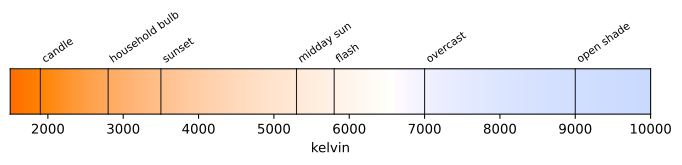
Light sources differ in their mix of wavelengths. A useful single number describing a source's colour is its colour temperature, in kelvins (K). It comes from physics: an ideal hot object glows red at about 1,000 K, orange-yellow at 2,000 to 3,000 K, white at about 5,500 K and bluish above 7,000 K. Light sources are described by the temperature of the glowing object they most resemble. Confusingly, "warm" (orange) light has a low colour temperature and "cool" (blue) light a high one.
| Light source | Approximate colour temperature |
|---|---|
| Candle, fire | 1,800–2,000 K |
| Household tungsten or warm-white LED bulb | 2,700–3,000 K |
| Studio tungsten lamp | 3,200 K |
| Sunrise and sunset | 2,500–3,500 K |
| Midday sun | 5,000–5,500 K |
| Electronic flash | 5,500–6,000 K |
| Overcast sky | 6,500–7,500 K |
| Open shade on a clear day | 8,000–10,000 K |
Daylight is not one colour: it varies through the day and with weather, from the warm, low sun of the golden hour to the blue of shade lit only by the sky, and the blue hour after sunset. Many artificial sources, especially fluorescent tubes and some LEDs, also have a tint, a shift along a second axis between green and magenta, which colour temperature alone does not describe. Cameras therefore adjust white balance on two axes: temperature (blue to amber) and tint (green to magenta).
How the camera sets white balance
White balance works by scaling the red, green and blue channels so that a neutral object (white or grey) records equal amounts of each. Cameras offer several ways to choose the scaling:
- Auto white balance (AWB) examines the scene and estimates the light. Modern AWB is good in daylight and often in mixed light, but can be fooled by scenes dominated by one colour, such as a green forest, a red wall or a sunset, which it tries to neutralize.
- Presets such as daylight, shade, cloudy, tungsten, fluorescent and flash apply a fixed correction for typical sources.
- Kelvin setting: you dial in a colour temperature directly, which gives consistent results across a series.
- Custom (preset manual) white balance: you photograph a white or grey card under the light and tell the camera to use it as its reference. This is the most accurate method for difficult or mixed light, and the standard for product and catalogue work where colour must match the real product.
Setting the camera to a Kelvin value matches the light: if the light is 3,200 K, setting 3,200 K renders it neutral. Setting a higher value than the light makes the image warmer; setting a lower value makes it cooler.
Worked problem
Fixing an orange interior
You photograph a room lit by warm-white LED bulbs (about 2,700 K) with the camera set to daylight (about 5,500 K). The picture is strongly orange. What should you set, and what if the room also has a window letting in blue daylight?
Show solution
- Set white balance to about 2,700 to 3,000 K, or use the tungsten preset, or take a custom reading from a grey card under the bulbs.
- If daylight from a window also falls on parts of the room, the two sources cannot both be neutral: the window-lit areas will look blue when the bulb-lit areas look neutral.
- Choose which source to neutralize, usually the one lighting the main subject, or reduce the conflict: turn off the bulbs, or close the curtains, or gel one source to match the other (PHOT-102).
Answer: Match the white balance to the main light. Mixed light can look pleasant, with warm interiors and cool windows suggesting evening, but when it falls on faces, it produces unflattering colour shifts. Controlling the light itself is the real fix.
Raw files and white balance
If you shoot raw files (Lesson 10), the white balance setting is only a note stored with the image; the sensor data are unchanged, and you can set white balance freely and losslessly in processing. With JPEG files, white balance is applied in the camera and baked into the image; large corrections afterward degrade colour. Even with raw, a sensible in-camera white balance helps you judge the picture on the screen and keeps the histogram accurate for each colour channel. A practical habit: photograph a grey card or a colour checker chart in each new lighting situation, so the correct balance can be set precisely later.
White balance as a creative choice
"Correct" white balance is not always the goal. A sunset corrected to neutral loses its glow; a candlelit dinner rendered neutral loses its warmth. Many photographers keep some of the warmth of golden-hour light and some of the blue of twilight because that is what makes the scene feel like that moment. Deliberate choices are common:
- Warmer balance for intimate, nostalgic or sunny moods.
- Cooler balance for cold, clinical, night-time or melancholy moods.
- A strong blue cast at dusk combined with warm artificial lights, setting perhaps 3,200 K so that tungsten lights look normal and the sky turns deep blue, the classic "blue hour" city image.
The key is that the choice is made on purpose. Use white balance to support the story of the picture, as colour grading does in film (VIS-101).
Mireds and filters
Changing colour temperature by a fixed number of kelvins has a very different visual effect at different points on the scale: 500 K is a big change near 3,000 K and a small one near 8,000 K. Lighting technicians therefore use the mired (micro reciprocal degree), equal to 1,000,000 divided by the colour temperature. Equal steps in mireds look like equal colour shifts, and colour-correction gels and filters are rated by the mired shift they produce.
Worked problem
Converting daylight to match tungsten
A window lets in daylight of about 5,500 K into a room lit by 3,200 K tungsten lamps. What mired shift is needed to make the window light match the lamps, and what gel does that correspond to?
Show solution
- Daylight: 10⁶/5,500 = 182 mireds. Tungsten: 10⁶/3,200 = 313 mireds.
- Required shift: 313 − 182 = +131 mireds (positive means warmer).
- A full CTO (colour temperature orange) gel gives about +130 to +160 mireds depending on the maker; a ¾ CTO about +100 to +120.
Answer: About +131 mireds, close to a full CTO gel taped over the window or placed over a daylight-balanced light. Cinematographers gel windows this way so a scene can be filmed with one white balance. The opposite gel, CTB (colour temperature blue), converts tungsten toward daylight but absorbs much more light, about a stop and a half for full CTB.
The colour quality of light sources
Two sources can have the same colour temperature and still render colours differently. Sunlight and incandescent bulbs emit a smooth, continuous spectrum and render every colour well. Many fluorescent and inexpensive LED sources emit spiky spectra with gaps, so some colours, especially skin tones and deep reds, look dull or shifted, and the green-magenta tint problem appears. Quality is measured by indices such as the Colour Rendering Index (CRI) and, for cameras, the Television Lighting Consistency Index (TLCI) and the newer TM-30 metrics. For photography and video, choose lights with CRI and TLCI of 95 or more; the difference shows most in skin and product colour. Street lights, stadium lights and cheap LEDs can also flicker (Lesson 4) and change colour slightly from frame to frame.
Picture styles and colour spaces
For JPEG files, picture styles or profiles (standard, neutral, vivid, portrait, landscape, monochrome) change contrast, saturation and sharpening. They are applied to raw files only as a starting point in processing. Choose a neutral or standard style when learning, so the camera's preview and histogram resemble what you will work with.
A colour space defines the range of colours (gamut) a file can describe and how numbers map to colours. Two matter for most photographers:
- sRGB: the standard for the web, phones and most screens. Images for online use should be delivered in sRGB.
- Adobe RGB and wider spaces such as Display P3 and ProPhoto RGB: larger gamuts, useful for printing and for editing raw files without clipping saturated colours.
An image tagged with one colour space and displayed as if it were in another looks wrong, typically dull or oversaturated. Raw files have no colour space until processed. Colour management, matching colours from camera to screen to print with calibrated monitors and profiles, is the subject of PHOT-301; for now, edit on a reasonably accurate screen and export in sRGB for sharing.
Some light sources cannot be corrected at all. Older low-pressure sodium street lights emit an almost single yellow-orange wavelength, so no white balance setting can restore other colours: the scene is effectively monochrome. High-pressure sodium and some mercury vapour lights have strong casts that correct only partly. In such light, either embrace the colour as part of the mood, convert to black and white, or add your own light (PHOT-102). Stage lighting with saturated coloured LEDs presents a similar problem: correcting for one colour of light makes the others look even stranger, so most concert photographers set a fixed Kelvin value and accept the colours the lighting designer created.
Black and white
Photographing in black and white removes colour as a tool and puts the emphasis on tone, shape, texture and light (VIS-101). Shoot raw or in colour and convert afterward: you can then control how each colour translates into grey, as photographers once did with coloured filters on black-and-white film. A red filter darkens blue skies and makes clouds stand out; a green filter lightens foliage; in digital conversion, sliders for each colour do the same. Seeing in tones takes practice: squinting at the scene, or setting the camera's preview to monochrome while still recording raw colour files, helps.
Common mistakes
MistakeAssuming auto white balance is always right.
InsteadCheck skin and neutrals; use presets, Kelvin or a custom reading when AWB is fooled.
MistakeConfusing warm with high colour temperature.
InsteadWarm (orange) light has a low colour temperature.
MistakeNeutralizing every sunset and candlelit scene.
InsteadKeep some of the light's colour when it carries the mood.
MistakeUsing cheap, low-CRI lights for portraits or products.
InsteadChoose sources with CRI and TLCI of 95 or more.
MistakePosting wide-gamut files online without conversion.
InsteadExport in sRGB for the web.
Summary and key terms
- Colour temperature, in kelvins, describes how warm or cool light is; warm is low, cool is high.
- Tint describes the green-magenta shift of some artificial sources.
- White balance scales the colour channels so neutrals look neutral.
- Use AWB, presets, Kelvin settings or custom readings from a grey card as appropriate.
- Raw files allow lossless white balance changes; JPEGs bake it in.
- Mireds (10⁶/K) measure colour shifts evenly and rate correction gels.
- High-CRI sources render colour well; deliver web images in sRGB.
- Colour temperature
- The temperature of an ideal glowing object matching a light's colour.
- Kelvin
- The unit of colour temperature.
- Tint
- A green or magenta shift in light not described by colour temperature.
- White balance
- Adjusting colour so neutral objects appear neutral.
- Custom white balance
- A reference reading from a white or grey card under the actual light.
- Mired
- One million divided by colour temperature in kelvins.
- CTO gel
- An orange filter that lowers colour temperature.
- Colour Rendering Index
- A measure of how accurately a source renders colours.
- Colour space
- A defined range of colours and the mapping of numbers to them.
- sRGB
- The standard colour space for the web and most screens.
Practice problems
Work each problem on paper first, then reveal the answer to check.
Is light at 3,000 K warmer or cooler than light at 6,500 K?
Show answer
Warmer (more orange).
A snow scene in shade looks blue. Which preset helps?
Show answer
Shade (or a higher Kelvin setting, around 8,000 K).
Why might AWB make a sunset look dull?
Show answer
It tries to neutralize the dominant orange.
How do you set a custom white balance?
Show answer
Photograph a white or grey card under the light and set it as the reference.
You set 4,000 K for light that is actually 3,000 K. Will the picture look warm or cool?
Show answer
Warm (orange), because the setting is higher than the light.
Convert 5,000 K and 2,500 K to mireds.
Show answer
200 and 400 mireds.
What mired shift converts 3,200 K tungsten to 5,600 K daylight?
Show answer
179 − 313 = −134 mireds (a blue CTB gel).
Why does white balance matter less when shooting raw?
Show answer
It is only metadata and can be changed losslessly later.
What CRI should lights for product photography have?
Show answer
95 or higher.
Which colour space should images for a website use?
Show answer
sRGB.
Lesson quiz · 5 questions
Score 60% or more to complete this lesson.
Create a free account to save your progress, take quizzes and earn a certificate.