
VIS-110 · Lesson 10 of 12 · 24 min
Color harmony, contrast and meaning
Knowing how color works physically and perceptually is only half the craft; the other half is choosing colors that serve the image. Color directs attention, creates depth, sets mood, signals time and place, distinguishes characters and objects, and carries cultural meanings. Some color combinations feel calm and unified, others vibrant or tense, and image makers use established principles of harmony and contrast as starting points rather than rules. This lesson covers the color wheel and harmony schemes, the main types of color contrast, warm and cool colors and depth, color and emphasis, emotional and cultural associations, palettes in cinematography and photography, and practical ways to control color through production design, wardrobe, lighting and post-production.
The color wheel
A color wheel arranges hues in a circle so that relationships between them are easy to see. Artists traditionally used a red-yellow-blue (RYB) wheel; designers working with light and screens use an RGB-based wheel, in which red sits opposite cyan, green opposite magenta and blue opposite yellow. Perceptually based wheels derived from opponent color theory place red opposite green and blue opposite yellow. The differences matter mainly when choosing exact complementary pairs; the general principles of harmony apply on all of them. Color grading tools use an RGB-based wheel, so moving shadows toward blue on a color wheel pushes their complement, yellow-orange, out of them.
Harmony schemes
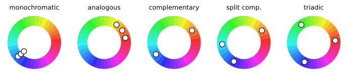
Harmony schemes describe combinations that tend to feel coherent:
- Monochromatic: variations in lightness and saturation of a single hue; unified, calm, often stylized.
- Analogous: neighboring hues on the wheel, such as yellow, orange and red, or green, teal and blue; harmonious and natural, common in landscapes.
- Complementary: hues opposite each other, such as orange and blue, or red and cyan-green; strong contrast and vibrancy, particularly when one color dominates and the other accents.
- Split complementary: one hue plus the two neighbors of its complement; strong contrast with less tension.
- Triadic: three hues evenly spaced around the wheel; lively and balanced, often best with one dominant hue.
In practice, harmony depends as much on proportion, saturation and lightness as on hue. A common guideline gives one color about 60 % of the image, a second about 30 % and an accent about 10 %. Highly saturated complementary colors at equal proportions can vibrate uncomfortably; desaturating one or varying lightness relieves the tension.
Types of color contrast
The painter and teacher Johannes Itten described several types of color contrast that remain useful:
- Contrast of hue: different hues side by side, strongest with primaries.
- Light-dark contrast: differences in lightness, the strongest and most important contrast, which also survives conversion to black and white and is visible to viewers with color vision deficiencies.
- Warm-cool contrast: oranges and reds against blues and cyans.
- Complementary contrast: opposite hues intensifying each other.
- Saturation contrast: vivid colors against muted ones, which makes the vivid colors stand out.
- Contrast of extension: the proportions of color areas, where a small amount of a strong color can balance a large area of a weaker one.
- Simultaneous contrast: the perceptual shifts described in Lesson 8.
A useful check is to convert an image to grayscale: if the subject does not separate from the background in lightness, color alone may not be enough to direct attention.
Warm, cool and depth
Warm colors (reds, oranges, yellows) tend to appear to advance toward the viewer and attract attention, while cool colors (blues, greens, cyans) tend to recede. Combined with aerial perspective (Lesson 2), in which distant objects become lighter, bluer and lower in contrast, warm foregrounds and cool backgrounds create a strong sense of depth. Cinematographers often light subjects warmer than their backgrounds, or place warm practical lamps in a cooler scene, to separate planes. The popular orange-and-teal look exploits this: skin tones fall in the orange range, so pushing backgrounds and shadows toward teal maximizes complementary contrast with faces, though overused it can look formulaic.
Color and emphasis
The eye is drawn to areas of strong contrast, high saturation and warm color, and to anything that differs from its surroundings. A single red object in a muted scene becomes the focus; a face lit warmly against a cool background stands out. Image makers can direct attention by limiting saturation elsewhere, controlling where accent colors appear, and keeping distracting bright or saturated objects out of the frame or desaturating them in post-production. Color can also connect elements: repeating a color in different parts of a frame or across scenes links them in the viewer's mind.
Worked problem
Planning color for a scene
A short film has a tense dinner scene in which a character realizes she has been betrayed. The production designer proposes beige walls and a green tablecloth. How could color support the story?
Show solution
- Establish a restrained, analogous base palette: muted warm neutrals in walls and table so the scene feels domestic and controlled.
- Give the betrayed character a single saturated accent, such as a deep red dress, that the eye returns to.
- As tension rises, shift lighting cooler (motivated by a window at dusk) while the practical lamps stay warm, increasing warm-cool contrast.
- Keep the betrayer in cooler, desaturated tones, visually separating the two characters.
- In post-production, slightly desaturate the background and protect skin tones.
Answer: A controlled base palette with a single accent, increasing warm-cool contrast as tension builds, and color separation between characters support the story without calling attention to themselves.
Emotional and cultural associations
Colors carry associations, but they depend on culture, context and personal experience. In many Western contexts, red suggests passion, danger or urgency; blue suggests calm, trust, cold or sadness; green suggests nature, growth or sickness; yellow suggests warmth, optimism or caution; black suggests elegance, death or authority; and white suggests purity, cleanliness or emptiness. Other cultures assign different meanings: white is associated with mourning in several East Asian traditions, red with luck and celebration in Chinese tradition, and saffron and other hues carry religious significance in parts of South Asia. Context changes meaning too: red can signal love on a valentine and danger on a warning sign. Image makers working for diverse audiences should research the cultural associations of their palette and test their work with members of the intended audience.
Palettes in cinematography and photography
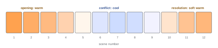
Many films and photographers establish a deliberate color palette that runs through a whole work: muted, desaturated palettes for gritty realism; saturated, pastel palettes for whimsy; cold blue-greens for science fiction or thrillers; warm sepia tones for nostalgia. Palettes can change across a story to mark different worlds, time periods or emotional arcs, for example a cool, desaturated present and a warm, saturated past. Color scripts, sequences of small color frames for each scene, are used in animation and increasingly in live action to plan color across a whole film. Look books and mood boards collect reference images for palette, lighting and texture to communicate intentions to the crew and client.
Controlling color in practice
Color in an image comes from several departments, and the cinematographer or photographer coordinates them:
- Production design and props: walls, furniture and objects set the base palette.
- Wardrobe and makeup: costume colors carry character and must work with skin tones and backgrounds; very saturated reds and fine stripes can cause problems on camera.
- Lighting: color temperature choices, gels and colored LEDs add color to scenes, sometimes motivated (neon signs, televisions, firelight), sometimes stylized.
- Camera and lens: white balance, filters and lens characteristics affect color.
- Post-production: color correction balances shots; color grading creates the final look, with tools for hue, saturation and luminance per color range, and secondary corrections to isolate skin, sky or objects.
Getting color right in production gives more freedom in post-production than trying to create it later, especially for compressed formats.
Color palettes from the real world
Image makers often find palettes in the world around them: the colors of a location at a particular time of day, a painting, a fabric, or a photograph. Tools that extract palettes from reference images help communicate a look to production designers and wardrobe teams. When building a palette, consider skin tones first, since they appear in most images and viewers are sensitive to them; then choose background and accent colors that complement them. Testing the palette on camera, under the planned lighting, catches surprises before shooting, since fabrics and paints can look quite different on camera than to the eye.
Color and accessibility
Accessible images and designs remain readable for viewers with color vision deficiencies and low vision. Practical guidelines include ensuring enough lightness contrast between text and backgrounds, never relying on color alone to convey information, choosing color pairs that remain distinct for common deficiencies (for example blue and orange rather than red and green), and testing with simulation tools. For moving images, subtitles and graphics should follow broadcaster and platform accessibility guidelines for contrast and legibility.
Learning from masters
Studying how admired films and photographers use color builds judgment. Watch a film with the sound off and note the dominant colors of each scene, how they change across the story, and which colors mark particular characters or places. Make small color scripts from stills. Compare photographers known for bold color with those known for restraint. Over time, these studies build an intuitive sense of which palettes support which moods, more useful than any set of rules.
Remember that color choices work together with light and composition. A carefully chosen palette can be undermined by poor lighting that muddies skin tones, or by framing that places a distracting accent color at the edge of the frame. The strongest images align all three: composition places the subject, light shapes and reveals it, and color sets the mood and directs attention.
Color in still photography
Still photographers use color in similar ways. Street photographers watch for moments where a single colored element, a red coat or a yellow taxi, stands out against a muted scene. Portrait photographers choose backgrounds and clothing that complement skin tones. Landscape photographers wait for light that creates warm-cool contrast between sunlit and shaded areas. Product and food photographers build sets around complementary or analogous palettes that make the product the focus. In each case, deliberate control of color turns an ordinary record into a composed image.
Black-and-white photography removes hue but not color thinking: colored filters on the lens or channel mixing in software change how colors translate to tones, for example darkening blue skies with a red filter. Understanding color therefore improves monochrome work too.
Treat color as a language that the audience reads quickly and often unconsciously: speak it deliberately and consistently, and it will support every other choice in the image.
Experiment freely, but always check that the palette serves the subject and the story.
Color, used with care, is one of the most direct ways an image speaks to its audience.
Common mistakes
MistakeUsing harmony schemes as rigid rules.
InsteadUse them as starting points, adjusting proportion, saturation and lightness.
MistakeRelying on hue alone for emphasis.
InsteadCheck light-dark contrast in grayscale.
MistakeApplying the same orange-and-teal grade to everything.
InsteadChoose palettes that serve the specific story.
MistakeAssuming color meanings are universal.
InsteadResearch the audience's cultural associations.
MistakeLeaving color decisions to post-production.
InsteadPlan with design, wardrobe and lighting.
Summary and key terms
- Color wheels show hue relationships; RGB-based wheels are used in grading tools.
- Monochromatic, analogous, complementary, split complementary and triadic schemes guide harmony.
- Proportion, saturation and lightness matter as much as hue; 60-30-10 is a useful guide.
- Itten's contrasts include hue, light-dark, warm-cool, complementary, saturation and extension.
- Warm colors advance and cool colors recede, creating depth.
- Color directs attention and connects elements; associations depend on culture and context.
- Palettes, color scripts and coordination across departments control color in practice.
- Color wheel
- A circular arrangement of hues.
- Analogous colors
- Neighboring hues on the wheel.
- Complementary colors
- Hues opposite each other on the wheel.
- Triadic scheme
- Three evenly spaced hues.
- Light-dark contrast
- Contrast in lightness between areas.
- Saturation contrast
- Vivid colors against muted ones.
- Contrast of extension
- Balance through the proportions of color areas.
- Color script
- A plan of color across scenes.
- Look book
- A collection of references communicating a visual style.
- Color grading
- Creating the final look of images in post-production.
Practice problems
Work each problem on paper first, then reveal the answer to check.
What is opposite red on an RGB color wheel?
Show answer
Cyan.
Describe an analogous scheme.
Show answer
Neighboring hues such as yellow, orange and red.
Why should one complementary color dominate?
Show answer
Equal saturated proportions can vibrate uncomfortably.
What is the 60-30-10 guideline?
Show answer
Dominant, secondary and accent color proportions.
Which contrast survives grayscale conversion?
Show answer
Light-dark contrast.
How do warm and cool colors create depth?
Show answer
Warm advances and cool recedes.
Why is orange and teal popular?
Show answer
Skin falls in orange, so teal backgrounds give complementary contrast.
Give an example of color meaning varying by culture.
Show answer
White for mourning in several East Asian traditions.
What is a color script?
Show answer
A sequence of color frames planning the palette across scenes.
Name four departments that affect color.
Show answer
Production design, wardrobe, lighting, camera, post-production.
Lesson quiz · 5 questions
Score 60% or more to complete this lesson.
Create a free account to save your progress, take quizzes and earn a certificate.