
VIS-120 · Lesson 6 of 12 · 25 min
Color management in practice: displays, profiles and proofing
A photographer edits a portrait until the skin tones look perfect, sends it to a client, and hears that the face looks orange. Another sends a file to a print lab and receives prints that are darker and duller than the screen. These are among the most common and frustrating problems in imaging, and they almost always trace back to uncalibrated displays, missing or wrong profiles, or mismatched expectations between screen and print. Color management is the system that keeps color consistent from capture through editing to output. This lesson covers display choice and calibration, the editing environment, ICC profiles and color management modules, rendering intents, soft proofing for print, and practical checks that catch problems before files leave your hands.
How color management works
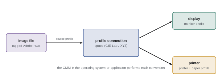
Every device reproduces color differently: a camera sensor, a laptop screen, a wide-gamut monitor and an inkjet printer each have their own gamut and response. ICC color management describes each device with a profile that relates its RGB or CMYK values to a device-independent reference space, the profile connection space (PCS), based on CIE XYZ or Lab. When an image moves from one device to another, the color management module (CMM) in the operating system or application uses the source profile to convert the image's values into the PCS, then uses the destination profile to convert them into the values the destination needs to reproduce the same colors, as nearly as its gamut allows. The image file carries its own profile (for example sRGB or Adobe RGB), the display has a monitor profile, and each printer, paper and ink combination has an output profile.
Choosing a display
The display is where most color decisions are made, so it deserves attention. Important characteristics include panel type (IPS panels offer consistent color across viewing angles; OLED panels offer deep blacks), gamut coverage (a display covering close to 100 % of sRGB is adequate for web work, while print and video work benefit from high Adobe RGB or DCI-P3 coverage), bit depth and uniformity across the screen, and support for hardware calibration, where calibration adjustments are stored in the monitor's own lookup tables rather than the computer's graphics card, preserving more tonal levels. Glossy screens show reflections that affect judgment; matte screens reduce them. For video grading, professional reference monitors with accurate Rec. 709 and HDR modes are used, and consumer televisions or computer screens are only approximations.
Calibrating and profiling a display
Calibration adjusts the display to known targets; profiling measures the result and creates an ICC profile describing it. Both are done with a colorimeter or spectrophotometer and software such as the manufacturer's tools, Calibrite PROFILER, DisplayCAL or Datacolor Spyder. Typical targets for photography are:
- White point: D65 (6,500 K) for web and video work; some print-oriented photographers choose D50 or a white matched to their print viewing light.
- Luminance: about 80 to 120 cd/m² for print-matching work in a dim room, far below the maximum brightness of most displays; brighter settings are common for web work in brighter rooms.
- Tone response: gamma 2.2 or the sRGB curve for general work; BT.1886 or gamma 2.4 for video in a dim environment.
Uncalibrated displays are often far too bright and too blue, which is the main reason prints look dark and warm compared with the screen. Calibrate monthly or as the software recommends, because displays drift as they age.
| Work type | White point | Luminance | Tone response |
|---|---|---|---|
| Web and social media | D65 | 120–160 cd/m² | sRGB / gamma 2.2 |
| Print matching | D65 or D50 | 80–120 cd/m² | Gamma 2.2 |
| SDR video grading | D65 | 100 cd/m² | BT.1886 (≈ gamma 2.4) |
| HDR video grading | D65 | Up to 1,000 nits or more | PQ or HLG |
The editing environment
Our perception of color adapts to the surroundings, so the room affects color judgments. A good editing environment has moderate, neutral ambient light that does not fall directly on the screen; neutral gray or white walls nearby rather than strongly colored ones; a neutral desktop background and interface in software; and, for print work, a viewing booth or lamp with high color rendering, around 5,000 K (D50) at a known brightness, for comparing prints with the screen. Taking breaks matters too: after staring at an image for a long time, the eye adapts to its color cast and corrections become unreliable. Reference images with known appearance and a gray card in the scene help anchor judgments.
Rendering intents and gamut mapping
When converting from a larger gamut to a smaller one, some colors cannot be reproduced. Rendering intents define how the CMM handles them:
- Perceptual: compresses the whole gamut to fit, preserving relationships between colors at the expense of some overall saturation. Good for images with many out-of-gamut colors.
- Relative colorimetric: reproduces in-gamut colors exactly (relative to the destination white point) and clips out-of-gamut colors to the nearest reproducible color. Good for images that are mostly in gamut, preserving accuracy, often used with black point compensation to keep shadow detail.
- Saturation: favors vivid colors over accuracy, used for business graphics.
- Absolute colorimetric: reproduces colors exactly including the white point, used for proofing one press on another, simulating paper color.
There is no single best intent: comparing perceptual and relative colorimetric in a soft proof for each important image is standard practice.
Soft proofing for print
Soft proofing simulates on screen how an image will look when printed on a specific printer and paper, using the output profile supplied by the paper manufacturer or print lab. With soft proofing turned on, the display shows reduced contrast and saturation, the paper's white and black, and out-of-gamut warnings. The photographer can then create a print-specific version, typically lifting shadows, adding contrast or adjusting saturation, so that the print matches their intentions. Matte papers have much lower maximum density (weaker blacks) and smaller gamuts than glossy or luster papers, so soft proofs on matte stock look especially flat. Accurate soft proofing depends on a calibrated display, correct profiles, and a suitable display brightness; with a display much brighter than the print viewing light, prints will always look dark by comparison.
Worked problem
Diagnosing dark prints
A photographer's prints from a lab consistently look darker and slightly warmer than the screen. The monitor is uncalibrated at maximum brightness, the files are exported in ProPhoto RGB, and the lab asks for sRGB. Identify the causes and solutions.
Show solution
- A display at maximum brightness (often 300 cd/m² or more) makes images look much brighter than a print under normal light.
- Uncalibrated displays are often too blue, so edits compensate by warming the image, which prints warm.
- Sending ProPhoto files to a lab that expects sRGB may cause misinterpretation or poor conversion.
- Solution: calibrate the display to about 100 to 120 cd/m² at D65, soft proof with the lab's profile, and export in the space the lab requests (here sRGB) with the profile embedded.
- Order a test print of a reference image to confirm the match.
Answer: Excess display brightness, an uncalibrated blue display and a color space mismatch; calibrate, soft proof and follow the lab's file requirements.
Camera profiles and color checkers
Color management begins at capture. Raw converters interpret raw data using camera profiles, which define how sensor responses map to colors. Manufacturers' and software defaults vary, and custom profiles can be built by photographing a color reference target, such as a ColorChecker chart, under the shooting light and processing it with profiling software. This is valuable for product, art reproduction and catalog work, where colors must be accurate, and for matching multiple cameras. A gray card or the neutral patches of a color chart also give a reliable reference for setting white balance in post-production. In video, matching cameras on a multi-camera shoot uses similar charts and the color management transforms discussed in Lesson 5.
Checking color on different devices
Most viewers will see your images on uncalibrated phones and laptops, so even with a perfectly calibrated workflow, appearance varies. Good practice is to make the master on a calibrated display, export correctly tagged sRGB or Display P3 files for screens, and check the results on a few typical devices, such as a recent phone and an ordinary laptop, to catch problems such as images that look too dark on screens with lower brightness or files that lost their profile on upload. Some platforms strip metadata, including profiles, from uploaded images; exporting in sRGB ensures images still look reasonable when that happens.
Printer profiles and paper choice
Inkjet printers used for photographic and fine art prints produce very different results on different papers, so each combination of printer, ink set and paper needs its own output profile. Paper manufacturers publish profiles for popular printers, and custom profiles can be created by printing a target chart and measuring it with a spectrophotometer, giving more accurate results. In the print dialog, either the application manages color using the paper profile, with the printer driver's own color management turned off, or the printer manages color, but never both; double color management is a classic cause of strangely colored prints. The paper type setting in the driver must also match the paper, because it controls ink quantity and the black ink used (photo black for glossy and luster, matte black for matte papers).
Paper choice is itself a creative and technical decision. Glossy and luster papers give deep blacks, high saturation and crisp detail; matte fine art papers give a softer, more painterly look with lower contrast and are less reflective under gallery lighting; baryta papers combine a fiber base with a glossy surface reminiscent of darkroom prints. Optical brightening agents make some papers look very white but can fade or shift over time, a consideration for archival prints. Soft proofing with each candidate paper's profile helps choose the right one before spending money on prints.
Color accuracy in commercial work
Some work demands measurable accuracy: product photography where the color of a garment or paint must match the real item, artwork reproduction for museums, and catalog images where returns cost money when colors disappoint customers. These workflows use custom camera profiles, controlled lighting with high color rendering, color targets in every set-up, calibrated displays, and objective checks of color differences measured in delta E units, where values below about 2 are generally hard to see. Museums and archives follow imaging guidelines such as FADGI and Metamorfoze, which specify targets, tolerances and procedures in detail. Even when full rigor is not required, borrowing these habits improves consistency.
Laptops and travel editing
Many photographers and editors work on laptops, which raises particular color issues. Laptop screens vary widely in quality; brightness, viewing angle and ambient light change constantly; and automatic brightness and night shift or true tone features alter color without warning. When color matters, disable automatic adjustments, calibrate the laptop screen, edit in consistent lighting, and treat edits made while traveling as provisional until they are checked on a calibrated studio display.
Finally, remember that color management cannot fix poor capture. Mixed lighting with different color temperatures, strongly colored reflections from walls and surroundings, and incorrect white balance in processed files all create color problems that no profile can fully solve. Getting light and white balance right at capture, as VIS-110 discussed, makes everything downstream easier and more predictable.
Common mistakes
MistakeEditing on an uncalibrated display at maximum brightness.
InsteadCalibrate to suitable white point and luminance targets.
MistakeJudging prints under warm household lamps.
InsteadUse a high-CRI viewing light near D50.
MistakeSending files in a space the lab did not request.
InsteadAsk for and follow the lab's file specifications.
MistakePrinting without soft proofing on matte paper.
InsteadSoft proof and create a print-specific version.
MistakeAssuming viewers see what you see.
InsteadExport tagged sRGB and check on typical devices.
Summary and key terms
- ICC profiles describe devices; the CMM converts colors through the PCS.
- Display choice affects gamut, uniformity and calibration options.
- Calibration sets white point, luminance and tone response; profiling measures the result.
- Neutral room lighting and surroundings support reliable judgments.
- Rendering intents control how out-of-gamut colors are handled.
- Soft proofing simulates print appearance on screen.
- Camera profiles and color charts improve accuracy from capture.
- Color management
- System for consistent color across devices.
- Profile connection space
- Device-independent reference space in ICC workflows.
- CMM
- Color management module performing conversions.
- Calibration
- Adjusting a device to known targets.
- Profiling
- Measuring a device and creating an ICC profile.
- Colorimeter
- Instrument measuring display color.
- Rendering intent
- Method of mapping out-of-gamut colors.
- Perceptual intent
- Compresses the gamut to keep relationships.
- Relative colorimetric
- Keeps in-gamut colors and clips the rest.
- Soft proofing
- On-screen simulation of printed output.
Practice problems
Work each problem on paper first, then reveal the answer to check.
What does the CMM do?
Show answer
Converts colors between profiles via the PCS.
Name two display characteristics important for photo work.
Show answer
Gamut coverage, uniformity, hardware calibration, panel type.
Typical luminance target for print matching?
Show answer
About 80–120 cd/m².
Why do prints look dark compared with many screens?
Show answer
Screens are set far too bright.
What white point is common for web and video?
Show answer
D65.
When is perceptual intent useful?
Show answer
When many colors are out of gamut.
What does relative colorimetric do with out-of-gamut colors?
Show answer
Clips them to the nearest reproducible color.
Why do matte paper soft proofs look flat?
Show answer
Lower maximum density and smaller gamut.
What target helps build camera profiles?
Show answer
A ColorChecker chart.
Why export screen images in sRGB?
Show answer
They look reasonable even if profiles are stripped.
Lesson quiz · 5 questions
Score 60% or more to complete this lesson.
Create a free account to save your progress, take quizzes and earn a certificate.