
CRE-230 · Lesson 10 of 12 · 27 min
Motion graphics basics
Movement catches the eye. A graphic that animates in the feed, a title that slides into a video, a chart whose bars grow, or a logo that reveals itself can stop the scroll and explain ideas more clearly than a still image. Motion graphics, animated graphic design, have become accessible to creators through tools built into editing apps and design platforms. This lesson covers the principles of motion design, timing and easing, keyframes, animating text, animated posts and stories, lower thirds and titles for video, animated data, logo animations, exporting motion, and accessibility considerations for movement.
Why motion works
Human vision is highly sensitive to movement, especially in peripheral vision, which is why animated elements are noticed in a feed of still images. Motion also communicates: it shows sequence (this comes first, then this), relationships (this element came from that one), change (this value grew), and emphasis (this word matters). Used well, motion clarifies and adds personality; used carelessly, it distracts, delays the message and can make viewers feel unwell. The aim of motion graphics for social media is usually short, purposeful animation that supports the message within the first second or two.
Principles of motion design
Several principles adapted from classic animation guide motion design:
- Timing: the duration of a movement affects how it feels; quick movements feel energetic, slow ones calm or heavy.
- Easing: real objects accelerate and decelerate rather than moving at constant speed; easing makes movement feel natural.
- Anticipation and follow-through: a small movement before the main action, and a slight overshoot or settle after it, add life.
- Staging: only one important thing should move at a time, so the eye knows where to look.
- Hierarchy in motion: the most important element animates first or most prominently; secondary elements follow.
- Consistency: use the same types of movement and timings throughout a piece and across a brand.
These principles apply whether animating a single word or a full explainer video.
Timing and easing
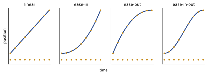
Social motion graphics move quickly, because viewers decide fast. Common durations are about 200 to 500 milliseconds for elements entering or leaving the screen, and 1 to 3 seconds for a title to stay readable. A rule of thumb for text on screen is to allow enough time to read it at least twice: roughly 0.3 seconds per word plus a second, though very short words and familiar phrases need less. Easing curves describe how speed changes over a movement: linear easing moves at constant speed and looks mechanical; ease-out starts fast and slows down, suiting elements arriving on screen; ease-in starts slowly and speeds up, suiting elements leaving; ease-in-out accelerates then decelerates, suiting movements from one position to another. Most tools offer easing presets and graph editors to shape curves.
Worked problem
Timing a title card
A creator wants an animated title "Three habits that saved my mornings" (6 words) at the start of a 30-second video. How long should it stay on screen, and how long should the entrance take?
Show solution
- Reading time: 0.3 × 6 + 1 = 2.8 seconds, about 3 seconds.
- Entrance animation: about 300–400 ms with ease-out, so the text arrives quickly and settles.
- Exit: about 200–300 ms with ease-in, or a cut to the next shot.
- Total: about 3.5 seconds, a significant part of a 30-second video, so keep the title short or overlay it on the first shot.
Answer: About 3 seconds on screen with a 300–400 ms ease-out entrance; overlay it on footage to avoid losing the opening.
Keyframes
Animation in most tools is created with keyframes: points in time at which a property, such as position, scale, rotation, opacity or colour, has a specific value. The software interpolates the values between keyframes, creating motion. A simple slide-in uses two keyframes for position: off-screen at the start and in place 400 milliseconds later, with ease-out. More complex animations combine several properties, such as a scale change with an opacity fade. Video editors such as CapCut, Premiere Pro and DaVinci Resolve, motion tools such as After Effects and Jitter, and design tools such as Canva and Figma all use keyframes or presets based on them. Learning to adjust keyframes and easing, rather than relying only on presets, gives more control and a more distinctive style.
Animating text
Animated text is the most common motion graphic in creator content, from titles and captions to quote posts. Effective approaches include revealing text word by word or line by line in time with speech, emphasizing key words with a scale, colour or underline animation, using kinetic typography that moves with the rhythm of music or voice, and using subtle entrance animations for captions. Keep animated text readable: avoid constant motion while viewers are reading, do not animate every word with a different effect, and keep the reading position stable. Automatic animated captions in editing apps are popular but can be distracting; choose styles that remain legible and accessible (Lesson 11).
Animated posts, stories and covers
Some platforms autoplay short animations or videos in the feed, making animated posts a way to stand out. Short loops of 3 to 10 seconds, such as a growing chart, a product rotating, a quote appearing line by line or a before-and-after wipe, work well. The first frame matters, since it may be shown as a still cover or before playback starts, so design it to work on its own. For stories, animated backgrounds, stickers and text add energy, but keep important content still long enough to read before the story advances, typically 5 to 15 seconds per frame.
Lower thirds, titles and video graphics
Long-form and documentary-style videos use graphic elements that should match the brand system: lower thirds, the text labels identifying people or places, usually placed in the lower part of the frame; title cards and chapter titles; callouts and arrows highlighting details; on-screen lists and quotes; end screens and subscribe prompts. Design them as templates with consistent typefaces, colours and animation styles, and respect safe areas for both horizontal and vertical versions. Keep them on screen long enough to read and avoid covering faces or important action. Many editing tools support saved title templates or motion graphics templates that make reuse easy.
| Video graphic | Typical duration | Placement |
|---|---|---|
| Lower third (name and role) | 3–5 s | Lower left or centre, inside safe area |
| Chapter title | 2–3 s | Centre or upper third |
| Callout or arrow | 1.5–3 s | Next to the detail |
| On-screen list item | Synced with speech | Consistent side of frame |
| End screen elements | 5–20 s | Platform-defined areas |
Animated data
Animation can make data easier to understand: bars that grow to their values, lines that draw over time, numbers that count up, maps that fill in. Animation reveals the order of information, highlights change and holds attention while the narrator explains. To keep animated data honest, animate toward the true values on a correct scale, keep axes and labels visible, avoid dramatic effects that exaggerate differences, and pause on the final state long enough to read it. The same principles as static charts apply (Lesson 8).
Logo animations and brand motion
A short logo animation, often called a sting or ident, at the start or end of videos builds recognition. Effective brand motion is short, typically 1 to 3 seconds, simple and consistent with the brand's personality: playful brands might bounce, professional brands might fade or slide precisely. Long intros cause viewers to leave, especially on short-form platforms, so many creators skip intros entirely or place a brief sting after the hook. A brand motion style, defined in the brand kit with standard durations, easing and transition types, keeps animated content consistent.
Exporting motion graphics
Export animated graphics in formats suited to the platform. Short looping animations for social feeds are usually exported as MP4 video (H.264), since animated GIFs have large file sizes, limited colours and inconsistent support; GIFs remain useful for email newsletters and some messaging contexts. Export at the platform's preferred dimensions and frame rate, commonly 30 frames per second, and keep files within size limits. Lottie, a format based on JSON for vector animations, is widely used for app and web animations but rarely uploaded directly to social platforms. Always preview exported motion on a phone, checking smoothness, legibility and the first frame.
Accessibility and motion
Motion can cause problems for some viewers. Rapid flashing can trigger seizures in people with photosensitive epilepsy; WCAG guidelines recommend no more than three flashes per second, and broadcasters use stricter tests. Large, fast movements, spinning, zooming and parallax effects can cause dizziness or nausea for people with vestibular disorders. Constant motion makes reading difficult for many people, including those with attention or cognitive differences. Keep motion purposeful and brief, avoid flashing and strobing, let text rest while it is read, and provide captions and descriptions so that information conveyed by motion is also available in other forms (Lesson 11).
Transitions between scenes and slides
Transitions connect one shot, slide or state to the next. Simple cuts are the default in most edits; animated transitions such as slides, wipes, zooms and match cuts can add energy when used consistently and sparingly. In motion graphics, transitions between states, such as one chart becoming another, work best when elements that persist move smoothly to their new positions, helping viewers track them, while new elements fade or slide in. Avoid using many different transition styles in one piece, which looks chaotic. A brand motion system might define one primary transition, such as a short slide with ease-in-out, and one accent transition for special moments.
Animating carousels and static posts
Even graphics designed as static images can be turned into short animations: elements fade in one by one, a chart builds, a highlight sweeps across a key word, or a background slowly zooms. These animated versions can be posted as short videos or Reels, reaching audiences who prefer video and benefiting from platforms that favour video formats. Keep the animated version close to the static design, so the brand remains consistent, and make sure the final frame contains the complete message, since some viewers will see only part of the animation.
Worked problem
Planning a 6-second animated tip
A creator wants to animate a static tip graphic with a headline, an icon and two lines of text into a 6-second vertical video. How could the timing be planned?
Show solution
- 0–0.4 s: background visible, headline slides in with ease-out.
- 0.4–0.8 s: icon scales up from 80 % to 100 % with a slight overshoot.
- 0.8–1.6 s: the two lines fade in one after the other, 400 ms each.
- 1.6–6 s: everything holds still for reading, about 4.4 seconds for roughly 12 words.
Answer: Animate elements in sequence over about 1.6 seconds, then hold the complete graphic for about 4.4 seconds of reading time.
Tools and learning paths
Creators can start with motion presets in editing apps and design tools, which offer ready-made entrances and exits. To build skills, learn keyframes and easing in one tool, study the timing of motion graphics you admire by stepping through them frame by frame, and recreate simple animations for practice. Professional motion designers use After Effects or similar tools, with plug-ins and expressions for complex work, but simple, well-timed animations made in accessible tools are usually enough for social content.
Sound and motion together
Many motion graphics are viewed with sound off, so they must communicate visually, but when sound is on, subtle sound effects, such as a soft whoosh for a slide-in or a click for a highlight, can make motion feel polished. Keep effects quiet and consistent, and ensure they do not clash with music or voice (CRE-210 covers sound for short-form video).
Previewing motion
Always preview animations on the device where they will be watched, at normal speed, before publishing.
Common mistakes
MistakeLinear movements that look mechanical.
InsteadUse ease-out for entrances and ease-in for exits.
MistakeAnimating everything at once.
InsteadStage one important movement at a time.
MistakeText leaving before it can be read.
InsteadAllow about 0.3 s per word plus 1 s.
MistakeLong logo intros.
InsteadKeep stings to 1–3 s or skip them.
MistakeFlashing or rapid strobing effects.
InsteadKeep below three flashes per second and avoid strobing.
Summary and key terms
- Motion attracts attention and communicates sequence, change and emphasis.
- Timing, easing, staging and consistency guide motion design.
- Entrances of 200–500 ms with ease-out feel natural.
- Keyframes define property values that software interpolates.
- Animated text, loops, lower thirds and data graphics need readable timing.
- Brand motion should be short and consistent.
- Export as MP4 for social, and respect motion accessibility.
- Motion graphics
- Animated graphic design.
- Easing
- Change of speed during a movement.
- Ease-out
- Fast start that slows to a stop.
- Keyframe
- Point defining a property value at a time.
- Interpolation
- Calculation of values between keyframes.
- Kinetic typography
- Moving text synced to sound or rhythm.
- Lower third
- Text label in the lower part of the frame.
- Sting
- Short logo animation.
- Lottie
- JSON-based vector animation format.
- Vestibular disorder
- Condition affecting balance and motion perception.
Practice problems
Work each problem on paper first, then reveal the answer to check.
Why does motion attract attention?
Show answer
Vision is highly sensitive to movement.
Name three motion principles.
Show answer
Timing, easing, anticipation, staging, hierarchy, consistency.
Typical entrance duration?
Show answer
About 200–500 ms.
Which easing suits elements arriving?
Show answer
Ease-out.
Reading time for 10 words?
Show answer
About 4 seconds.
What does a keyframe define?
Show answer
A property value at a point in time.
Typical lower third duration?
Show answer
3–5 seconds.
Why export loops as MP4 rather than GIF?
Show answer
Smaller files, better quality and support.
Maximum flash rate recommended by WCAG?
Show answer
Three per second.
Which effects can cause dizziness?
Show answer
Spinning, zooming, parallax, large fast movements.
Lesson quiz · 5 questions
Score 60% or more to complete this lesson.
Create a free account to save your progress, take quizzes and earn a certificate.