
CRE-230 · Lesson 4 of 12 · 26 min
Typography for social graphics
Words carry most of the meaning in many social graphics, and typography, the choice and arrangement of type, determines whether those words are read. Good typography is legible at small sizes, expresses the right tone and reinforces a creator's brand; poor typography is hard to read, looks amateur and undermines the message. VIS-101 introduced typography in general. This lesson focuses on type for small screens: anatomy and classifications, choosing typefaces for social use, legibility and readability, type sizes and scales, weight and width, line length, leading and tracking, pairing typefaces, text on images, emphasis, and multilingual and accessible type.
Type anatomy
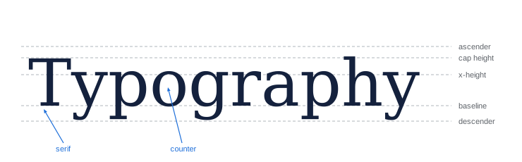
A few terms help describe type. The baseline is the line letters sit on; the x-height is the height of lowercase letters such as x, excluding ascenders (the parts of b, d, h that rise above it) and descenders (the parts of g, p, y that fall below it); the cap height is the height of capital letters. Counters are the enclosed or partly enclosed spaces inside letters such as o, e and a. Serifs are small strokes at the ends of letter strokes; sans-serif type lacks them. Weight describes stroke thickness, from thin to black; width describes how narrow or wide the letters are, from condensed to extended. A typeface is a design, such as Helvetica; a font is a particular file or style of it, such as Helvetica Bold; a type family includes all the weights and styles of a typeface.
Type classifications
Typefaces fall into broad families, each with a different character:
- Serif typefaces, such as Garamond, Georgia and Playfair Display, feel traditional, literary or elegant; high-contrast serifs with very thin strokes can break up at small sizes on screens.
- Sans-serif typefaces, such as Helvetica, Inter, Montserrat and Roboto, feel modern, clean and neutral, and are the default for most social and interface text because they stay clear at small sizes.
- Slab serifs, such as Roboto Slab and Rockwell, have thick, blocky serifs and feel sturdy and friendly.
- Display typefaces are designed for large sizes: bold, decorative, condensed or quirky faces that add personality to headlines but are hard to read in body text.
- Script and handwritten typefaces imitate handwriting and add warmth or elegance, but many are hard to read, especially in all capitals or at small sizes.
- Monospaced typefaces give every character the same width, suggesting code, typewriters or technical content.
For social graphics, a sturdy sans-serif with a large x-height and open counters is the safest choice for most text, with a display or serif face used for headlines when it suits the brand.
Legibility and readability
Legibility is how easily individual characters can be distinguished; readability is how easily text as a whole can be read. On small screens, legibility depends on a large x-height, open counters, clear differences between similar characters (such as uppercase I, lowercase l and the numeral 1, or O and 0), moderate stroke contrast and enough weight. Readability depends on size, line length, spacing, contrast with the background, and the number of words. Very thin weights, tightly condensed widths, all-caps text in long passages, decorative scripts and text on busy backgrounds all reduce legibility. Test small text at actual size on a phone; if you have to concentrate to read it, most viewers will not.
Type sizes and scales
Choosing sizes from a type scale, a set of sizes related by a consistent ratio, creates harmonious hierarchy. A scale with a ratio of 1.25 (a "major third") starting at 32 pixels gives 32, 40, 50, 63, 78 and 98 pixels; a ratio of 1.5 gives 32, 48, 72, 108 and 162 pixels, creating stronger contrast suited to bold social graphics. Each step up the scale is the previous size multiplied by the ratio.
Worked problem
Building a type scale for a carousel
A designer wants body text of 36 px on a 1080-pixel-wide carousel slide, and a type scale with ratio 1.5. What sizes are available for subheadings and headlines?
Show solution
- Step 0: 36 px (body).
- Step 1: 36 × 1.5 = 54 px (subheading).
- Step 2: 54 × 1.5 = 81 px (headline).
- Step 3: 81 × 1.5 ≈ 122 px (cover headline).
Answer: Body 36 px, subheading 54 px, headline 81 px and cover headline about 122 px.
| Text role | Typical size at 1080 px wide | Notes |
|---|---|---|
| Cover or thumbnail headline | 100–200 px | Three to six words, bold |
| Slide headline | 70–100 px | One line or two short lines |
| Subheading | 48–64 px | Supports the headline |
| Body text | 32–44 px | Short sentences or bullets |
| Small print (sources, handle) | 24–30 px | Use sparingly; still legible |
Weight, width and style
Weight is a powerful hierarchy tool: bold headlines over regular body text create contrast without changing size. For small screens, avoid weights lighter than regular for body text, and avoid extremely heavy weights for long text, since counters can fill in. Condensed widths fit more characters into narrow spaces, useful for long words in thumbnails, but very condensed type is harder to read. Italics provide emphasis but are less legible at small sizes on screens; use them sparingly. All capitals work well for short headlines and labels, especially with slightly increased letter spacing, but slow reading in longer text because word shapes become uniform rectangles.
Line length, leading and tracking
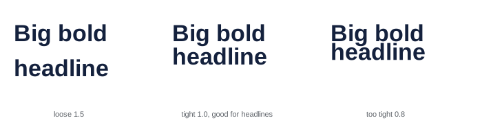
Line length, the number of characters per line, affects readability. For body text in social graphics, aim for about 20 to 40 characters per line on narrow formats; longer lines are hard to follow on phones, and very short lines create choppy reading. Leading, or line height, is the vertical distance between baselines; for body text, about 1.2 to 1.5 times the font size works well, while large headlines often look better with tighter leading of about 0.9 to 1.1 times the size. Tracking, or letter spacing, adjusts the space between all letters; large bold headlines often benefit from slightly tightened tracking, while small text and all-caps labels benefit from slightly loosened tracking. Kerning adjusts spacing between specific pairs of letters, such as AV or To, and matters most in large headlines and logos, where awkward gaps become visible.
Pairing typefaces
Most social graphics need only one or two typefaces. Common pairings combine a distinctive display or serif face for headlines with a neutral sans-serif for body text, or use a single versatile family in several weights. Good pairings contrast clearly in one or two characteristics, such as serif versus sans-serif or heavy versus light, while sharing proportions such as x-height. Avoid pairing two typefaces that are similar but not identical, such as two geometric sans-serifs, which looks like a mistake. Using more than two or three typefaces in one graphic or brand creates visual noise. Variable fonts, which contain a continuous range of weights and widths in a single file, offer flexibility within one family.
Text on images
Placing text directly on photos is common in covers, thumbnails and stories, but busy or uneven backgrounds make text hard to read. Techniques for legible text on images include placing text over calm areas such as sky, walls or blurred backgrounds; adding a darkening gradient or overlay behind the text; placing text on a solid or semi-transparent shape; adding a subtle shadow or outline; choosing a strong, heavy typeface; and checking contrast with a contrast tool (Lesson 11). The platform's own text tools in stories and short-form videos usually provide background boxes for this reason.
Emphasis and expressive type
Emphasis highlights the most important word or phrase: a different colour, weight, size, underline, highlight shape or typeface. Use one emphasis technique at a time and emphasize only a word or two; emphasizing everything emphasizes nothing. Expressive typography, in which type itself becomes the image through size, arrangement, distortion or animation, can be striking for quotes, announcements and brand moments, but must remain readable. Emoji in graphics add tone but display differently across devices and may not be read clearly by screen readers.
Multilingual and accessible type
Creators reaching audiences in more than one language, such as English and French in Canada or English and Spanish in the United States, need typefaces that support accents and characters correctly: é, à, ç, ñ, ü and others. French text typically runs about 15 to 20 % longer than English, so layouts need room to expand. Some typefaces lack glyphs for certain languages, producing missing characters or substitutions. For accessibility, use legible typefaces at generous sizes, high contrast, sentence case for longer text, and avoid conveying meaning through type style alone. Text inside images is invisible to screen readers unless repeated in captions or alt text, which Lesson 11 covers.
Choosing typefaces for a brand
Typefaces carry personality. Geometric sans-serifs such as Montserrat and Poppins feel modern and friendly; humanist sans-serifs such as Source Sans and Open Sans feel warm and readable; grotesque and neo-grotesque sans-serifs such as Inter and Helvetica feel neutral and professional; serifs such as Playfair Display and Lora feel editorial or elegant; rounded typefaces feel playful; condensed bold faces feel urgent and loud. Choose typefaces that match the brand's personality and audience, test them in real graphics at small sizes, and check that the family includes the weights you need. Widely used free typefaces are safe and well made, but very popular choices can make a brand look generic; pairing them with a distinctive headline face or custom treatment helps.
Worked problem
Fitting a headline into a thumbnail
A designer wants the four-word headline "BUDGET GAMING SETUP 2026" in a 1280 × 720 thumbnail, occupying no more than half the width, about 600 pixels, with a cap height of at least 110 pixels for legibility. In a regular-width bold sans-serif, each character is about 0.65 times the cap height wide. Will it fit on one line?
Show solution
- Characters including spaces: 24.
- Approximate width at 110 px cap height: 24 × 0.65 × 110 ≈ 1716 pixels.
- That is far wider than 600 pixels, so split it over three lines (BUDGET GAMING / SETUP / 2026) or shorten it (for example "$300 SETUP").
- A condensed typeface with characters about 0.45 times the cap height would still need about 1188 pixels on one line.
Answer: No; it needs about 1700 pixels on one line, so shorten the text or stack it on two or three lines.
Numbers in graphics
Numbers are powerful in social graphics: "7 tips", "$50 vs $500", "30-day results". Typefaces handle numbers differently: lining figures sit on the baseline at cap height, suiting headlines and tables; old-style figures vary in height like lowercase letters, suiting body text in some serif faces; tabular figures have equal widths, so columns of numbers align, while proportional figures have varying widths for better appearance in text. For charts and comparisons, use tabular lining figures if the typeface offers them. Write numbers as numerals in graphics, even small ones, because they catch the eye and save space.
Typography checklist
Before finishing a graphic, check that all text is spelled correctly, sizes follow the type scale, no more than two typefaces are used, line lengths are comfortable, leading is appropriate for each size, headlines are kerned where needed, there are no widows (single words alone on the last line) in headlines, emphasis is limited to a word or two, and text contrast meets accessibility guidelines.
Type on video and motion
Type that appears over video must be readable over moving backgrounds and for limited time. Use heavier weights, backing boxes or shadows, and keep text on screen long enough to read (Lesson 10). Captions and titles should sit inside safe areas and avoid covering faces.
Common mistakes
MistakeThin or decorative fonts for small text.
InsteadUse sturdy sans-serifs with large x-heights.
MistakeRandom font sizes.
InsteadUse a type scale with a consistent ratio.
MistakeUsing four or five typefaces.
InsteadUse one or two typefaces in a few weights.
MistakeText over busy photos.
InsteadAdd overlays, shapes or choose calm areas.
MistakeLong passages in all capitals.
InsteadUse sentence case for anything longer than a few words.
Summary and key terms
- Type anatomy includes baseline, x-height, cap height, ascenders, descenders and counters.
- Sans-serifs with large x-heights are safest for small screens.
- Legibility concerns characters; readability concerns text as a whole.
- Type scales multiply sizes by a consistent ratio.
- Control weight, width, line length, leading, tracking and kerning.
- Pair one or two contrasting typefaces.
- Make text on images legible and support multilingual and accessible needs.
- Typeface
- A type design such as Helvetica.
- Font
- A specific style or file of a typeface.
- X-height
- Height of lowercase letters such as x.
- Serif
- Small stroke at the end of a letter stroke.
- Display typeface
- Type designed for large sizes.
- Type scale
- Set of sizes related by a ratio.
- Leading
- Vertical distance between lines.
- Tracking
- Uniform spacing between letters.
- Kerning
- Spacing between specific letter pairs.
- Variable font
- Font file with a continuous range of styles.
Practice problems
Work each problem on paper first, then reveal the answer to check.
What is the x-height?
Show answer
Height of lowercase letters such as x.
Why are sans-serifs common in social graphics?
Show answer
They stay clear at small sizes.
Difference between legibility and readability?
Show answer
Characters versus text as a whole.
Sizes in a 1.25 scale from 40 px?
Show answer
40, 50, 62.5, 78, 98.
Typical body text size at 1080 px wide?
Show answer
32–44 px.
Typical leading for body text?
Show answer
1.2–1.5 times the font size.
What is kerning?
Show answer
Adjusting space between specific letter pairs.
How many typefaces in most graphics?
Show answer
One or two.
Name two techniques for text on images.
Show answer
Gradients, shapes, calm areas, shadows, heavy type.
How much longer is French text typically?
Show answer
About 15–20 %.
Lesson quiz · 5 questions
Score 60% or more to complete this lesson.
Create a free account to save your progress, take quizzes and earn a certificate.