
PHOT-202 · Lesson 3 of 12 · 25 min
Raw processing: profiles, white balance and tone
Raw processing turns sensor data into a photograph. The global adjustments made at this stage, to the camera profile, white balance, exposure and tone, establish the foundation on which every later edit builds. Getting them right makes local adjustments and retouching easier and more subtle; getting them wrong forces heavy corrections that degrade the image. This lesson covers what happens when a raw file is opened, camera profiles, white balance, reading the histogram, exposure and the basic tone controls, tone curves, contrast and clarity, and a systematic approach to global tone.
Opening a raw file
A raw file contains the sensor's data before demosaicing, white balance and tone mapping (PHOT-201). When a raw processor opens the file, it demosaics the data, applies a white balance using the camera's recorded setting, converts colours using a camera profile, applies a default tone curve, and displays a preview. The image you see is therefore already an interpretation, and different raw processors produce noticeably different starting points from the same file, because they use different demosaicing algorithms, profiles and default curves. The camera's embedded JPEG preview, which you may see briefly while the raw processor renders its own version, reflects the camera's picture style and often looks different again. None of these is the "correct" image; they are starting points for your interpretation.
Camera profiles
The camera profile defines how the camera's colour response is translated into a standard colour space, and often includes a tone curve. Raw processors offer several kinds of profile:
- Neutral or standard profiles from the software maker, such as Adobe Standard or Adobe Color, designed to look natural across many cameras.
- Camera-matching profiles that emulate the manufacturer's picture styles, such as Camera Standard, Portrait, Landscape or Fujifilm film simulations, useful when you like the camera's own rendering.
- Adaptive or AI profiles that analyse each image and adjust tone and colour automatically.
- Creative profiles that apply a look, such as black and white or vintage styles, often with an amount slider.
- Custom profiles created from colour charts for accurate reproduction (Lesson 4).
Choose the profile first, before other adjustments, because it changes the starting point for everything else. For portraits, profiles with gentle contrast and pleasing skin tones help; for landscapes, more vivid profiles may suit; for product and art reproduction, accurate custom profiles are best.
White balance
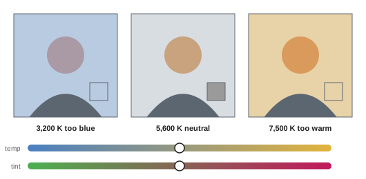
White balance sets the colour of neutral tones. In raw files, it is applied as metadata, so it can be changed freely without loss. The controls are temperature, in kelvin, moving between blue and yellow, and tint, moving between green and magenta. The white balance selector or eyedropper sets white balance by clicking on something that should be neutral, such as a grey card, a white shirt in shade, or grey pavement, and is often the fastest and most accurate method. Presets such as daylight, cloudy, shade, tungsten and flash give starting points.
Correct white balance is not always neutral white balance. A sunset photographed with perfectly neutral white balance loses its warmth; a blue-hour cityscape loses its cool mood; candlelit interiors feel natural when slightly warm. Skin tones are the most sensitive test: viewers instantly notice skin that looks grey, green, magenta or too orange. When a scene contains mixed lighting, choose the white balance for the most important subject, usually faces, and correct other areas with local adjustments if needed. Shooting a grey card or colour chart at the start of each lighting setup makes white balance fast and consistent across a shoot.
Reading the histogram
The histogram in a raw processor shows the distribution of tones in the current rendering, usually in red, green and blue channels overlaid, from black on the left to white on the right. It helps you judge whether the image is using the full tonal range, whether highlights or shadows are clipping, shown by indicators in the corners or by colour overlays on the image, and whether one colour channel is clipping in saturated areas. There is no single correct histogram shape: a low-key image is weighted to the left, a high-key image to the right, and a foggy landscape may occupy only the middle. Use the histogram with clipping warnings as a guide to protect detail, and your calibrated monitor to judge appearance.
Exposure and the basic tone controls
Most raw processors offer a similar set of global tone controls, each targeting a range of tones:
- Exposure: brightens or darkens the whole image, in stops, much like changing exposure in the camera. Set it so that the main subject has the intended brightness.
- Contrast: increases or decreases the separation between dark and light tones around the midpoint.
- Highlights: adjusts the bright tones; reducing it recovers detail in skies, clouds, white clothing and windows.
- Shadows: adjusts the dark tones; raising it reveals detail in shadow areas.
- Whites: sets the white point, the brightest tones in the image.
- Blacks: sets the black point, the darkest tones.
A common sequence is to set exposure for the subject, then adjust highlights and shadows to manage the range, then set whites and blacks so that the image has a true black and white, or deliberately does not, for a softer look. Many raw processors let you hold a modifier key while dragging whites or blacks to display only the clipped areas, making precise setting easy. Automatic tone buttons, including AI-based ones, can provide a sensible starting point.
| Control | Main tonal range | Common use |
|---|---|---|
| Exposure | All tones, weighted to midtones | Set overall brightness of subject |
| Contrast | Midtone separation | Add punch or soften |
| Highlights | Bright tones | Recover skies and windows |
| Shadows | Dark tones | Reveal shadow detail |
| Whites | Brightest tones | Set white point |
| Blacks | Darkest tones | Set black point and depth |
Tone curves
The tone curve is the most powerful and flexible tone control. It maps input tones on the horizontal axis to output tones on the vertical axis; a straight diagonal line means no change. Raising a point on the curve brightens those tones; lowering it darkens them. An S-shaped curve, lowering the shadows and raising the highlights, increases midtone contrast; an inverted S reduces it. Lifting the black point at the bottom-left creates faded, matte blacks associated with film looks; lowering the white point at the top-right softens the brightest whites. Point curves allow precise control with multiple points; parametric curves adjust regions such as highlights, lights, darks and shadows with sliders. Curves can also be applied to individual red, green and blue channels to adjust colour, as Lesson 4 explains.
Worked problem
Building a gentle S-curve
A portrait looks flat after shadows were lifted and highlights reduced. The photographer wants more depth without crushing shadows or clipping skin highlights. How could a tone curve help?
Show solution
- Place a point at about 25 % input and lower it slightly to about 21 %, darkening the lower midtones.
- Place a point at about 75 % input and raise it slightly to about 79 %, brightening the upper midtones.
- Leave the black and white endpoints in place, so that nothing new clips.
- Check skin highlights with the clipping overlay and adjust the upper point if they approach white.
Answer: A gentle S-curve with points at about 25 % and 75 % moved a few per cent adds depth while keeping blacks and whites intact.
Clarity, texture and dehaze
Several controls adjust local contrast, the contrast between nearby tones, rather than the global tonal range. Texture enhances or smooths fine detail, such as skin pores, fabric weave and foliage, with less effect on larger structures; reducing it softens skin subtly. Clarity increases or decreases contrast in midtone edges and medium-sized details, adding punch and definition, but heavy clarity creates halos and a gritty, overprocessed look, and negative clarity creates a dreamy glow. Dehaze increases contrast and saturation to cut through atmospheric haze in landscapes, or adds haze when reduced; it can also deepen skies and add drama, but strong dehaze darkens and saturates images unnaturally. These controls are powerful in small amounts and are often better applied locally (Lesson 6) than globally.
A systematic approach to global tone
A consistent sequence makes global tonal editing faster and more predictable:
- Choose the profile and set lens corrections, which change the starting point and corners.
- Set white balance.
- Set exposure for the main subject.
- Adjust highlights and shadows to manage the range.
- Set whites and blacks.
- Add or reduce contrast with the contrast slider or a tone curve.
- Add texture, clarity or dehaze sparingly.
Then move on to colour (Lesson 4), detail (Lesson 5) and local adjustments (Lesson 6). Revisit earlier steps as needed: colour and local adjustments may change your judgement of exposure and contrast.
Synchronizing and consistency
Photographs from the same shoot usually share lighting, so global adjustments made on one image can be synchronized to others, then fine-tuned. Raw processors offer copy and paste of settings, sync across selected images, and auto-sync, which applies changes to all selected images as you edit. Be careful to sync only appropriate settings: white balance, profile and tone may sync well across a set, while crops, local adjustments and spot removal usually should not. For long events in changing light, group images by lighting condition and process each group separately. Consistency across a gallery or album is a mark of professional work.
Process versions and software updates
Raw processors improve their processing engines over time. Adobe, for example, labels each generation of its raw processing as a process version; newer versions introduce different tone controls, better highlight recovery and improved demosaicing. Older images keep their original process version unless you update them, because updating can change their appearance. Updating older images to the latest process version can improve them, but check each image after updating. Similarly, Capture One and other applications update their engines and profiles, and profiles for new cameras are added in software updates, which is why newly released cameras may not be supported immediately.
Setting defaults and import presets
Raw processors apply default settings to every new image. Changing the defaults, for example choosing a preferred profile, turning on lens corrections, setting moderate capture sharpening and a little noise reduction, saves repetitive work. Defaults can be set per camera model and even per ISO, so that high-ISO images automatically receive more noise reduction. Develop presets applied on import can add a house style as a starting point. Good defaults mean that every image starts close to finished, and editing concentrates on decisions that require judgement.
High dynamic range output in raw processors
Recent versions of some raw processors can edit and export images in high dynamic range, taking advantage of HDR displays on modern laptops, tablets and phones that can show highlights several times brighter than standard white. HDR editing modes show an extended histogram, with headroom above standard white for bright highlights such as sunsets, lamps and reflections, and export formats such as AVIF, JPEG XL and HDR-enabled JPEGs with gain maps preserve this information, while still displaying acceptably on standard screens. HDR photography is still developing, with varying support across platforms and browsers, but it can make images appear strikingly luminous on compatible displays. Use HDR highlights sparingly, as with HDR video, and always check how images look on standard displays too.
Developing an eye for tone
Technical controls are only useful with a trained eye. Study tonal relationships in photographs you admire: where the darkest and brightest areas are, how much detail remains in shadows and highlights, how contrast varies between subject and background. Compare your edits with reference images, and look at your images at small and large sizes. Over time, you will learn to see whether an image needs more contrast, brighter midtones or darker edges at a glance.
Common mistakes
MistakeIgnoring the camera profile.
InsteadChoose a profile first as the starting point.
MistakeNeutralizing sunsets and candlelight.
InsteadChoose white balance for mood and skin.
MistakeLifting shadows and lowering highlights to extremes.
InsteadKeep depth with contrast and curves.
MistakeHeavy global clarity and dehaze.
InsteadUse small amounts, often locally.
MistakeSyncing crops and spot removal across images.
InsteadSync only appropriate global settings.
Summary and key terms
- Opening a raw file already involves interpretation by the software.
- Profiles set the starting colour and tone; choose them first.
- White balance is adjustable without loss and should flatter skin and mood.
- The histogram and clipping warnings guide tonal decisions.
- Exposure, highlights, shadows, whites and blacks shape the global range.
- Tone curves give precise control of contrast and look.
- Texture, clarity and dehaze adjust local contrast and should be used sparingly.
- Camera profile
- Translation of camera colour into a standard space.
- White balance
- Setting the colour of neutral tones.
- Temperature
- Blue to yellow white balance control in kelvin.
- Tint
- Green to magenta white balance control.
- Histogram
- Graph of tonal distribution.
- Black point
- Darkest tone in the image.
- White point
- Brightest tone in the image.
- Tone curve
- Graph mapping input to output tones.
- Clarity
- Midtone local contrast control.
- Dehaze
- Control that removes or adds atmospheric haze.
Practice problems
Work each problem on paper first, then reveal the answer to check.
Why do raw processors show different starting images?
Show answer
Different demosaicing, profiles and default curves.
Why choose the profile first?
Show answer
It changes the starting point for all adjustments.
How do you set white balance quickly?
Show answer
Click a neutral area with the eyedropper.
When is neutral white balance wrong?
Show answer
Sunsets, candlelight, blue hour moods.
What does reducing highlights do?
Show answer
Recovers detail in bright areas.
How can you see clipped areas while setting whites?
Show answer
Hold a modifier key while dragging.
What does an S-curve do?
Show answer
Increases midtone contrast.
How do you create matte blacks?
Show answer
Lift the black point of the curve.
What is the risk of heavy clarity?
Show answer
Halos and a gritty look.
Which settings should not usually be synced?
Show answer
Crops, local adjustments and spot removal.
Lesson quiz · 5 questions
Score 60% or more to complete this lesson.
Create a free account to save your progress, take quizzes and earn a certificate.