
CRE-211 · Lesson 9 of 12 · 25 min
Titles and thumbnails
Lesson 3 argued that packaging should be designed before a video is made. This lesson turns to the craft of creating the final title and thumbnail: how viewers scan packaging, principles of thumbnail design, faces and expressions, text in thumbnails, color and contrast, composition for small and large screens, writing titles, making title and thumbnail work together, testing packaging, updating packaging after publishing, and keeping packaging honest and consistent with a channel's brand.
How viewers scan packaging
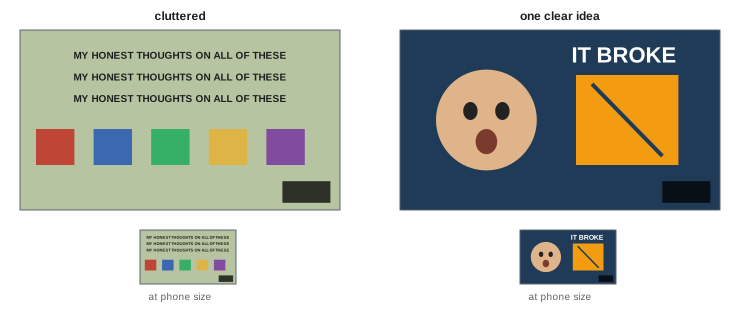
On the home page, in search results and in suggested videos, viewers scroll past dozens of options in seconds. Their eyes are drawn first to images, particularly faces, bright colors, strong contrasts and unusual shapes, and then to short phrases. Thumbnails are therefore usually seen before titles, and a thumbnail that fails to catch the eye means the title may never be read. Thumbnails also appear at very different sizes: tiny on a phone in a list of suggestions, medium in a grid on a computer, and large on a television home screen. Packaging must work at all of these sizes, with the main idea readable at a glance on the smallest.
Principles of thumbnail design
Effective thumbnails usually follow a few principles:
- One clear idea: a single subject or contrast that conveys the video's promise, rather than a collage of many small elements.
- A strong focal point: the eye should know immediately where to look, often a face, an object or a striking image.
- Simplicity: three or fewer main elements; clutter becomes unreadable at small sizes.
- Contrast: between subject and background, in brightness and color, so the subject stands out.
- Intrigue: an image that raises a question, such as an unusual situation, a before-and-after, a comparison, or an object in an unexpected state.
- Accuracy: an image that represents what the video contains.
YouTube thumbnails are uploaded at 1280 × 720 pixels in a 16:9 ratio, and at the time of writing must be under 2 MB in JPG, PNG or similar formats. YouTube overlays the video length in the bottom-right corner, so avoid placing important elements there.
Faces and expressions
Human faces attract attention, and many successful thumbnails include the creator or a subject with a clear expression that conveys emotion: surprise, curiosity, concern, joy or determination. A face looking toward the main object of the thumbnail directs the viewer's gaze there. Expressions should be genuine to the video and the creator's personality; exaggerated shock faces became so common that many viewers find them tiresome, and some channels have moved toward calmer, more authentic expressions or thumbnails without faces. Faces work particularly well for personality-driven channels, vlogs and commentary; for tutorials, products and documentaries, the subject itself may be the stronger image. Testing (below) can show what works for a particular audience.
Text in thumbnails
Text in a thumbnail should add to the title, not repeat it. A few large words, typically two to four, can state a key fact, a question, a number or a reaction that the image alone cannot convey, such as "6 MONTHS LATER", "$30 vs $600" or "IT FAILED". Use bold, highly legible fonts, large enough to read at phone size, with strong contrast against the background, often with an outline or shadow. Many thumbnails use no text at all, relying on the image and title, which can look cleaner and work better across languages. Avoid small text, long sentences and text that duplicates the title word for word.
Color, contrast and composition
Color and contrast make thumbnails stand out in a page of competitors. Use a limited palette, often with one bright accent color against a darker or simpler background; complementary colors, such as orange against blue, create strong contrast. Consider what surrounds the thumbnail: YouTube's interface is white or dark depending on the user's settings, so thumbnails with large white or black areas may blend into the page. Composition follows familiar principles: placing the main subject on a third, leaving space around it, and using depth, such as a subject in front and a blurred background. Increase saturation and contrast moderately compared with normal photographs, since thumbnails are viewed small, but avoid garish over-processing that looks cheap.
| Element | Effective practice | Common mistake |
|---|---|---|
| Subject | One clear focal point | Several small, competing objects |
| Text | Two to four large words adding information | Repeating the whole title |
| Face | Genuine expression directing attention | Exaggerated, unrelated shock |
| Color | Limited palette with an accent | Many clashing colors |
| Layout | Clear of the duration label area | Important element under the timestamp |
Writing titles
Titles complete the packaging. Effective long-form titles are specific, clear about the subject, and curious about the outcome (Lesson 3). Practical guidelines include keeping titles concise, often under about 60 to 70 characters, since longer titles are truncated in many views, especially on phones and televisions; placing the most important words first; using natural language that matches how viewers think and search, particularly for tutorials and evergreen topics; using numbers, stakes, time frames and outcomes where they genuinely apply; and avoiding all-capital titles, excessive punctuation and clickbait phrases that undermine trust. For search-focused videos, include the main keyword phrase naturally; for browse-focused videos, emphasize the story, stakes or curiosity.
Worked problem
Refining a title
A creator's draft title is "My Experience With Learning the Piano as an Adult Over the Course of One Whole Year (Progress Update and Tips)", which is 106 characters long. How could it be improved?
Show solution
- Identify the core promise: progress from learning piano as an adult over a year.
- Lead with the most important words and add curiosity: "I learned piano at 35. Here's one year of progress".
- Check the length: about 50 characters, which fits on phones and televisions.
- Pair with a thumbnail showing a before-and-after contrast, such as hands fumbling a simple piece beside playing a difficult one, with "DAY 1 → DAY 365".
Answer: "I learned piano at 35. Here's one year of progress", about 50 characters, paired with a before-and-after thumbnail.
Making title and thumbnail work together
The title and thumbnail should function as a pair, each carrying part of the message. A common pattern is for the thumbnail to show the most intriguing image and the title to provide context or stakes: a thumbnail showing a tiny house in deep snow with the title "We lived in a 12 m² cabin through a Yukon winter." Another is for the thumbnail text to pose a question that the title frames. Avoid redundancy, where both say the same thing, and contradiction, where they suggest different videos. Reviewing the pair as it will appear in search results and recommendations, using mock-up tools or a screenshot of a real results page with your packaging inserted, reveals whether it stands out and makes sense.
Testing packaging
YouTube's Test and Compare feature, available in YouTube Studio for eligible channels at the time of writing, lets creators upload up to three thumbnails for a video, and in some cases alternative titles, and shows them to different viewers. YouTube selects the winning version based on watch time share, rather than click-through rate alone, because a thumbnail that attracts clicks but leads to short viewing is not truly better. Tests need enough impressions to be reliable, and small differences may not be meaningful (CRE-202). Test genuinely different concepts, such as a face versus no face, or a product shot versus a result shot, rather than tiny variations, which rarely reveal much. Record what you test and what wins, so that patterns emerge across videos.
Updating packaging after publishing
Packaging can be changed after a video is published. Many creators review the first days of a video's performance and change the title or thumbnail if click-through rate or views are well below the channel's typical results, sometimes reviving a video that was struggling. Older videos can also benefit from refreshed packaging that reflects current design or a better understanding of the audience. Change one element at a time and allow enough time to judge the effect, since performance varies naturally day to day. Avoid changing packaging in ways that misrepresent the video, and keep a record of changes.
Brand consistency and honesty
Over time, a channel's thumbnails form a visual identity, recognizable in a feed: consistent fonts, colors, layouts, framing of the creator, or a recurring style of illustration. Consistency helps loyal viewers spot new videos quickly, while variety within the style keeps each video distinct. Build templates in design software for efficiency, but adapt each thumbnail to its video. Above all, keep packaging honest. YouTube's policies prohibit misleading metadata and thumbnails that are sexually suggestive, violent or shocking in ways that violate guidelines, and misleading packaging harms viewer satisfaction and channel reputation (Lesson 3). The best packaging is both compelling and true: it shows viewers the most interesting truth about the video.
Photographing for thumbnails
Many strong thumbnails start with a photograph taken specifically for them, rather than a frame grabbed from the video. Benefits include higher resolution, sharper focus, controlled lighting and expressions captured deliberately. A thumbnail shoot might include several expressions from the host, the main object or subject photographed against a plain background for easy cut-out, before-and-after shots, and wide images with space for text. Shooting with a camera or phone in good light, with the subject separated from the background, makes design work easier. Plan the thumbnail shoot into the filming schedule (Lesson 3).
Design tools and workflow
Thumbnails are typically designed in image editors such as Adobe Photoshop, Affinity Photo, Canva or Figma. A typical workflow involves cutting out the subject from its background, placing it on a designed background, adjusting brightness, contrast and color for impact at small sizes, adding a few words of text, and exporting at 1280 × 720 pixels. Templates with the channel's fonts, colors and layouts save time. Previewing designs at actual small sizes and in mock-ups of YouTube's interface, in both light and dark modes, shows how they will look among competing videos. AI image tools can help with background removal and extensions, but generated imagery must not misrepresent the video's content.
Packaging for different audiences and languages
Channels with international audiences face extra packaging decisions. Thumbnails with little or no text work across languages, while titles can be translated in YouTube Studio so that viewers see them in their own language. Cultural differences affect how images, colors and expressions are read, so research the audiences you serve. For channels with significant audiences in several countries, analytics showing traffic by geography help decide whether translated titles, descriptions and subtitles are worthwhile (Lesson 10).
Studying packaging that works
A useful exercise is to collect the packaging of outlier videos in your niche and neighboring niches, then analyze each: what is the promise, what is the focal point, how many elements are there, how do the title and thumbnail divide the message, and what makes it stand out? Patterns emerge quickly. Keep a swipe file of examples for inspiration, while making your own packaging original and true to your videos.
Thumbnails for different video types
Thumbnail approaches vary by format. Tutorials often show the finished result or the problem being solved, sometimes with a clear before-and-after. Reviews show the product prominently, sometimes with a verdict hint. Documentaries and video essays often use striking images, archival photographs or illustration that create mood and intrigue. Vlogs and personality-driven channels lean on the creator's face and an interesting location or moment. Podcasts and interviews often show the guest prominently, with their name or a provocative quote. Choosing an approach that matches the format sets accurate expectations.
Checking legibility quickly
A quick legibility test is to shrink the thumbnail to the size of a postage stamp on screen, or view it from across the room. If the main idea, the focal point and any text are still clear, the thumbnail will work in a crowded feed and on a television home screen.
Common mistakes
MistakeCluttered thumbnails with many elements.
InsteadUse one clear focal point and few elements.
MistakeThumbnail text repeating the title.
InsteadUse a few words that add information.
MistakeLong titles that truncate on phones.
InsteadKeep titles concise with key words first.
MistakeTesting near-identical variants.
InsteadTest genuinely different concepts.
MistakeExaggerated or misleading images.
InsteadShow the most interesting truth about the video.
Summary and key terms
- Viewers see thumbnails first, at sizes from tiny to television.
- Thumbnails need one idea, a focal point, simplicity, contrast and intrigue.
- Faces with genuine expressions attract attention when they fit the content.
- Thumbnail text should be short and add to the title.
- Titles should be concise, specific and lead with key words.
- Title and thumbnail should work as a pair; test real alternatives.
- Update underperforming packaging and keep it honest and on-brand.
- Thumbnail
- Image representing a video before it is clicked.
- Focal point
- Where the eye goes first.
- Contrast
- Difference in brightness or color.
- Accent color
- Bright color used to draw attention.
- Truncation
- Cutting off long titles in display.
- Test and Compare
- YouTube feature testing packaging variants.
- Watch time share
- Share of watch time each variant earns in a test.
- Click-through rate
- Clicks divided by impressions.
- Template
- Reusable design layout.
- Misleading metadata
- Titles, thumbnails or descriptions that misrepresent content.
Practice problems
Work each problem on paper first, then reveal the answer to check.
What size are YouTube thumbnails?
Show answer
1280 × 720 pixels, 16:9.
Why avoid the bottom-right corner?
Show answer
The duration label covers it.
Name three thumbnail principles.
Show answer
One idea, focal point, simplicity, contrast, intrigue, accuracy.
How many words of thumbnail text are typical?
Show answer
Two to four.
Why might a thumbnail with white edges blend in?
Show answer
YouTube's interface may be white.
Typical maximum title length before truncation?
Show answer
About 60–70 characters.
What metric decides Test and Compare?
Show answer
Watch time share.
What should you test?
Show answer
Genuinely different concepts.
When might you change packaging after publishing?
Show answer
When performance is well below typical.
What is the honesty test for packaging?
Show answer
It shows the most interesting truth about the video.
Lesson quiz · 5 questions
Score 60% or more to complete this lesson.
Create a free account to save your progress, take quizzes and earn a certificate.