
CRE-230 · Lesson 11 of 12 · 27 min
Accessible and inclusive design
Millions of people who follow creators have disabilities: low vision, blindness, color vision deficiency, hearing loss, cognitive and learning differences, photosensitivity and motor impairments, along with temporary and situational limitations such as a cracked screen, bright sunlight or viewing without sound. Accessible design makes content usable by as many people as possible; inclusive design goes further, reflecting the diversity of the audience in images, language and representation. Both improve content for everyone: high contrast helps in sunlight, captions help in noisy places, clear layouts help tired viewers. This lesson covers who benefits, contrast and legibility, color vision deficiency, alt text and image descriptions, text in images, captions and audio, motion, cognitive accessibility, inclusive representation, the legal context, and testing.
Who benefits from accessible design
The World Health Organization estimates that about 1.3 billion people, roughly one in six, experience significant disability. Around 1 in 12 men and 1 in 200 women of northern European ancestry have some form of color vision deficiency. Many more people experience age-related vision changes, use magnification or larger system text, or view content in difficult conditions. Accessibility features also serve people without disabilities: captions are used by many viewers watching without sound, and clear, high-contrast design is easier for everyone to read quickly. For creators, accessible design widens the audience, builds goodwill and reflects respect for followers.
Contrast and legibility
Contrast between text and background is the most important accessibility factor in graphics. WCAG 2.2 level AA requires a contrast ratio of at least 4.5:1 for normal text and 3:1 for large text and important graphical elements; level AAA requires 7:1 for normal text and 4.5:1 for large text (Lesson 5 shows the calculation). Legibility also depends on size, weight and typeface: use sturdy typefaces at generous sizes (Lesson 4), avoid thin weights and decorative scripts for important information, and avoid placing text over busy images without a backing shape or overlay. Contrast checkers built into many design tools, browser extensions and websites make checking quick.
| Element | WCAG 2.2 AA minimum | AAA |
|---|---|---|
| Normal text | 4.5:1 | 7:1 |
| Large text (about 24 px regular or 19 px bold on the web) | 3:1 | 4.5:1 |
| Icons, chart lines and essential graphics | 3:1 | Not specified |
| Decorative elements | No requirement | No requirement |
Color vision deficiency
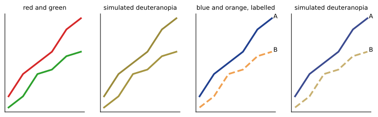
Color vision deficiency, often called color blindness, most commonly affects the ability to distinguish reds and greens (protanopia, deuteranopia and their milder forms), and less commonly blues and yellows (tritanopia). Graphics that rely on red and green to mean good and bad, or charts with red and green lines of similar lightness, can be unreadable for these viewers. Strategies include never using color as the only way to convey information; adding labels, icons, patterns or position cues; choosing palettes with differences in lightness as well as hue; using color-blind-safe palettes such as blue and orange combinations; and checking graphics with color vision simulators available in design tools and browsers.
Alt text and image descriptions
Alt text (alternative text) is a written description of an image read aloud by screen readers for blind and low-vision users, and shown when images fail to load. Most major platforms, including Instagram, Facebook, X, LinkedIn and Bluesky, allow creators to add custom alt text to images; some generate automatic alt text, which is often vague or inaccurate. Good alt text describes what matters about the image in context, concisely, usually in one or two sentences: the subject, action, setting and any text in the image. It does not begin with "image of", since screen readers already announce an image, and it does not include hashtags or keyword stuffing. For complex graphics such as infographics and charts, summarize the key message in the alt text and provide full details in the caption or a linked text version.
Worked problem
Writing alt text for a carousel slide
A slide shows a bar chart titled "Average weekly screen time by age" with bars for 18–24 (28 h), 25–34 (24 h), 35–54 (19 h) and 55+ (14 h), on a navy background with the creator's logo. What alt text would work?
Show solution
- Identify the purpose: show that screen time falls with age.
- Include the title and the key data, since the image contains text.
- Omit decorative details such as the background color and logo unless relevant.
- Alt text: "Bar chart: average weekly screen time by age. 18–24: 28 hours; 25–34: 24; 35–54: 19; 55 and over: 14. Screen time falls steadily with age."
Answer: A concise description giving the chart title, the four values and the conclusion, without decorative details.
Text in images
Text that is part of an image cannot be read by screen readers, cannot be enlarged with system text settings, cannot be translated automatically and is not indexed by search. Wherever possible, repeat the important text of a graphic in the caption or alt text. Keep text in images short and essential, using platform text features (such as post captions or story text tools, which some screen readers can read) for longer content. For quote graphics, include the quote and attribution in the caption. For carousels that are mostly text, consider whether a text post, thread or document with selectable text would serve some viewers better.
Captions and audio
Video graphics and animated posts often include speech or sound. Captions make audio content accessible to deaf and hard-of-hearing viewers and to anyone watching without sound. Burned-in captions should be large, high-contrast, placed in safe areas and timed for reading; platform captions, which viewers can turn on or off and which screen readers and search can use, should be enabled and checked for accuracy (CRE-210 covers caption styles). Audio descriptions, narration describing important visual information, help blind viewers understand content that relies on visuals; creators can build description into their narration by describing what they show.
Motion and flashing
As Lesson 10 explained, motion can harm some viewers. Avoid content that flashes more than three times per second, avoid large-scale rapid movement and spinning, keep text still while it is being read, and avoid autoplaying animations that cannot be paused on your own website. Warn viewers before content that includes unavoidable flashing, such as concert footage with strobe lights.
Cognitive accessibility
Cognitive accessibility helps people with learning disabilities, attention differences, memory difficulties, brain injuries, dementia and those reading in a second language, and it benefits everyone who is busy or tired. Principles include using plain language and short sentences (CRE-120 covers plain language writing); presenting one idea at a time; using consistent layouts and navigation across a series; using familiar icons with text labels; avoiding dense text and jargon; providing clear step numbers and progress indicators; and avoiding unnecessary time pressure such as countdowns that disappear quickly.
Inclusive representation
Inclusive design also concerns who appears in graphics and how. Audiences notice when images, illustrations and stock photos represent only a narrow range of people. Inclusive practice includes representing diverse ages, body types, skin tones, genders, abilities, cultures and family structures where people appear; avoiding stereotypes, such as showing only men as experts or only women in caregiving roles; depicting disabled people as full participants rather than objects of pity or inspiration; using respectful, current language for identities and asking people how they wish to be described; and checking that illustration styles render a range of skin tones well. Representation should be genuine and not tokenistic: it should reflect your actual community and the people you collaborate with.
The legal context
Accessibility laws apply to some organizations and contexts, and their requirements can affect creators who work with businesses, governments and institutions.
In the United States, the Americans with Disabilities Act (ADA) prohibits discrimination on the basis of disability, and courts and the Department of Justice have applied it to websites and digital content of businesses open to the public, leading to many lawsuits over inaccessible websites. A 2024 Department of Justice rule requires state and local government websites and mobile apps to meet WCAG 2.1 level AA, with compliance dates in 2026 and 2027 depending on the size of the government. Section 508 of the Rehabilitation Act requires federal agencies to make their information and communication technology accessible. Creators producing content for these organizations may be asked to meet WCAG standards, provide alt text and captions, and supply accessible documents.
Even where the law does not apply directly to an individual creator's social posts, the WCAG guidelines are the widely accepted benchmark, and following them is good practice.
Testing for accessibility
Practical tests include checking contrast with a contrast checker; viewing graphics with color vision simulators; turning on a screen reader (VoiceOver on Apple devices, TalkBack on Android) and listening to a post with its alt text and caption; increasing system text size; watching videos with sound off; viewing in bright light and on a dim screen; and asking disabled members of your community for feedback, compensating them where appropriate for their time and expertise. A short accessibility checklist attached to your templates makes these checks routine.
Plain language on graphics
Graphic text should be short, but short is not always clear. Abbreviations, jargon, puns and clever wordplay can confuse viewers reading quickly, those reading in a second language and people with cognitive differences. Prefer common words, active verbs and concrete numbers. Write dates and times unambiguously, for example "Oct 24, 7 p.m. ET" rather than "24/10 19:00". Avoid using all capitals for long phrases, which some readers with dyslexia find harder to read, and avoid justified text, which creates uneven spacing. Test wording by asking someone unfamiliar with the topic what the graphic means.
Worked problem
Fixing an inaccessible quote graphic
A quote graphic uses light gray script text (#B0B0B0) on a white background, 28 pixels tall on a 1080 px canvas, with no caption text. What should change?
Show solution
- Contrast: light gray on white is about 2.1:1, failing AA; use dark text such as #222222, about 16:1.
- Typeface: replace the thin script with a sturdy serif or sans-serif.
- Size: increase to at least 48–60 pixels for a quote.
- Caption: repeat the full quote and attribution in the caption, and add alt text describing the graphic.
Answer: Use dark, sturdy, larger type with strong contrast, and repeat the quote in the caption and alt text.
Accessibility in sponsored and client work
When creating graphics for brands, governments or institutions, accessibility requirements may be part of the contract or the client's own policies. Ask clients about their accessibility standards, deliver alt text and caption files with graphics, provide contrast checks for brand color combinations, and offer accessible alternatives such as text versions of infographics. Some brand palettes fail contrast standards for text; suggest using the brand colors for shapes and backgrounds while keeping text in high-contrast neutrals.
Building accessibility into templates
The most efficient way to make accessibility routine is to build it into the design system: approved contrast pairs in the brand kit, minimum text sizes in templates, color-blind-safe chart palettes, caption styles with backing boxes, motion presets without flashing, and an alt text field or reminder in the publishing checklist. When the default choices are accessible, every graphic produced from the system starts accessible.
Accessibility as a habit
Accessibility becomes easy when it is part of every step rather than a final check: choose accessible palettes and typefaces when building the system, write alt text while writing the caption, caption videos while editing, and test with a screen reader occasionally. Audiences increasingly notice and appreciate creators who make their content accessible, and many disabled followers share accessible content within their communities.
Further resources
The W3C Web Accessibility Initiative publishes the WCAG guidelines and practical guidance on images, color and media; disability organizations and accessibility specialists offer training and audits. Following accessible creators and listening to disabled audiences provides practical insight into what helps most.
Common mistakes
MistakeLow-contrast brand text.
InsteadCheck and meet at least 4.5:1 for normal text.
MistakeRed and green as the only difference.
InsteadAdd lightness differences, labels and patterns.
MistakeLeaving alt text empty or automatic.
InsteadWrite concise, specific alt text.
MistakeImportant text only inside images.
InsteadRepeat it in captions or alt text.
MistakeTokenistic or stereotyped imagery.
InsteadRepresent your real community respectfully.
Summary and key terms
- About one in six people experience significant disability; accessibility helps everyone.
- Contrast, size and legible typefaces are the foundation.
- Do not rely on color alone; check with simulators.
- Write concise, specific alt text and describe complex graphics fully elsewhere.
- Repeat important image text in captions; caption all speech.
- Limit motion and flashing; design for cognitive accessibility.
- Represent people inclusively and know the relevant accessibility laws.
- Accessibility
- Design usable by people with disabilities.
- Inclusive design
- Design reflecting the diversity of users.
- WCAG
- Web Content Accessibility Guidelines.
- Color vision deficiency
- Reduced ability to distinguish certain colors.
- Deuteranopia
- Form of red-green color vision deficiency.
- Alt text
- Text description of an image for screen readers.
- Screen reader
- Software that reads screen content aloud.
- Audio description
- Narration describing visual information.
- Cognitive accessibility
- Design that reduces mental effort.
- Tokenism
- Superficial inclusion without genuine representation.
Practice problems
Work each problem on paper first, then reveal the answer to check.
How many people experience significant disability worldwide?
Show answer
About 1.3 billion, one in six.
AA contrast for large text?
Show answer
3:1.
Which colors are most commonly confused?
Show answer
Reds and greens.
Name two alternatives to color alone.
Show answer
Labels, icons, patterns, lightness differences.
Should alt text begin with "image of"?
Show answer
No.
How should complex infographics be described?
Show answer
Key message in alt text, full details in caption or text version.
Why repeat image text in captions?
Show answer
Screen readers, enlargement, translation and search cannot use it.
Name two cognitive accessibility principles.
Show answer
Plain language, one idea at a time, consistent layouts.
Which screen readers can you test with?
Show answer
VoiceOver and TalkBack.
What is tokenism?
Show answer
Superficial inclusion.
Lesson quiz · 5 questions
Score 60% or more to complete this lesson.
Create a free account to save your progress, take quizzes and earn a certificate.