
CRE-230 · Lesson 7 of 12 · 27 min
Thumbnails, covers and profile assets
Thumbnails and covers are the most viewed graphics a creator makes. A YouTube thumbnail may be seen hundreds of thousands of times in recommendations and search results for every person who clicks; a Reels or TikTok cover appears on the profile grid and in search; a podcast cover appears in directory listings. CRE-211 covered thumbnails as part of packaging long-form video, including how titles and thumbnails work together and how to test them. This lesson focuses on the graphic design craft: the anatomy of an effective thumbnail, composition and readability at tiny sizes, faces and expressions, text, color and contrast, consistent styles, covers for vertical video, podcast and newsletter artwork, and profile assets such as avatars and banners.
Anatomy of an effective thumbnail
Most effective thumbnails combine a few elements:
- A clear subject: a face, an object, a scene or a result, large enough to recognize instantly.
- An idea or tension: something that creates curiosity or promises value, such as a before and after, a surprising object, an extreme result or a clear question.
- Optional text: two to five large words that add information the image cannot show, rather than repeating the title.
- Strong contrast and color: separating the subject from the background and standing out from surrounding thumbnails.
- Simplicity: usually no more than three main elements.
The best test of a thumbnail is whether its main idea can be understood when it is shown at about 160 to 250 pixels wide, the size it often appears in mobile recommendations, alongside competing thumbnails.
Composition at tiny sizes
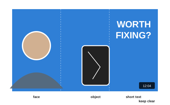
Thumbnails are composed for small sizes. Use large shapes and avoid fine detail; fill the frame with the subject rather than showing it small in a wide scene; place the main elements in different thirds of the frame so they do not overlap; keep the lower right corner clear, where YouTube displays the video length; and avoid placing text or faces at the very edges, where cropping or rounded corners may cut them. Depth helps: a foreground subject, a midground object and a simple background create separation. A blurred or simplified background makes the subject pop. Many successful thumbnails look almost like simple posters, with one or two shapes that read from across a room.
Faces and expressions
Faces attract attention and convey emotion quickly. In thumbnails, faces are usually shown large, often from the shoulders up, with expressions that match the video's emotional promise: curiosity, excitement, concern, delight, focus. Lighting the face well during filming, or shooting dedicated thumbnail photos, gives much better results than grabbing a frame from the video. Eyes should be visible and sharp. Gaze can direct attention toward the object or text (Lesson 3). Exaggerated expressions became a cliché in some niches; authentic, specific expressions that fit the content are more trustworthy and age better. Not every channel needs faces: product, tutorial, gaming and documentary channels often succeed with strong objects, results or scenes.
Text in thumbnails and covers
Text in thumbnails should be short, large and complementary to the title. If the title says "I tested 5 budget headphones", the thumbnail text might say "$20 vs $300" rather than repeating the title. Use a bold, condensed or heavy sans-serif; make text at least about 15 to 20 % of the thumbnail's height; limit it to one or two lines; add contrast with outlines, shadows or solid shapes; and place it where it does not cover the face or main object. Avoid small text entirely; if it cannot be read at 200 pixels wide, remove it. Text should be accurate: exaggerated claims that the video does not support damage trust.
Worked problem
Sizing thumbnail text
A 1280 × 720 thumbnail uses a two-word phrase. The designer wants the text to remain readable when the thumbnail is displayed 200 pixels wide. If the cap height is 140 pixels in the original, how tall will it appear at display size?
Show solution
- Scale factor: 200 ÷ 1280 ≈ 0.156.
- Displayed cap height: 140 × 0.156 ≈ 22 pixels.
- At about 22 pixels on a high-density phone screen, bold text is readable; text with a 50-pixel cap height would appear only about 8 pixels tall and be hard to read.
Answer: About 22 pixels, readable for short bold words; much smaller text would disappear.
Color and contrast in thumbnails
Thumbnails compete with others on the same page, so contrast with the platform's interface and surrounding content matters. Bright, saturated colors, and complementary combinations such as blue and orange or purple and yellow, stand out; but if every thumbnail in a niche uses red and yellow, a calmer or unexpected palette may stand out more. Separate the subject from the background with differences in brightness and saturation, rim light in the photo, or an outline. Check thumbnails in both light and dark mode, since YouTube and other platforms display them against white or near-black backgrounds. Avoid excessive saturation that makes skin tones look unnatural.
A consistent thumbnail style
Channels with a recognizable thumbnail style let returning viewers spot their videos instantly. Consistency can come from a signature color, a recurring layout, a typeface, a border, a logo placement or the presence of the creator's face in a particular position. Templates (Lesson 9) make consistency efficient. But too rigid a template can make every video look the same and hide what is new about each one; the idea and subject should vary even when the style is consistent. Series often have their own variation of the style, such as a colored band or an episode number.
Covers for vertical video
Reels, TikTok and Shorts covers appear on profile grids, in search results and sometimes in feeds. Platforms crop covers differently in different places: a 9:16 cover may appear as 3:4 or 1:1 on a profile grid. Design covers with the key content, a face and a short title, in the center of the frame, so that it survives these crops. A consistent cover style makes a profile look organized and helps visitors find topics quickly, which matters for creators whose profiles serve as libraries of content, such as recipes, tutorials and tips. Some platforms allow uploading a custom cover image, while others require choosing a frame from the video, in which case planning a strong frame, such as a held title card at the start, helps.
Podcast and newsletter artwork
Podcast cover art appears in directories such as Apple Podcasts and Spotify at sizes from large to tiny. Apple Podcasts requires square artwork between 1400 × 1400 and 3000 × 3000 pixels in the RGB color space, and recommends designs that remain clear at small sizes. Effective podcast covers use a bold title, a simple image or illustration, and minimal text; avoid small subtitles, long host lists and fine detail. Episode artwork, where supported, can add variety. Newsletter headers and social preview images (the image shown when a link is shared, set with Open Graph tags) should also be designed deliberately, typically at about 1200 × 630 pixels.
| Asset | Typical size and shape | Key considerations |
|---|---|---|
| YouTube thumbnail | 1280 × 720, 16:9 | Clear duration corner, readable at 200 px |
| Reels/TikTok/Shorts cover | 1080 × 1920, 9:16 | Center key content for grid crops |
| Podcast cover | 1400–3000 px square | Bold title, legible at tiny sizes |
| Link preview (Open Graph) | About 1200 × 630 | Readable title, brand colors |
| Profile picture | Square upload, displayed as a circle | Face or simple logo, centered |
| YouTube banner | 2560 × 1440, safe area 1546 × 423 | Key text inside central safe area |
Profile assets
Profile pictures and banners shape first impressions. Profile pictures display as small circles across platforms, so they should feature a clear face, cropped from about the shoulders up and centered, or a simple logo mark with enough padding to survive circular cropping; complex logos and full-body photos become unreadable. Using the same profile image across platforms builds recognition. Banners and headers, such as YouTube channel art, X headers and LinkedIn backgrounds, display at very different sizes on phones, desktops and televisions; YouTube shows only the central safe area on phones, so keep the channel name, tagline and schedule there. Update banners for major launches, and keep them consistent with the brand kit.
Testing and iterating
Thumbnails and covers are among the easiest graphics to test. YouTube's Test and Compare feature runs thumbnail variations against each other (CRE-211 explains how results are judged), and many creators also compare click-through rates for similar videos with different styles. Before publishing, compare draft thumbnails side by side with competitors' thumbnails in a mock search results page, at actual size; ask a few people which they would click and why. Keep a swipe file of effective thumbnails from your niche and beyond, analyzing why they work, but do not copy them.
Thumbnail styles by content type
Different content types call for different thumbnail approaches. Tutorials and how-to videos often show the result or the key tool large, with a few words naming the outcome. Reviews and comparisons show the products side by side, sometimes with a verdict symbol. Vlogs and personal stories rely on expressive faces and a striking moment from the video. Educational and explainer content may use a simple diagram, a bold question or a surprising image. Entertainment and challenges emphasize stakes, scale or reactions. Podcasts and interviews often show the guest and host with a compelling quote. Studying the most successful thumbnails in each format in your niche, and noting their common patterns and the gaps they leave, helps you design thumbnails that fit expectations while standing out.
Designing a thumbnail series
Series benefit from a shared visual signature that makes each episode recognizable as part of the set: a colored band with the series name, a consistent position for the episode number, a recurring background or a frame. At the same time, each thumbnail should communicate what is unique about that episode. Designing the series template first, then producing each thumbnail from it, saves time. On channel pages and playlists, where thumbnails appear together, a consistent series style looks organized and encourages binge watching.
Producing thumbnail photos efficiently
Dedicated thumbnail photography takes only a few minutes per video if planned. Set up a simple backdrop and light near your filming area, keep a short list of expressions and poses that suit your content, and take a burst of photos at the start or end of each filming session, including holding key objects. Shoot with space around yourself for cut-outs and text, at high resolution. Some creators shoot a batch of generic expression photos every few months to use across many thumbnails, supplemented by video-specific shots with props.
Worked problem
Comparing two thumbnail options
A creator tests two thumbnails for a video. Option A, a face with three words, gets 4.2 % click-through rate on 50,000 impressions; option B, an object with no face, gets 5.1 % on 48,000 impressions, but its viewers watch 20 % less of the video on average. Which performed better overall?
Show solution
- Clicks: A = 0.042 × 50,000 = 2,100; B = 0.051 × 48,000 ≈ 2,448.
- If average view duration for A is 6 minutes, total watch time A ≈ 2,100 × 6 = 12,600 minutes.
- B's viewers watch 20 % less, 4.8 minutes: total ≈ 2,448 × 4.8 ≈ 11,750 minutes.
- A produced more total watch time despite fewer clicks, which suggests B may overpromise or attract less interested viewers.
Answer: Option A produced more total watch time, so it performed better overall despite a lower click-through rate.
Thumbnails and accessibility
Thumbnails cannot carry alt text on most video platforms, so the title and description must convey the content. Avoid relying on thumbnail text alone for important information, and ensure titles describe the video accurately.
Common mistakes
MistakeRepeating the title in thumbnail text.
InsteadUse text that adds information.
MistakeSmall or crowded elements.
InsteadUse two or three large elements readable at 200 px.
MistakeCovering the duration corner.
InsteadKeep the lower right clear.
MistakeGrabbing blurry video frames for thumbnails.
InsteadShoot dedicated, well-lit thumbnail photos.
MistakeComplex logos as profile pictures.
InsteadUse a clear face or simple mark centered for circular crops.
Summary and key terms
- Thumbnails need a clear subject, an idea, optional short text, contrast and simplicity.
- Compose for tiny sizes with large shapes and a clear duration corner.
- Faces and genuine expressions attract attention; objects work too.
- Text should be short, large and complementary to the title.
- Consistent styles build recognition without hiding what is new.
- Design vertical covers and podcast art to survive crops and small sizes.
- Profile pictures and banners need centered, simple content in safe areas.
- Thumbnail
- Small preview image for a video.
- Cover
- Image representing a vertical video or podcast.
- Duration label
- Video length shown on a thumbnail corner.
- Swipe file
- Collection of reference examples.
- Open Graph image
- Preview image shown when a link is shared.
- Profile picture
- Small image identifying an account.
- Channel banner
- Header image on a channel page.
- Safe area
- Region visible on all devices.
- Rim light
- Light outlining a subject's edges.
- Test and Compare
- YouTube feature for testing thumbnails.
Practice problems
Work each problem on paper first, then reveal the answer to check.
Name the elements of a strong thumbnail.
Show answer
Clear subject, idea or tension, short text, contrast, simplicity.
At what size should thumbnails be tested?
Show answer
About 160–250 px wide.
Which corner should be kept clear on YouTube?
Show answer
The lower right.
Why shoot dedicated thumbnail photos?
Show answer
Better light, focus and expression than video frames.
Displayed size of 160 px text at 1280 → 200 px?
Show answer
About 25 px.
Why check thumbnails in dark mode?
Show answer
They appear against near-black backgrounds.
How should vertical covers handle grid crops?
Show answer
Center key content.
Apple Podcasts artwork size range?
Show answer
1400–3000 px square.
Typical Open Graph image size?
Show answer
About 1200 × 630 px.
What should profile pictures feature?
Show answer
A clear face or simple mark, centered.
Lesson quiz · 5 questions
Score 60% or more to complete this lesson.
Create a free account to save your progress, take quizzes and earn a certificate.