
PHOT-202 · Lesson 4 of 12 · 27 min
Color adjustments and black and white
Color shapes how viewers feel about a photograph. Warm tones suggest comfort, nostalgia or heat; cool tones suggest calm, distance or cold; saturated color feels energetic; muted color feels quiet or melancholy. Raw processors offer precise tools to correct color casts, refine individual hues, create color grades and convert to black and white. This lesson covers vibrance and saturation, HSL and color mixer tools, color grading, calibration and custom profiles, skin tones, color harmony and consistency across a series, and black-and-white conversion.
Vibrance and saturation
Saturation increases or decreases the intensity of all colors equally. Even modest increases can push already strong colors, such as red flowers, blue skies or orange skin, into clipping, where detail and gradation are lost and colors look garish. Vibrance increases the intensity of muted colors more than already saturated ones, and in most software protects skin tones, making it a safer general control. Reducing saturation slightly can create a subtle, refined look; reducing vibrance strongly desaturates muted colors while keeping strong ones, an effect some photographers use creatively. Watch the RGB histogram and clipping warnings when adding saturation, since single-channel clipping often appears first.
HSL and color mixer
HSL tools, also called the color mixer, adjust individual color ranges independently:
- Hue shifts a color toward its neighbors: making greens more yellow or more blue, oranges more red or more yellow, blues more cyan or more purple.
- Saturation increases or decreases the intensity of a color range.
- Luminance brightens or darkens a color range.
HSL is the main tool for fine color work. Common adjustments include shifting greens toward yellow or blue to make foliage look natural or stylized; darkening blue luminance to deepen skies; brightening orange luminance to brighten skin; reducing saturation in distracting colors, such as a bright red sign in the background; and harmonizing colors by shifting them toward a shared palette. Targeted adjustment tools let you click and drag directly on an area of the image to adjust the colors under the cursor. Because color ranges overlap, large adjustments can create unnatural transitions or banding at the boundaries between colors, particularly in skies and skin; small adjustments are usually better.
| Goal | HSL adjustment |
|---|---|
| Deeper blue sky | Lower blue luminance, slightly raise blue saturation |
| Brighter, cleaner skin | Raise orange luminance, slightly lower orange saturation |
| Less yellow foliage | Shift green and yellow hue toward blue-green |
| Calmer background | Lower saturation of distracting colors |
| Warmer autumn colors | Shift yellows toward orange, raise orange saturation |
Color grading
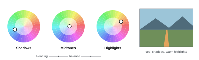
Color grading, called split toning in older software, adds color to the shadows, midtones and highlights separately. Each range has a color wheel to choose a hue and saturation, plus controls for balance, which shifts the boundary between shadows and highlights, and blending, which controls how smoothly the ranges overlap. A popular approach is complementary grading: warm highlights and cool shadows, echoing the orange and teal look of many films, which separates skin tones from backgrounds. Others include warm overall grades for nostalgia, cool grades for melancholy, and subtle tints in black-and-white images. Color grading is most effective when subtle; heavy grades can make skin unnatural and date quickly as fashions change. Channel curves, adjusting the red, green and blue tone curves separately, offer even finer control, such as adding blue to the shadows while removing it from the highlights.
Calibration and custom profiles
Calibration controls in some raw processors adjust how the camera's primary colors are interpreted, shifting the hue and saturation of the underlying red, green and blue primaries. Because every color is built from these primaries, calibration adjustments affect the whole image in a coherent way, and they are used by some photographers to create signature color looks or to correct a camera's color rendering. For accurate color, such as product photography, art reproduction and scientific work, custom camera profiles are the best tool. The photographer photographs a color chart, such as a Calibrite ColorChecker, under the shooting light, and profiling software compares the recorded colors with the chart's known values to create a profile that corrects the camera's response under that light. Applying the profile to images shot under the same light produces color that closely matches the original.
Worked problem
Accurate color for a clothing catalog
A photographer shoots a clothing catalog in a studio with LED lights. The client complains that a teal sweater looks bluer in the images than in reality. How should the photographer fix the color?
Show solution
- Photograph a color chart under the same lights at the start of the shoot (and repeat if lighting changes).
- Create a custom camera profile from the chart with profiling software.
- Apply the profile and set white balance from the chart's neutral patch for all images under that light.
- Compare the sweater with the physical garment on a calibrated monitor under suitable viewing light, and make a small HSL hue adjustment to the teal range if needed.
Answer: Use a custom profile built from a color chart under the shooting light, set white balance from the chart, and fine-tune with HSL while comparing with the garment.
Skin tones
Skin is the color viewers judge most critically. Natural skin tones across all ethnicities share a similar hue, roughly between red and yellow, differing mainly in brightness and saturation. Common problems include magenta or red casts, often from flash or warm light; green or yellow casts, from fluorescent light, foliage reflections or some LEDs; uneven color between face, neck and hands; and excessive saturation that makes skin look orange or sunburnt. Corrections include setting white balance carefully; using the orange, red and yellow HSL controls to adjust hue, saturation and luminance; using local adjustments to even out redness in specific areas; and checking skin on a vectorscope or with color sampler readings in RGB, where well-balanced skin typically shows red highest, green in the middle and blue lowest. Respect the natural diversity of skin tones: avoid lightening or homogenizing skin in ways that misrepresent people.
Color harmony and consistency
Strong color in photographs often comes from harmony: a limited, coherent palette rather than every color at full intensity. Analogous harmonies use neighboring hues, such as greens and blues, for calm; complementary harmonies use opposites, such as orange and blue, for contrast and energy; monochromatic schemes use variations of one hue. In editing, you can reinforce harmony by reducing the saturation of colors that clash, shifting hues toward the palette, and using color grading to unify tones. For a series, a feed, an album or a book, consistency matters as much as the individual image: similar white balance, saturation, contrast and grading across images make the work feel cohesive. Editing images in a grid view, side by side, helps judge consistency.
Black-and-white conversion
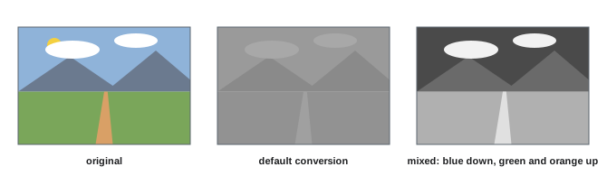
Black-and-white photography emphasizes tone, shape, texture and light. Converting a color raw file to black and white offers more control than shooting in a monochrome mode, because you can choose how each color translates into gray. The black-and-white mixer adjusts the brightness of each color range in the monochrome result: darkening blues deepens skies and makes clouds stand out, like a red filter in film photography; brightening greens lightens foliage, like a green filter; brightening oranges lightens skin and reduces blemishes. Strong tonal separation between subject and background is essential, since colors that contrast strongly can become similar grays. After conversion, adjust contrast, curves, local dodging and burning, and grain to taste. Toning, adding a subtle warm or cool tint to the black-and-white image through color grading, can evoke traditional darkroom toners such as sepia or selenium.
When to choose black and white
Black and white suits images where color distracts from the subject, form or emotion; where color is unattractive or inconsistent, such as mixed lighting at events; where the subject has strong shapes, textures or contrasts; and where a timeless or documentary feeling is desired. It does not rescue weak images, and converting simply because color editing is difficult often produces flat, gray results. Many photographers decide during shooting whether an image is conceived in color or black and white, and setting the camera to a monochrome picture style while shooting raw shows a black-and-white preview while preserving the color data.
Point color and targeted color adjustments
Some raw processors offer point color tools, which sample a specific color from the image and adjust its hue, saturation and luminance within a defined range, more precisely than HSL sliders. Point color is useful for correcting a single product color to match a reference, adjusting skin tones without affecting similar colors in the background, or making a specific color pop. Range controls determine how much nearby colors are included, and a visualization view shows which areas are affected. Capture One's color editor offers similar precision, with the ability to select color ranges directly on the image and save them for reuse, and is widely used for skin tone uniformity in commercial portrait and fashion work.
Working with skin tone uniformity
Skin often varies in color across a face and body: redder cheeks and nose, yellower forehead, different color on hands and neck. Uniformity tools, such as Capture One's skin tone tool or targeted HSL and point color adjustments in Lightroom, pull the range of skin hues and saturations closer together, producing more even, flattering skin without affecting texture. Used subtly, they reduce redness and blotchiness; overused, they make skin look painted. Combined with local masks for face skin, these tools achieve much of what once required detailed Photoshop work.
Worked problem
Matching a series for an album
A wedding photographer edits 400 images from a day that moved from a warm church interior to an overcast park and a reception lit by tungsten and LED lights. How can color be made consistent across the album?
Show solution
- Group images by lighting situation: church, park and reception.
- Edit one representative image in each group, setting white balance on skin and neutral elements, and adjusting HSL for consistent skin tones.
- Sync settings within each group, then adjust exposure and white balance where individual images differ.
- Compare images from all groups side by side in a grid, adjusting each group so skin tones and overall warmth feel related.
- Apply a subtle, shared color grade across all images to unify the album.
Answer: Edit by lighting group, sync within groups, compare across groups for consistent skin, and unify with a gentle shared grade.
Color and culture
Color meanings vary between cultures and contexts: white signifies purity and weddings in many Western cultures but mourning in some East Asian traditions; red signifies luck and celebration in China, danger or passion elsewhere. Brands have specific colors that must be reproduced exactly. When editing for clients and audiences from different backgrounds, consider how color choices will be read, and respect the importance of colors in clothing, ceremonies and products to the people photographed.
Monochrome profiles and infrared
Some raw processors include monochrome camera profiles that emulate classic black-and-white films, with characteristic contrast curves and tonal responses, as starting points for conversion. Infrared photography, made with converted cameras or infrared filters, produces images with glowing foliage and dark skies; processing typically involves a custom white balance, channel swapping in Photoshop to create false-color looks, and black-and-white conversion. These specialized techniques reward experimentation and show how flexible the raw processor can be.
Common mistakes
MistakeBoosting global saturation heavily.
InsteadUse vibrance and targeted HSL adjustments.
MistakeLarge HSL moves that cause banding.
InsteadMake small adjustments and check transitions.
MistakeHeavy orange and teal grades on every image.
InsteadGrade subtly to suit each subject.
MistakeLightening or homogenizing skin tones.
InsteadCorrect casts while respecting natural skin diversity.
MistakeConverting to black and white without tonal separation.
InsteadUse the mixer, curves and local adjustments.
Summary and key terms
- Vibrance boosts muted colors safely; saturation affects all colors equally.
- HSL tools adjust hue, saturation and luminance of color ranges.
- Color grading tints shadows, midtones and highlights separately.
- Custom profiles from color charts give accurate color.
- Skin tones share a hue range and need careful, respectful correction.
- Color harmony and consistency strengthen individual images and series.
- Black-and-white conversion uses the mixer to control tonal separation.
- Saturation
- Intensity of colors.
- Vibrance
- Saturation control favoring muted colors.
- HSL
- Hue, saturation and luminance per color range.
- Color grading
- Tinting shadows, midtones and highlights.
- Split toning
- Older term for tinting shadows and highlights.
- Calibration panel
- Controls adjusting primary color interpretation.
- Color chart
- Target with known color patches.
- Custom profile
- Camera profile built from a chart.
- Black-and-white mixer
- Controls for converting colors to grays.
- Toning
- Adding a tint to a black-and-white image.
Practice problems
Work each problem on paper first, then reveal the answer to check.
Why is vibrance safer than saturation?
Show answer
It favors muted colors and protects skin.
What do the three HSL controls do?
Show answer
Shift hue, change intensity, change brightness of a color range.
How do you deepen a blue sky with HSL?
Show answer
Lower blue luminance.
What is complementary grading?
Show answer
Warm highlights with cool shadows, for example.
How is a custom profile made?
Show answer
From a color chart photographed under the shooting light.
Typical RGB order in balanced skin?
Show answer
Red highest, green middle, blue lowest.
Name two color harmonies.
Show answer
Analogous, complementary, monochromatic.
How do you darken a sky in black and white?
Show answer
Lower blue in the black-and-white mixer.
What does brightening orange do in black and white?
Show answer
Lightens skin.
When does black and white suit an image?
Show answer
When color distracts or form, texture and emotion dominate.
Lesson quiz · 5 questions
Score 60% or more to complete this lesson.
Create a free account to save your progress, take quizzes and earn a certificate.