
PHOT-301 · Lesson 5 of 12 · 25 min
Viewing conditions and standards
A print has no color of its own until light falls on it. The same print looks warm under tungsten bulbs, cool under north daylight, flat in dim light and vivid in bright light, and its surroundings change how we perceive its tones. A calibrated monitor and an accurate printer profile are wasted if prints are judged under uncontrolled light. Professional color work therefore relies on standardized viewing conditions. This lesson covers why viewing conditions matter, the CIE illuminants D50 and D65, the ISO 3664 viewing standard, viewing booths and their use, color rendering quality of light sources, optical brightening agents and UV content, comparing screen and print, viewing light for exhibitions and clients, and practical arrangements for small studios.
Why viewing conditions matter
Lesson 1 described how a print's appearance depends on the light source spectrum, its intensity and the surroundings. Changing the light changes the reflected spectrum, which changes the color and can break metameric matches. Changing intensity changes perceived contrast and colorfulness. Changing the surroundings changes apparent lightness and color through simultaneous contrast. When photographers, labs, clients and printers judge prints under different conditions, they reach different conclusions about the same print. Standard viewing conditions give everyone a common reference, so that a decision made in one place holds in another.
Standard illuminants: D50 and D65
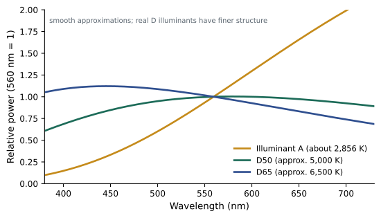
The CIE defines standard illuminants as mathematical spectral power distributions representing typical light sources. Illuminant A represents incandescent tungsten light at about 2,856 K. The D-series illuminants represent phases of daylight: D50, with a correlated color temperature of about 5,000 K, is slightly warm horizon daylight; D65, at about 6,500 K, is average north-sky daylight. The graphic arts and photography industries standardized on D50 for evaluating prints and proofs, while television, video and computing standardized on D65 for displays. This split is why ICC color management uses D50 in the profile connection space, while monitors are usually calibrated to D65, with chromatic adaptation linking the two.
The ISO 3664 standard
ISO 3664 specifies viewing conditions for graphic technology and photography. Its key conditions for critical comparison of prints, known as condition P1, include an illuminant simulating D50, an illuminance of 2,000 lux (plus or minus 500 lux) on the print, a high color rendering quality with a specified ultraviolet content, neutral matte gray surroundings of about 60 % reflectance or less, and uniformity of illumination across the viewing surface. A second condition, P2, at 500 lux (plus or minus 125 lux), is intended for practical appraisal of prints under conditions closer to typical display. ISO 3664 also specifies conditions for viewing transparencies and displays. The 2009 revision added requirements for ultraviolet content, so that papers with optical brighteners look as they would in daylight. Other standards, such as ISO 12646 for displays used in soft proofing, complement it.
| Condition | Illuminant | Illuminance | Purpose |
|---|---|---|---|
| ISO 3664 P1 | D50 simulator | 2,000 ± 500 lux | Critical comparison of prints and proofs |
| ISO 3664 P2 | D50 simulator | 500 ± 125 lux | Practical appraisal, closer to display |
| Typical home | Warm LEDs or mixed | 50–300 lux | Real-world viewing |
| Typical gallery | Halogen or LED spots, 2,700–4,000 K | 100–300 lux (often lower for sensitive works) | Exhibition |
Viewing booths
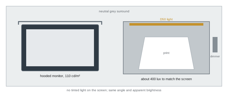
A viewing booth, or light booth, is an enclosure with neutral gray interior surfaces and controlled lighting, often with several selectable light sources such as D50, D65, illuminant A and shop lighting, for checking metamerism. Booths from companies such as GTI, Just Normlicht and others are designed to meet ISO 3664. For photographers, a booth beside the monitor allows direct comparison between a print and its image on screen. Many booths include dimmers so that the light on the print can be adjusted to match the monitor's brightness, which is important because a print under 2,000 lux will look far brighter than a monitor set to 110 cd/m². In practice, many fine art printers dim the booth to roughly match screen brightness for comparisons, and then check the print under the intended display lighting.
Worked problem
Matching a booth to the monitor
A monitor is calibrated to 110 cd/m². A print on paper with 88 % reflectance is placed in a dimmable booth. What illuminance on the print gives a similar paper-white luminance?
Show solution
- Rearrange \(L \approx E \rho / \pi\) to \(E \approx \pi L / \rho\).
- \(E \approx 3.14 \times 110 / 0.88 \approx 393\) lux.
- Set the booth to about 400 lux for side-by-side comparison.
- Then also check the print at the brightness of its intended display location.
Answer: About 400 lux on the print gives a paper white similar to a 110 cd/m² screen.
Color rendering quality of light sources
Not every lamp labeled 5,000 K renders colors like D50. Correlated color temperature describes only the color of the light itself, not how faithfully it renders surface colors. Two lamps with the same color temperature can have very different spectra, one smooth and continuous, the other spiky, and they will render prints differently. Color rendering metrics include the color rendering index (CRI or Ra) with special indices such as R9 for saturated red; the IES TM-30 fidelity (Rf) and gamut (Rg) indices; and the CIE metamerism index, used in ISO 3664 to describe how closely a simulator matches the true D50 spectrum. For print evaluation, look for D50 sources with CRI or Rf of 95 or more, high R9 and a good metamerism index. High-quality LED sources have largely replaced fluorescent tubes in modern booths.
Optical brightening agents and ultraviolet light
Many papers contain optical brightening agents (OBAs), fluorescent compounds that absorb invisible ultraviolet light and re-emit it as visible blue light, making paper look whiter and brighter. Their effect depends on the UV content of the light: under daylight with plenty of UV, OBA papers look bright and slightly blue-white; under UV-free LED or museum lighting, they look warmer and duller. This makes their appearance less predictable, and OBAs gradually lose their effect over time and with light exposure, so prints may slowly appear to yellow even if the paper base itself is stable. Measurement standards address this with conditions M0 (undefined UV, typical of older instruments), M1 (UV content matching D50, as ISO 3664 requires), M2 (UV excluded) and M3 (polarized). Profiling papers with OBAs works best when the measurement condition matches the viewing condition. Many fine art papers are made without OBAs for these reasons (Lesson 10).
Comparing screen and print
A print will never look exactly like the screen, because one emits light and the other reflects it. The goal is a convincing match in color, tone and mood. Good practice includes: calibrating the monitor so that its white luminance and color approximate paper under the booth; soft proofing to simulate the paper's white and black (Lesson 8); placing the print in the booth beside the monitor, at a similar angle and apparent brightness; comparing neutrals and skin tones first, then saturated colors and shadows; and allowing the eyes to adapt for a minute when moving between screen and print. Discrepancies found this way can then be traced to profiles, settings or edits.
Light for exhibitions, clients and homes
Prints are rarely seen under D50. Galleries typically use track lighting with halogen or LED spotlights of about 2,700 to 4,000 K at 100 to 300 lux, and museums restrict light on sensitive works to 50 lux or less. Homes and offices use warm LEDs and mixed daylight. A print optimized under bright D50 may look dark and warm in such conditions. Strategies include evaluating test prints under the actual display lighting before printing an edition; asking clients where prints will hang; lightening prints slightly for dim display locations, a common adjustment; choosing papers whose white looks good under warm light; and recommending suitable lighting to clients and galleries, such as high-CRI LEDs at 3,000 to 4,000 K aimed to avoid glare. Some printers make separate versions for different lighting conditions.
Practical arrangements for small studios
Not every photographer can afford a full ISO 3664 booth. Practical alternatives include a high-quality D50 LED lamp with CRI or Rf of 95 or more and good R9, mounted on an adjustable arm and dimmable, used in a corner of the room with neutral surroundings; a portable viewing light designed for print evaluation; or a simple viewing station made with neutral gray card and a high-CRI daylight lamp. Whatever the setup, keep it consistent, avoid colored walls and windows behind the viewing area, block direct daylight, which varies constantly, and always view prints and screen under the same arrangement. Consistency is more valuable than perfection: a stable, known viewing condition lets you learn how your prints will look elsewhere.
The surround and the room
Standards for viewing also address the surroundings. Walls and surfaces near the viewing area should be neutral gray, ideally around Munsell N7 or similar mid-gray, so that colored surfaces do not reflect onto prints or influence adaptation. Bright colored clothing can also reflect color onto prints viewed closely, which is why some color professionals wear neutral colors at work. Windows should be covered or the viewing area positioned away from them, because daylight changes in color and intensity throughout the day and with weather, making judgments inconsistent. The monitor area itself should be lit dimly and evenly, with no light falling directly on the screen.
Viewing transparencies and backlit displays
Transparencies and backlit prints are viewed on light tables or lightboxes rather than under reflected light. ISO 3664 specifies conditions for transparency viewing, with D50 illumination at a much higher luminance and masking to prevent glare from surrounding light. Photographers digitizing film or producing backlit displays, such as duratrans prints for exhibitions and retail, should evaluate them under suitable backlit conditions, which differ from print viewing.
Training your eye
Standards provide consistent conditions, but judgment develops with practice. Regularly compare prints with screens, view the same print under different lights, and keep a set of reference prints, such as a color chart print and a familiar portrait, to check your viewing conditions. Over time, you will learn how your prints shift in warm living rooms, cool offices and galleries, and you will make better choices about paper, brightness and color for each destination.
Viewing conditions for clients and approvals
When clients approve prints remotely, they view them under their own conditions, often uncontrolled. Agree in advance how approvals will work: send hard proofs evaluated under stated light, provide soft-proof images with a note about calibrated viewing, or invite clients to view prints in your studio under standard conditions. Documenting the viewing conditions used for approval protects both parties if questions arise later.
Light sources to avoid
Some common light sources make color judgment unreliable. Low-CRI fluorescent tubes and inexpensive LEDs can make skin look gray and greens unnatural. Colored or "warm" smart bulbs shift appearance strongly. Sodium and mercury lamps found in some industrial and outdoor settings have extremely narrow spectra. Mixed lighting, such as daylight combined with warm room lamps, gives different colors on different parts of a print. When no booth is available, choose a single high-quality source, avoid mixing, and always use the same arrangement so that your judgments are consistent from day to day.
A quick check of your viewing light
A simple check of a viewing light is to view a print of a color chart beside the same chart's known values on a calibrated screen, and to look at a neutral gray step wedge under the light. Grays should look neutral, without green or magenta tints, and saturated reds should look rich rather than dull. If the light fails these checks, replace it before trusting it for color decisions.
Common mistakes
MistakeJudging prints near a window or under mixed room light.
InsteadUse a consistent D50 viewing light.
MistakeComparing a brightly lit print with a dim screen.
InsteadDim the booth to match screen brightness for comparisons.
MistakeChoosing lamps by color temperature alone.
InsteadCheck CRI or TM-30, R9 and spectrum quality.
MistakeIgnoring optical brighteners under UV-free light.
InsteadExpect OBA papers to look warmer under LED lighting.
MistakeAssuming a booth-perfect print will look right in a dim home.
InsteadCheck prints under the intended display light.
Summary and key terms
- Print appearance depends on light spectrum, intensity and surroundings.
- D50 is the standard for prints; D65 for displays.
- ISO 3664 P1 specifies D50 at 2,000 lux for critical comparison; P2 is 500 lux.
- Viewing booths with dimmers allow screen and print comparison.
- Color rendering quality matters as much as color temperature.
- Optical brighteners respond to UV and change appearance with the light.
- Check prints under their intended display lighting.
- Standard illuminant
- CIE-defined spectral power distribution.
- D50
- Daylight illuminant of about 5,000 K used for prints.
- D65
- Daylight illuminant of about 6,500 K used for displays.
- ISO 3664
- Standard for viewing conditions in photography and graphic arts.
- Viewing booth
- Enclosure with standardized lighting for evaluating prints.
- Correlated color temperature
- Color of a light compared with a blackbody.
- TM-30
- IES method for evaluating color rendition.
- Optical brightening agent
- Fluorescent additive that makes paper look whiter.
- M1 measurement condition
- Measurement with UV content matching D50.
- Metamerism index
- Measure of how closely a source matches a standard illuminant.
Practice problems
Work each problem on paper first, then reveal the answer to check.
Which illuminant is standard for prints?
Show answer
D50.
Which illuminant is standard for displays?
Show answer
D65.
ISO 3664 P1 illuminance?
Show answer
2,000 ± 500 lux.
ISO 3664 P2 illuminance?
Show answer
500 ± 125 lux.
Illuminance to match 100 cd/m² on 90 % paper?
Show answer
About 350 lux.
Why is color temperature not enough?
Show answer
Spectra with the same CCT can render colors differently.
What do optical brighteners do?
Show answer
Convert UV to visible blue light.
What is measurement condition M2?
Show answer
UV excluded.
Typical gallery lighting?
Show answer
2,700–4,000 K at 100–300 lux.
What adjustment suits prints for dim homes?
Show answer
Slight lightening.
Lesson quiz · 5 questions
Score 60% or more to complete this lesson.
Create a free account to save your progress, take quizzes and earn a certificate.