
SLS-251 · Lesson 2 of 12 · 20 min
Store layouts
▶ Video coming soon A video version of this lesson is on the way.
At the second Tuesday merch walk, on October 6, Noura spread three printed floor plans across the sales desk before the store opened. One was Juniper & Pine's flagship as it is today. One was the plan of the store it replaced, a long, narrow building the company left in 2014. The third was a sketch Noura had drawn of a grocery store down the road. "Same people, same city, three completely different ways of moving them around," she said. "The layout decides which products a shopper even gets the chance to see."
A store layout is the arrangement of aisles, departments and fixtures on the sales floor. It sets the main paths shoppers will take, the sightlines they will have, and how much of the floor holds product rather than walkway. This lesson describes the common layout types, how retailers decide where each department goes, and the rules about exits and aisles that every layout must respect.
Four basic layouts
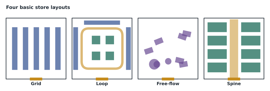
Most stores use one of four basic layouts, or a mix of them.
| Layout | Description | Where it works well | Drawbacks |
|---|---|---|---|
| Grid | Long parallel aisles of shelving, with cross aisles at the ends | Grocery, pharmacy, hardware: shoppers with lists who want to find items fast | Can feel monotonous; shoppers see only the aisle they are in; little room for display |
| Loop or racetrack | A main aisle circles the floor; departments open off it on both sides | Large-format stores such as furniture, department and home stores | Shoppers in a hurry can feel forced to walk the whole loop |
| Free-flow | Fixtures and displays placed in open, irregular groupings with no fixed aisles | Boutiques, fashion, gift stores where browsing is the point | Can confuse shoppers; uses floor space less efficiently; harder to keep accessible routes clear |
| Spine | One main aisle runs from front to back; departments branch off to each side | Medium-sized specialty stores | The back of each side department can be hard to see from the spine |
Juniper & Pine's flagship is a loop. A main aisle runs from the main entrance, turns right, carries shoppers past décor, living room furniture, dining and bedroom furniture, around the mattress gallery at the back right, past appliances at the back left and the clearance corner, and returns to the front past the sales desk. Inside the loop, room settings, called vignettes, are arranged in a looser, free-flow style, so shoppers can wander among sofas and dining tables as they would at home. The appliance department, where customers compare many similar models side by side, uses short grid-like rows.
The old store was a spine: one long aisle from the front door to the back wall. Noura remembers that the departments on either side of the far end barely sold, because shoppers turned around halfway down. The move to a loop in 2014 was partly a fix for that problem.
Planning the main aisle
In a loop layout, the main aisle does most of the work. It needs to be wide enough for two-way traffic, for a shopper using a wheelchair to pass another shopper, and for delivery staff to move a sofa on a dolly. It needs a clearly different floor finish, such as polished concrete, wood-look vinyl or a contrasting color, so shoppers can tell the path from the department floor without signs. And it needs to curve or turn at regular intervals, because a straight aisle that is too long invites shoppers to walk fast and look at nothing.
Juniper & Pine's main aisle is 8 feet wide for its full length, with a wood-look vinyl finish against the carpet or tile of the departments. Every 80 to 100 feet it turns, and at each turn there is a feature display facing the approaching shopper.
Worked problem
How much floor does the main aisle use?
The flagship has about 40,000 square feet of selling floor. The main loop aisle is 8 feet wide and about 790 feet long. What share of the floor does the main aisle take?
Show solution
- Area of the main aisle:
- \[8 \times 790 = 6{,}320\ \text{sq ft}\]
- Share of the selling floor:
- \[6{,}320 \div 40{,}000 = 0.158\]
Answer: The main aisle uses about 6,320 square feet, or about 16 in 100 of the selling floor. That is space that holds no product, but without it most of the other 84 in 100 would be hard to reach. Secondary aisles inside departments add more walkway on top of this.
Deciding where departments go
Retailers place departments using a few common principles. They are not rules that must all be followed; they often pull in different directions, and the layout is a balance.
| Principle | What it means | At Juniper & Pine |
|---|---|---|
| Destinations to the back | Put categories that people come specifically to buy farther in | Mattress gallery and appliances at the back |
| Impulse and seasonal near the front | Lower-priced items bought on impulse go where most shoppers pass | Décor and seasonal at the front right |
| Adjacency | Put categories that are bought together next to each other | Bedroom furniture beside the mattress gallery; rugs next to living room |
| Space by contribution | Give more floor to categories that earn more per unit of space | Living room furniture has the largest share of floor |
| Service needs | Categories that need staff, counters or demonstrations go where staff can reach them | Appliances have their own sales counter |
| Operations | Heavy and bulky goods near the loading area and pick-up | Appliances and mattresses near the furniture entrance and pick-up desk |
Adjacency is one of the most useful principles for a salesperson to understand. When bedroom furniture sits beside the mattress gallery, a couple buying a mattress walks past the beds and dressers that go with it. A mismatch, such as putting rugs at the opposite end of the store from sofas, makes it harder for associates to help customers complete a room, and harder for shoppers to imagine the finished space.
The space principle is measured with sales or gross margin per unit of floor area, which SLS-253 covers in detail. In this course it is enough to know that a department's share of the floor should roughly reflect what it contributes to the store, and that the numbers are checked every year or two, not just when the store is built.
Sightlines
A sightline is what a shopper can see from a given point. Good layouts protect long sightlines from the main aisle into each department, so shoppers can see what is there without walking in. Tall fixtures near the aisle block sightlines; low fixtures and platforms keep them open. The common practice is to step heights up from front to back: low tables and platforms near the aisle, mid-height fixtures inside the department, and tall shelving and wall displays at the back and around the perimeter, where they can be seen from across the floor.
Noura uses a simple test. She stands in the main aisle at eye height, about 5 feet, and asks whether she can see the back wall of the department and at least one strong display inside it. If a fixture near the aisle blocks the view, it is either moved back or replaced with something lower.
Sightlines also matter for safety and loss prevention. Marcus Dube, who leads operations and loss prevention, wants staff at the sales desk to be able to see across most of the floor, and dislikes tall fixtures that create hidden corners. SLS-252 returns to this, but every layout decision is a balance between selling, safety and security.
Exits, aisles and the fire code
Every layout must respect fire and building codes. Merchandisers do not need to know the codes clause by clause, but they must know the practical rules, because displays and seasonal stock are among the most common causes of code violations in stores.
In South Dakota, building and fire codes are adopted and enforced locally, and Sioux Falls, like most US cities, uses the International Building Code and the International Fire Code, with the fire department inspecting. The practical rules for a store floor are these:
| Rule | Why |
|---|---|
| Never block, narrow or lock an exit, exit door or the path leading to it, even briefly with stock or a display | People must be able to leave quickly in a fire; blocked exits are a leading cause of deaths in building fires and a top inspection finding |
| Keep exit signs, fire extinguishers, alarm pull stations and sprinkler valves visible and unobstructed | People and firefighters must find them quickly |
| Keep the required aisle widths along exit routes, including during resets and holiday peaks | Aisles leading to exits are part of the escape route |
| Keep stock below the sprinkler clearance line | Sprinklers need open space to spray (lesson 3) |
| Use only decorations and fabrics that meet flame-resistance rules, and keep them away from lights and heat | Seasonal decorations can spread fire quickly |
| Keep electrical cords out of walkways and do not chain extension cords | Trip and fire hazards |
At Juniper & Pine the paths to the four emergency exits are marked on the floor plan Noura keeps for every reset, and nothing may be placed in them. Marcus walks the exit routes every morning. When a holiday tree display was set up in 2025 a little too close to the side exit, the fire inspector noticed within a week, and it had to be moved. Noura now checks exit routes as the last step of every display.
Changing a layout
Large layout changes are expensive: they can mean moving fixtures, flooring, lighting and even walls. Most layouts change slowly, through smaller moves such as shifting a department's boundary, turning fixtures to open a sightline, or moving one category to a better spot, as Noura did with the clearance corner after the traffic count. Each change should have a reason, a measurement plan and a date to review the result. Lesson 11 shows how.
Before any change, Noura draws it on a scaled copy of the floor plan. Drawing to scale catches problems that look fine in the imagination: a new display that narrows an aisle below the required width, a vignette that blocks the view of a department, or a fixture that will not fit between two columns. Many stores now use planning software for this, but a printed plan, a ruler and a pencil still work.
Layouts and shopping missions
Retailers often describe why a shopper has come as their shopping mission. A customer replacing a broken dishwasher today is on an urgent, focused mission; a couple furnishing a new house is on a long, exploratory one; someone killing time before a movie is browsing. A good layout serves several missions at once. The loop and the vignettes inside it suit explorers, the clear signs to appliances and mattresses serve focused shoppers, and the décor tables near the entrance give browsers a reason to stay. When Noura reviews the floor plan, she walks it three times, once as each kind of shopper, and notes where each one would get stuck, bored or lost.
Layouts also have to work for the people who keep the store running. Delivery staff need a route from the loading door to every department wide enough for a sofa on a dolly, and the stockroom needs doors close to the departments that refill most often. At Juniper & Pine, décor, which is refilled twice a day, sits between the main entrance and a stockroom door, while appliances and mattresses sit beside the furniture entrance, where delivery trucks load. A layout that looks perfect to shoppers but sends staff across the whole floor with every refill wastes hours each week and fills the main aisle with carts.
Common mistakes
MistakeOne layout is best for every store.
InsteadGrid, loop, free-flow and spine layouts each suit different products and shopping missions. Many stores combine them.
MistakeNarrow the main aisle to fit more product.
InsteadThe main aisle carries shoppers to every department and is part of the exit route. Product gained at the edge is lost everywhere else.
MistakePut tall fixtures near the aisle so they are seen.
InsteadTall fixtures near the aisle block sightlines. Step heights up from front to back.
MistakeA display can sit in an exit path for an hour during a reset.
InsteadExits and the paths to them must never be blocked, even briefly.
MistakeDepartment placement is decided once, when the store is built.
InsteadPlacement should be reviewed with traffic and sales data every year or two.
Summary and key terms
- A store layout arranges aisles, departments and fixtures, and decides which products shoppers get the chance to see.
- Grid, loop, free-flow and spine layouts suit different products; large home stores often use a loop with free-flow vignettes inside.
- The main aisle needs width, a distinct floor finish and regular turns with feature displays.
- Departments are placed using destinations, impulse and seasonal placement, adjacency, space by contribution, service needs and operations.
- Low fixtures near the aisle and taller ones at the back protect sightlines for selling and security.
- Exits, the paths to them, exit signs, extinguishers and required aisle widths must always stay clear.
- Store layout
- The arrangement of aisles, departments and fixtures on the sales floor.
- Loop layout
- A layout with a main aisle circling the floor and departments opening off it; also called a racetrack.
- Free-flow layout
- A layout with fixtures in open, irregular groupings and no fixed aisles.
- Vignette
- A display set up as a small room, showing products used together.
- Adjacency
- Placing categories bought together next to each other.
- Sightline
- What a shopper can see from a given point in the store.
Practice problems
Work each problem on paper first, then reveal the answer to check.
Which layout would you choose for a hardware store, and why?
Show answer
A grid, because shoppers usually come with a list and want to find specific items quickly.
A main aisle 6 feet wide and 500 feet long runs through a 20,000-square-foot store. What share of the floor does it use?
Show answer
6 times 500 is 3,000 square feet; 3,000 divided by 20,000 is 0.15, or 15 in 100.
Give an example of good adjacency in a home store.
Show answer
Bedroom furniture next to the mattress gallery, or rugs next to living room furniture.
Why does Noura check exit routes as the last step of every display?
Show answer
Displays and seasonal stock often end up narrowing or blocking exit paths, which is dangerous and a common inspection finding.
Lesson quiz · 5 questions
Score 60% or more to complete this lesson.
Create a free account to save your progress, take quizzes and earn a certificate.