
SLS-251 · Lesson 6 of 12 · 21 min
Signage and price displays
▶ Video coming soon A video version of this lesson is on the way.
On October 27, Noura gave Aiden a stack of sticky notes and a pen and sent him on a sign walk. His job was to stand where a shopper would stand at each sign in the store and write down three things: whether he could read it from there, how long it took to understand, and whether it told him something useful. He came back with 41 notes. Eleven signs were too small to read from the aisle. Six had outdated promotions. Three in the mattress gallery said "Sale" without saying what was on sale or for how long. And one sign in appliances announced a "regular price" that, when Noura checked, the store had hardly ever charged.
Signs are the store's silent salespeople. They tell shoppers where things are, what a product is, what it costs and why it is worth buying, at moments when no associate is nearby. They also carry legal weight: a price on a sign is a statement the store must honor, and a comparison such as "was 1,299, now 999" must be true. This lesson covers the kinds of signs a store uses, how to write and size them, and the rules on displaying prices and sale claims.
A hierarchy of signs
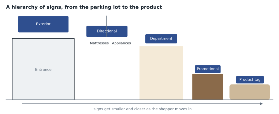
Stores use several levels of signs, each with a different job. Too many signs at the same level compete with each other; a clear hierarchy lets shoppers find what they need at each step.
| Level | Job | Example |
|---|---|---|
| Exterior | Identify the store and attract people from a distance | The building sign and window signs |
| Directional (wayfinding) | Help shoppers find departments and services | Hanging signs over the main aisle: "Mattresses", "Appliances", "Pick-up" |
| Department | Name the area once shoppers arrive | "Living room" on the back wall of the department |
| Promotional | Announce sales, events and featured products | "Holiday delivery booking now" on the feature table |
| Product (point of sale) | Tell shoppers what a product is, what it does and what it costs | The tag on a sofa listing fabric, dimensions, options and price |
| Informational and policy | Explain services and rules | Return policy at the sales desk; financing information; delivery areas |
Writing a sign
Shoppers read signs in a few seconds, usually while moving. Good signs say one thing, in as few words as possible, starting with what matters most to the shopper. The rules are simple and often broken.
| Rule | Weak sign | Better sign |
|---|---|---|
| One message per sign | "New fall colors, free delivery over 999, ask about financing, see our mattresses" | "New fall colors" |
| Lead with the benefit | "Model RS-4410 with 4-zone coil" | "Stays cool all night" |
| Be specific | "Sale" | "Recliners 20 in 100 off until Nov 15" |
| Use plain words | "Proprietary ergonomic lumbar architecture" | "Built-in lower back support" |
| Say what to do next | "Mattress trial" | "Try it for 90 nights. Ask us how." |
Product tags have more room, but the same rules apply. A shopper standing at a sofa wants to know its name, its size, what it is made of, the options, the price and whether it is in stock or must be ordered. Juniper & Pine's tag template puts these in the same place on every tag, so shoppers learn where to look. The template was rewritten in 2025 after the store noticed that associates were answering the same questions about dimensions dozens of times a day.
Legibility and size
A sign that cannot be read from where shoppers stand does nothing. Legibility depends on letter size, contrast between the letters and the background, the typeface and the lighting. A common rule of thumb in the sign industry is to allow about 1 inch of capital-letter height for every 10 feet of viewing distance for comfortable reading, and more for signs seen in passing or from an angle. Industry guides vary, so the rule is a starting point to test on the floor.
Worked problem
How big should the mattress department sign be?
The mattress gallery's department sign is on the back wall. Noura wants it readable from the main aisle where it turns toward the gallery, about 100 feet away. Using about 1 inch of letter height per 10 feet of distance, how tall should the capital letters be? The current sign has letters 5 inches high.
Show solution
- Number of 10-foot steps in 100 feet:
- \[100 \div 10 = 10\]
- Letter height needed:
- \[10 \times 1 = 10\ \text{in}\]
- Compare with the current sign:
- \[10 \div 5 = 2\]
Answer: The letters should be about 10 inches tall, twice the height of the current 5-inch letters. Noura ordered a new sign with 10-inch letters and moved the old one to a closer position at the gallery entrance.
Contrast matters as much as size. Dark letters on a light background, or light on dark, are easiest to read; pale gray on white, or text printed over a busy photograph, is not. Plain typefaces with clear letter shapes are easier than decorative scripts. Text in all capitals is harder to read in longer phrases than mixed case, so capitals are best kept for one or two words. These choices also make signs easier for shoppers with low vision, which lesson 10 discusses along with other accessibility needs.
Placement completes legibility. Hanging directional signs should be high enough to clear shoppers' heads and tall displays, and positioned where shoppers make decisions, such as the point where the main aisle meets a department, not halfway along a straight run. Product tags should be at a consistent height and position on similar products so shoppers do not have to hunt.
Digital signs
Many stores now use screens for promotional and directional signs. Screens can change messages by time of day, show video and be updated centrally. They also bring risks: too many moving screens make a store feel like an airport, video can distract from products, and a screen showing an expired promotion or a frozen error message is worse than no sign. Juniper & Pine uses two screens, both near the sales desk, and keeps everything else in print. Noura's view is that a home store should feel like a home, and homes do not have screens on every wall.
Displaying prices
Every product for sale should show its price clearly, and the price shown must be the price charged. Price display is also where stores most often run into legal trouble, through errors, unclear sale claims and comparisons with prices that were not real.
In the US, the FTC Act prohibits deceptive advertising, including deceptive prices, and the FTC's Guides Against Deceptive Pricing explain how former-price and comparison claims should be made. State laws add their own rules; in South Dakota, advertising or charging prices in a misleading way can be a deceptive act under the state's deceptive trade practices law. Juniper & Pine, like many retailers, has a policy of charging the lower price when a product carries two different prices or when the shelf price is lower than the price at the register, and of including any mandatory fees in the advertised price.
Sale and "was" prices
A sign that says "Was 1,299, now 999" makes two claims: that the product now costs 999, and that 1,299 was a genuine former price. If the product was rarely or never sold at 1,299, the comparison exaggerates the saving and misleads shoppers.
The FTC's guides say a former price is a fair basis for comparison only if the product was openly and actively offered at that price, in good faith, for a reasonably substantial period in the recent past. A price set high just so that a later "sale" looks bigger does not qualify. Some states set specific time periods, and many retailers set their own. Juniper & Pine's rule is that a "was" or "regular" price must have been the actual selling price for at least 90 of the last 180 days, and that most units must have sold at or above it over the past year.
Worked problem
Can the recliner sign say "Regular 1,299"?
The appliance-area sign Noura checked was actually for a power recliner displayed near appliances. The sign read "Regular 1,299, now 999". Store records showed that in the past 12 months the store sold 140 of these recliners: 52 at 1,299 and 88 at the promotional price of 999. In the past 180 days the recliner was offered at 1,299 for about 75 days and at 999 for the rest. Does the claim meet the store's rule of 90 of the last 180 days, with most units sold at or above the price?
Show solution
- Days at 1,299 in the last 180:
- \[75 < 90\]
- The time part of the rule fails.
- Share of units sold at or above 1,299 in 12 months:
- \[52 \div 140 \approx 0.37\]
- About 37 in 100, less than half, so the volume part fails too.
Answer: The claim meets neither part of the rule, and under the FTC's guides 1,299 was not a price the store offered for a reasonably substantial period. In practice the recliner's usual price was 999. Noura removed the sign the same morning. The store can show 999 as the price, or use a different, truthful comparison if one exists.
Other price claims need the same care. "Up to 50 in 100 off" must apply to a meaningful share of the products, not just one. "Lowest price in town" must be true and checked. "Free delivery" must not be offset by a higher product price than usual. And sale signs must come down when the sale ends; the six outdated signs Aiden found were not a legal problem only because the prices had not yet changed back.
Signs about stock and delivery
For large items, shoppers want to know not only the price but whether they can have it, and when. A sofa that must be special-ordered in 10 to 12 weeks is a different purchase from one that can be delivered on Friday. Juniper & Pine's product tags carry a colored dot: green for in stock and deliverable within a week, amber for in stock at the warehouse with delivery in two to three weeks, and blue for made to order, with the usual lead time printed beside it. The dots are updated with the Monday price changes. Since they were introduced, associates report fewer awkward moments at the counter, when a customer who had fallen in love with a sofa learned for the first time that it would not arrive until spring. Accurate stock signs are part of honest selling as much as accurate prices are.
Keeping signs accurate
Juniper & Pine changes prices every week. Every Monday, the sign team prints the week's changes, and every Monday before opening associates replace the tags in their zones and initial a checklist. Noura does a random check of 20 tags each Tuesday. When her check finds an error, the price on the tag is honored, the error is corrected, and the cause, usually a tag left from an earlier promotion, goes on the next week's list. Accurate signs are a merchandising task and a legal duty at the same time.
Signs also need an owner. At Juniper & Pine every sign in the store has a start date and an end date written on the back in pencil, and the person who put it up is responsible for taking it down. The rule sounds fussy, but it is the reason the store no longer finds expired promotions in corners months after the sale ended. Aiden's sign walk in October found most of the outdated signs in places nobody passed by regularly, which is why the end date matters more than anyone's memory.
Common mistakes
MistakePut everything the shopper might want to know on one sign.
InsteadOne message per sign, with a clear hierarchy from exterior to product tag.
MistakeSmall, elegant lettering looks more upmarket.
InsteadSize letters for the viewing distance and use strong contrast, or the sign does nothing.
MistakeAny former price can be used in a "was" comparison.
InsteadThe former price must be genuine: it must meet the legal tests and the store's own rule.
MistakeAdd mandatory fees at the counter so the advertised price looks lower.
InsteadMandatory fees belong in the advertised price; adding them later is drip pricing.
MistakeExpired promotion signs can stay up until someone has time.
InsteadTake signs down when the promotion ends and check tags every week.
Summary and key terms
- A hierarchy of signs, from exterior and directional to department, promotional, product and policy, helps shoppers at each step.
- Good signs carry one message, lead with the benefit, are specific and say what to do next.
- Size letters for the viewing distance, use strong contrast and plain type, and place signs where shoppers make decisions.
- The price shown must be the price charged; stores should honor the lower price when two prices conflict and include mandatory fees.
- "Was" and "regular" prices must be genuine under the law and store policy.
- Check tags and signs every week and remove expired promotions.
- Wayfinding
- Signs and design that help people find their way through a space.
- Point-of-sale sign
- A sign at the product that describes it and shows its price.
- Drip pricing
- Advertising a price that cannot be paid because mandatory fees are added later.
- Double ticketing
- A product carrying two different prices.
- Ordinary selling price
- The genuine usual price of a product, used as the basis for a sale comparison.
Practice problems
Work each problem on paper first, then reveal the answer to check.
Using about 1 inch of letter height per 10 feet, how tall should letters be on a sign read from 40 feet?
Show answer
40 divided by 10 is 4; 4 times 1 is 4 inches.
Rewrite this sign: "Sale on selected items".
Show answer
For example: "Dining chairs 25 in 100 off until Sunday".
A product sold 30 of 100 units at its "regular" price in the past year. What does this suggest about the claim?
Show answer
Most units sold below that price, so the regular price claim is likely not genuine.
Why does Juniper & Pine use only two screens in the store?
Show answer
Too many moving screens feel cluttered and distract from products, and the store wants to feel like a home.
Lesson quiz · 5 questions
Score 60% or more to complete this lesson.
Create a free account to save your progress, take quizzes and earn a certificate.