
VIS-130 · Lesson 2 of 12 · 29 min
Classical and medieval foundations
Long before anyone thought about cameras, artists faced questions every image maker still faces. How should a human body be proportioned to look ideal or real? How do you show what matters most? How can a flat surface carry stories, symbols and beliefs to people who may not read? This lesson looks at the ancient Mediterranean and medieval European traditions that answered those questions, and at the habits they left behind: canons of proportion, the idea of an ideal figure, hierarchical scale, iconography, gold grounds and the illuminated page. These may seem far from a phone camera, but you will find their descendants in fashion photography, superhero films, religious imagery, logos and the layout of every magazine page.
Ancient Egypt: clarity over appearance
Ancient Egyptian painting and relief, made over roughly three thousand years, followed strict conventions. Figures combine viewpoints: the head in profile, the eye shown as if from the front, the shoulders frontal, the legs in profile. This composite view was not a failure to observe. It aimed to show each part in its most recognizable form, giving a complete, permanent account of the person, which mattered for images connected with the afterlife.
Egyptian artists also used grids to proportion figures consistently, and they used hierarchical scale: the most important person, often a pharaoh, appears largest, with officials and servants progressively smaller. Registers, horizontal bands stacked one above another, organized scenes like lines of text. Two lessons carry forward: images can prioritize clarity and meaning over optical realism, and size can signal status rather than distance.
Ancient Greece and the ideal body
Greek sculptors between about 600 and 300 BCE moved from stiff, frontal figures toward increasingly naturalistic bodies. Around the middle of the fifth century BCE, the sculptor Polykleitos wrote a treatise known as the Canon, now lost, describing ideal proportions based on ratios between body parts. His statue of a spear bearer, known today through Roman marble copies, demonstrated the system.
That statue also shows contrapposto, a pose in which the weight rests on one leg, so the hips tilt one way and the shoulders the other. The result is a body that seems relaxed, balanced and alive. Contrapposto remains one of the most useful posing principles in portrait and fashion photography: asking a model to shift their weight onto one leg instantly breaks a stiff, symmetrical stance.
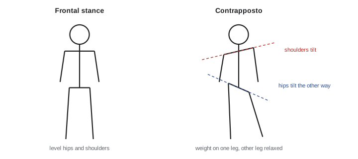
Greek artists pursued an ideal rather than a portrait. They combined the best features of many models into a perfected type. This idea of the ideal body, smooth, symmetrical and youthful, has had an enormous and sometimes harmful afterlife, from Renaissance art to advertising and retouched images today. Recognizing it as a historical convention rather than a natural standard is one of the benefits of art history.
Proportion systems and the golden ratio myth
Because proportion was so important in classical art, later writers searched for a single mathematical key behind beauty. The most famous candidate is the golden ratio, written with the Greek letter phi.
A line divided so that the whole is to the longer part as the longer part is to the shorter part is divided in the golden ratio. It has genuinely interesting mathematical properties, and some architects and artists, especially from the nineteenth century onward, used it deliberately. But many popular claims are exaggerated. Measurements of ancient buildings, faces and famous paintings often find approximately golden ratios only because enough points are chosen to make the numbers fit. Psychological studies have not shown a strong, consistent preference for golden rectangles over nearby proportions.
For image makers, the practical lesson is to treat proportion systems as tools, not laws. The rule of thirds, the golden section and grid systems are all ways to avoid placing everything in the dead center and to create relationships between parts. None guarantees a good image.
Worked problem
Testing a golden ratio claim
A website claims a painting's main figure is placed at the golden section of a 120 cm wide canvas, at 74 cm from the left edge. Where would the golden section and the rule-of-thirds line fall, and does the claim hold?
Show solution
- Divide the width by phi to find the longer part: \(120 \div 1.618 \approx 74.2\) cm from one edge.
- The golden section lines are therefore at about 74.2 cm from the left and 45.8 cm from the left (74.2 cm from the right).
- The rule-of-thirds lines are at \(120 \div 3 = 40\) cm and 80 cm from the left.
- The figure at 74 cm is close to the golden section, but only about 6 cm from the thirds line at 80 cm. Measurement error from photographs and the width of a figure easily exceed that difference.
Answer: The golden section falls at about 74.2 cm and the thirds lines at 40 cm and 80 cm. The figure fits the golden section, but it is almost as close to a thirds line, so the measurement alone does not prove the painter used the golden ratio.
Rome: portraits, narrative and illusion
Roman art borrowed heavily from Greece but added strengths of its own. Roman portrait busts of the Republic often show strikingly individual, aged faces, wrinkles and all, valuing character and experience over idealized youth. Emperors later used portraits as propaganda, distributing standardized images on coins and statues across the empire, an early form of image branding.
Roman artists also told continuous stories in spiral reliefs, such as Trajan's Column, completed in 113 CE, which winds around a tall shaft showing military campaigns in sequence, almost like a scroll or a storyboard. Wall paintings in houses at Pompeii, preserved by the eruption of Vesuvius in 79 CE, show painted architecture, landscapes and windows that open illusionistic views onto imaginary spaces. They used an intuitive perspective in which receding lines roughly converge, though not to a single systematic point.
| Convention | Origin | Modern descendant |
|---|---|---|
| Contrapposto | Greek sculpture, 5th century BCE | posing in portrait and fashion photography |
| Ideal proportions | Greek canons such as Polykleitos | fashion and fitness imagery, retouching norms |
| Veristic portrait | Roman Republic busts | character portraiture, documentary faces |
| Image as propaganda | Roman imperial coins and statues | political imagery, brand consistency |
| Continuous narrative | Trajan's Column reliefs | comics, storyboards, scrolling layouts |
| Illusionistic wall painting | Pompeii houses | trompe-l'oeil murals, set painting, matte paintings |
Late antiquity and Byzantium: the gold ground
As Christianity spread through the Roman world, artists developed new aims. In Byzantine art, centered in Constantinople from the fourth century until 1453, the goal was not to imitate the physical world but to make the spiritual world present. Mosaics of glass and gold tesserae covered church walls and domes. Figures became more frontal, elongated and still, set against shimmering gold backgrounds that removed any sense of earthly space or time.
The gold ground is worth pausing on for image makers. It is a deliberate refusal of depth and atmosphere. Instead of a window onto a scene, the image becomes a radiant surface that reflects changing light from candles and windows as worshippers move. Icons, painted panels of holy figures, followed strict conventions so that the image was recognizable and theologically correct. Their faces look directly out, establishing a relationship with the viewer that feels intense and direct. That frontal, eye-contact gaze remains a powerful device in portrait photography and in films that break the fourth wall.
Hierarchical scale and the meaning of size
Medieval European art, like Egyptian art, often used hierarchical scale. In a typical altarpiece, the Virgin and Child are much larger than the saints around them, and the donors who paid for the painting kneel as tiny figures at the edges. Size signals importance, not distance.
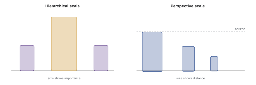
Modern image makers still use size this way, often in combination with perspective. A low camera angle that makes a hero loom, a poster where the star's face dwarfs the other cast members, or a corporate photograph where the chief executive stands in front and center all carry echoes of hierarchical scale. Recognizing the convention helps you decide whether to use it, subvert it or avoid it.
Illuminated manuscripts: the page as a designed space
Before printing, books in Europe were copied by hand. The most precious were illuminated manuscripts, decorated with gold, colored inks and pictures. Insular manuscripts made in Ireland and Britain, such as the Book of Kells, made around 800, are famous for intricate interlace patterns, decorated initial letters and full pages of ornament. Later Gothic manuscripts combined text, small framed scenes called miniatures and decorated margins full of plants, animals and humorous creatures.
Illuminated pages are an early lesson in layout. Designers balanced blocks of text with images, used enlarged initials to signal the start of sections, and created hierarchy through size, color and ornament. The same principles organize magazine layouts, websites and title sequences. The decorated initial lives on in drop caps, and the marginal doodle in the playful details designers hide in corners.
Gothic light and stained glass
From the twelfth century, Gothic cathedrals in France and across Europe opened their walls to huge stained glass windows. Abbot Suger, who rebuilt the abbey church of Saint-Denis near Paris in the 1140s, wrote about light as a way to lift the mind toward the divine. Colored light falling through windows transformed the interior, shifting with the time of day and season.
Stained glass is essentially projected, colored light, and it anticipates cinema in a striking way: images made of light, viewed in a darkened interior by a gathered audience. Gothic designers also used narrative windows, reading upward from bottom to top in a sequence of scenes. When you light a set with colored gels, project patterns through windows or design an installation around changing light, you are working in a tradition that includes the Gothic cathedral.
Symbols and color codes
Medieval viewers read images through shared symbols. Saints carried attributes that identified them: keys for Saint Peter, a wheel for Saint Catherine. Colors carried meanings too, though they varied by region and period. Ultramarine blue, made from the semi-precious stone lapis lazuli imported from Afghanistan, was extremely expensive and often reserved for the Virgin Mary's robe, so the color itself signaled value and holiness. Gold signaled the divine and eternal.
Worked problem
Reading iconography and color value
A described medieval panel shows a large central woman in a deep blue robe holding a child, flanked by two smaller standing figures, one holding keys and one holding a sword, against a gold background. Two tiny kneeling figures appear at the bottom corners. Interpret the image's hierarchy and symbols.
Show solution
- Note hierarchical scale: the central woman and child are largest, so they are the most important figures, most likely the Virgin and Child.
- Read the color: the expensive ultramarine robe reinforces her status.
- Read the attributes: keys traditionally identify Saint Peter; a sword often identifies Saint Paul.
- Read the gold ground: it removes earthly space and signals a heavenly, timeless setting.
- Identify the kneeling figures: tiny figures at the edges are likely donors who paid for the panel, shown humbly in prayer.
Answer: The panel ranks its figures by size: the Virgin and Child at the center, saints Peter and Paul as smaller attendants identified by their keys and sword, and the donors smallest of all. The costly blue robe and the gold ground mark the central figures as holy and place the whole scene outside ordinary space and time.
Seeing medieval art in North America
US collections are especially rich in medieval art; The Met Cloisters in New York presents medieval sculpture, stained glass and manuscripts in a building assembled partly from European architectural elements, and many university museums hold gold-ground panels.
What image makers take from this period
The classical and medieval traditions offer a surprisingly practical set of tools. Contrapposto improves almost any standing pose. Proportion systems help, as long as you treat them as aids rather than laws. Hierarchical scale reminds you that size can signal importance. Frontal, direct gazes create intensity. Gold grounds and flat backgrounds show that removing depth can make an image feel timeless or iconic, as many studio portraits on seamless backdrops do. Continuous narratives and illuminated pages anticipate storyboards, comics and editorial design. And stained glass reminds you that light itself, colored and projected, can be the image.
Common mistakes
MistakeTreating ancient Egyptian composite figures as a failure to observe
InsteadRecognize they deliberately show each body part in its clearest form for meaning and permanence
MistakeBelieving the golden ratio is a proven secret of all beauty
InsteadTreat it as one proportion tool among many, since many claims rely on selective measurement
MistakeAssuming size in an image always means distance
InsteadRemember that hierarchical scale uses size to show importance, as in Egyptian and medieval art
MistakeSeeing gold backgrounds as primitive because they lack depth
InsteadUnderstand the gold ground as a deliberate choice to show a spiritual, timeless space
MistakeTreating the classical ideal body as a natural standard
InsteadRecognize it as a historical convention with a long and sometimes harmful influence on imagery
Summary and key terms
- Egyptian art combined viewpoints, used grids and registers, and used hierarchical scale to show importance.
- Greek sculpture developed ideal proportions and contrapposto, a relaxed weight-shift pose still used in photography.
- The golden ratio is about 1.618, but claims that it governs all beauty are often based on selective measurement.
- Roman art added individual portraits, image propaganda, continuous narrative and illusionistic wall painting.
- Byzantine icons and mosaics used frontal figures and gold grounds to make a spiritual world present.
- Medieval altarpieces and manuscripts used hierarchical scale, symbols and carefully designed pages.
- Gothic stained glass turned colored light into narrative images, anticipating projected media.
- Contrapposto
- A pose with weight on one leg, so the hips and shoulders tilt in opposite directions
- Canon of proportions
- A system of ratios defining ideal relationships between parts of the body
- Golden ratio
- A proportion of about 1.618, written phi, in which the whole relates to the larger part as the larger part relates to the smaller
- Hierarchical scale
- Using size to show a figure's importance rather than its distance
- Register
- A horizontal band used to organize scenes in rows
- Icon
- A sacred image, especially a painted panel of a holy figure in Byzantine and Orthodox tradition
- Gold ground
- A gold background that removes depth and signals a sacred, timeless space
- Illuminated manuscript
- A handwritten book decorated with gold, color and images
- Attribute
- An object that identifies a figure, such as keys for Saint Peter
- Continuous narrative
- A single image or band showing several moments of a story in sequence
Practice problems
Work each problem on paper first, then reveal the answer to check.
Why do Egyptian figures show the head in profile but the eye from the front?
Show answer
Each part is shown in its most recognizable form to give a complete, permanent image.
Describe contrapposto in one sentence.
Show answer
The weight rests on one leg, so the hips tilt one way and the shoulders the other, making the figure look relaxed.
Calculate the golden section point on a 50 cm wide image.
Show answer
\(50 \div 1.618 \approx 30.9\) cm from one edge, or about 19.1 cm from the other.
Where are the rule-of-thirds lines on a 90 cm wide image?
Show answer
At 30 cm and 60 cm from the left edge.
What does hierarchical scale signal?
Show answer
Importance or status, rather than distance.
What was distinctive about Roman Republican portrait busts?
Show answer
They often showed individual, aged faces with wrinkles, valuing character over idealized youth.
Why might a Byzantine artist choose a gold background?
Show answer
To remove earthly space and time and make a spiritual, radiant setting.
Why was ultramarine blue associated with the Virgin Mary?
Show answer
It was made from costly lapis lazuli, so it signaled value and holiness.
Name one modern descendant of illuminated manuscripts.
Show answer
Examples include magazine layouts, drop caps or website design.
How does stained glass anticipate cinema?
Show answer
It creates images from colored light viewed in a darkened interior by an audience.
Lesson quiz · 5 questions
Score 60% or more to complete this lesson.
Create a free account to save your progress, take quizzes and earn a certificate.