
CRE-120 · Lesson 11 of 12 · 25 min
Accessible and inclusive writing
Accessible content can be perceived, understood and used by people with a wide range of abilities, including people who are blind or have low vision, are deaf or hard of hearing, have cognitive or learning disabilities, or have motor disabilities. One in four or five adults lives with a disability, and many more people benefit from accessible content temporarily or situationally: watching videos without sound on a train, reading in bright sunlight, using a second language, or recovering from an injury. Inclusive writing goes further, using language that respects and represents diverse audiences. Accessibility and inclusion are ethical commitments, increasingly legal expectations, and good practice for reach and engagement. This lesson covers captions and transcripts, alt text, accessible text formatting, hashtags and emoji, plain language and cognitive accessibility, inclusive language, and building accessibility into a workflow.
Captions and transcripts
Captions present spoken words and important sounds as text synchronized with video. They are essential for deaf and hard-of-hearing viewers and widely used by everyone else: many viewers watch social video with the sound off. Good captions are accurate (including names, technical terms and numbers), synchronized, complete (including speaker identification and meaningful sounds such as [laughter] or [door slams]), readable (short lines, sufficient display time, good contrast) and positioned so they do not cover important visuals or the platform interface. Automatic captions from platforms and editing apps have improved greatly but still make errors, especially with accents, specialized vocabulary and names, so creators should review and correct them. Burned-in captions (styled text added in editing) ensure captions appear on every platform but cannot be turned off or resized; closed captions uploaded as files can be toggled and are read by assistive technologies. For podcasts and audio, transcripts provide access and also help search (Lesson 10).
| Caption quality | What it means | Common failure |
|---|---|---|
| Accurate | Correct words, names and numbers | Uncorrected auto-captions |
| Synchronized | Appear with the speech | Lagging or early text |
| Complete | Speakers and meaningful sounds included | Missing sound cues and speaker labels |
| Readable | Short lines, enough time, good contrast | Long lines, fast flashes, low contrast |
| Well placed | Not covering key visuals or interface | Captions hidden behind buttons |
Alt text
Alternative text (alt text) is a written description of an image, read aloud by screen readers and displayed when images fail to load. Most social platforms let creators add custom alt text to images; some generate automatic descriptions, which are often vague or wrong. Good alt text:
- Describes what matters in the context of the post, not every detail.
- Is concise, often one or two sentences.
- Includes any text that appears in the image, such as quotes or slide text.
- Does not start with "image of" or "picture of", because screen readers already announce an image.
- Conveys the purpose or emotion if that is the point ("a toddler laughing as a golden retriever licks her face").
For carousels and infographics with a lot of text, the text should be available in the caption or alt text for each slide, because screen readers cannot read text embedded in images. Charts need a summary of the key finding in alt text or the caption.
Worked problem
Writing alt text
A baking creator posts a photo of a sourdough loaf cut open, showing an open crumb with large irregular holes, on a wooden board next to a jar of starter labelled "Gerald". The caption is about getting a more open crumb. Write alt text.
Show solution
- Identify what matters in context: the open crumb, the subject of the post.
- Include visible text: the starter jar label "Gerald".
- Avoid "image of"; start with the subject.
- Keep it concise and descriptive.
- Alt text: "A sourdough loaf cut in half on a wooden board, showing an open crumb with large, irregular holes. Beside it is a jar of starter labelled Gerald."
Answer: A concise description focused on the open crumb, including the jar label, without "image of".
Accessible text formatting
Several formatting choices affect people using screen readers and those with low vision or cognitive disabilities:
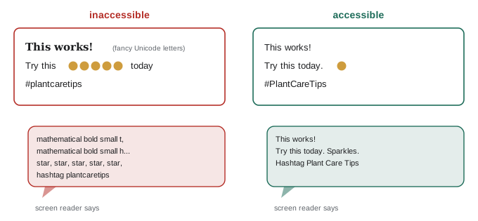
- Avoid Unicode "fancy" fonts and symbols used to style text, such as bold or script letters copied from generator websites. Screen readers read them as mathematical symbols or skip them entirely, making the text incomprehensible.
- Use camel case for multi-word hashtags (#AccessibilityMatters), so screen readers pronounce the words correctly and everyone reads them more easily.
- Place hashtags and mentions at the end of posts rather than throughout sentences, where they interrupt reading.
- Use emoji sparingly and not in the middle of sentences; screen readers read each emoji's full name ("face with tears of joy"), and strings of emoji become long and confusing. Do not use emoji as bullet points for important lists without considering how they will sound.
- Use descriptive link text rather than "click here" (Lesson 7).
- Ensure text on images and videos has strong contrast against its background and is large enough to read on a phone.
- Avoid conveying meaning by colour alone, such as red and green text indicating wrong and right.
Plain language and cognitive accessibility
Plain language (Lesson 9) helps people with cognitive and learning disabilities, people reading in a second language and anyone reading under stress. Additional practices that support cognitive accessibility include explaining abbreviations and jargon, using consistent terminology, breaking complex instructions into numbered steps, avoiding flashing or rapidly changing visuals (which can also trigger seizures in people with photosensitive epilepsy; avoid content that flashes more than three times per second), giving viewers enough time to read on-screen text, and providing summaries for long content. Content warnings for distressing material help people make informed choices about what they view.
Inclusive language
Inclusive language avoids excluding, stereotyping or demeaning people and reflects the diversity of the audience. Principles include:
- Use people-first or identity-first language according to the preferences of the community or person concerned; for example, many autistic and Deaf people prefer identity-first language, while other groups prefer people-first ("a person with diabetes"). When unsure, ask or follow guidance from community organizations.
- Avoid outdated or offensive terms for disabilities, ethnicities, genders and sexual orientations, and avoid using disability terms as metaphors or insults ("that is so lame", "I am so OCD about my desk").
- Use gender-neutral language where gender is unknown or irrelevant ("they", "everyone", "folks", "chair" rather than "chairman").
- Avoid assumptions about the audience's families, incomes, bodies, religions or cultures.
- Represent diversity in examples, images and stories, and avoid stereotypes.
Inclusive language evolves, so creators should listen to their audiences, learn, and correct course gracefully when they make mistakes.
Legal context
Accessibility laws mainly apply to governments and organizations rather than individual creators, but creators working with brands, public institutions and educational organizations increasingly encounter accessibility requirements, and platforms are adding accessibility features because of them. The international Web Content Accessibility Guidelines (WCAG) are the reference standard, covering captions, alternative text, contrast and more.
In Canada, the Accessible Canada Act applies to federally regulated organizations, and provincial laws such as Ontario's Accessibility for Ontarians with Disabilities Act (AODA) require many organizations' websites and web content to meet WCAG 2.0 level AA; creators producing content for public bodies or large organizations may be asked to meet these standards.
Building accessibility into the workflow
Accessibility is easiest when it is part of the routine rather than an afterthought. Practical habits include: writing alt text when drafting a caption; reviewing and correcting auto-captions before publishing; using a caption style template with good contrast and safe-zone placement; keeping a checklist (captions, alt text, camel case hashtags, emoji placement, no fancy fonts, descriptive links, contrast); asking disabled audience members for feedback; and testing posts with a screen reader such as VoiceOver on iPhone or TalkBack on Android to hear how they sound. These habits take minutes per post and widen the audience significantly.
Accessible video beyond captions
Captions are the best-known accessibility feature for video, but others matter too. Audio description narrates important visual information, such as actions, scene changes and on-screen text, for blind and low-vision viewers; creators can build it in by describing what they are doing as they do it ("I am pouring the batter into a round tin"), which also helps viewers who are not watching closely. Flashing or strobing effects can trigger seizures in people with photosensitive epilepsy, so creators should avoid rapid flashes, especially more than three per second, and add warnings when such content is unavoidable. Background music should not drown out speech. Clear, well-lit shots of the speaker's face help people who lip-read.
Accessible links and calls to action
Links and calls to action should be understandable out of context, because screen reader users often navigate by jumping from link to link. Descriptive link text, such as "read the full packing checklist", is clearer than "click here" or a raw web address. In captions where links are not clickable, the text should explain where to find the link, such as "link in bio" with a clear label in the bio. Buttons and link stickers should have readable text and sufficient contrast. Calls to action that rely only on visual cues, such as "tap the arrow on screen", exclude people who cannot see the screen, so they should also be stated in words.
Colour, contrast and text on images
Text placed on images or video must have enough contrast with its background to be readable by people with low vision or colour vision deficiencies, and by anyone watching in bright light. The Web Content Accessibility Guidelines (WCAG) recommend a contrast ratio of at least 4.5 to 1 for normal text and 3 to 1 for large text. Placing text on a solid or semi-transparent background panel, using bold sans-serif typefaces, and avoiding red and green as the only way to convey meaning all help. Free contrast checkers allow creators to test colour combinations before using them in templates.
Inclusive representation
Inclusive writing is also about whose stories and experiences appear in content. Examples, case studies, images and guests that reflect a diverse range of people, in age, ethnicity, gender, ability, body type, income and location, help more audience members see themselves in the content. Representation should be authentic rather than tokenistic: featuring people meaningfully, letting them speak for themselves, and avoiding stereotypes. Creators can review their recent content and ask whose perspectives are missing, then seek out collaborators, sources and stories that broaden it.
Handling mistakes and feedback
Everyone makes accessibility and language mistakes. When audience members point them out, the most constructive response is to thank them, correct the issue where possible, and apply the lesson in future content, rather than becoming defensive. Creators can also invite feedback openly, for example by asking disabled viewers what would make content easier to use. Accessibility knowledge evolves, and terminology preferences change over time and vary between communities, so staying curious and willing to learn matters more than achieving perfection. Following disabled creators and accessibility advocates is one of the best ways to learn.
Accessibility as a growth strategy
Accessible content reaches more people. Captions increase watch time among viewers who watch without sound, which is a large share of mobile viewers. Clear, plain writing is understood by people reading in a second language and by readers in a hurry. Alt text and transcripts add searchable text. Readable formatting improves engagement for everyone. Seen this way, accessibility is not a cost but a practice that widens reach, deepens loyalty and reflects respect for the whole audience.
An accessibility review of one post
Consider a carousel post with six text-heavy slides, a caption written in decorative Unicode letters, five emoji in the middle of the first sentence and the hashtag #smallbusinesstips. An accessibility review would replace the decorative letters with plain text, move the emoji to the end and reduce them to one or two, change the hashtag to #SmallBusinessTips, add alt text for each slide containing its text, check the slide colour contrast, and add a short summary of the key points to the caption. Each change takes a minute or two, and together they make the post usable for screen reader users and easier for everyone to read.
Common mistakes
MistakePublishing uncorrected auto-captions.
InsteadReview and correct captions before posting.
MistakeStarting alt text with "image of".
InsteadDescribe the important content directly.
MistakeUsing Unicode fancy fonts for emphasis.
InsteadUse plain text; screen readers cannot read styled symbols.
MistakePutting text only inside images.
InsteadProvide the text in alt text or the caption.
MistakeUsing disability terms as insults or metaphors.
InsteadChoose respectful, accurate language.
Summary and key terms
- Accessible content works for people with many abilities and situations.
- Captions must be accurate, synchronized, complete, readable and well placed.
- Alt text describes what matters in context, concisely.
- Avoid fancy fonts, use camel case hashtags and limit emoji.
- Plain language, clear steps and no flashing support cognitive accessibility.
- Inclusive language respects identities and represents diversity.
- Build an accessibility checklist into every post.
- Accessibility
- Usability by people with diverse abilities.
- Closed captions
- Captions viewers can turn on or off.
- Burned-in captions
- Captions permanently added to the video image.
- Transcript
- Full text of spoken content.
- Alt text
- Text description of an image.
- Screen reader
- Software that reads screen content aloud.
- Unicode fancy fonts
- Styled symbols that mimic bold or script text.
- WCAG
- Web Content Accessibility Guidelines.
- Identity-first language
- Placing identity before the person, as in autistic person.
- Inclusive language
- Language that avoids excluding or stereotyping.
Practice problems
Work each problem on paper first, then reveal the answer to check.
Who benefits from captions?
Show answer
Deaf and hard-of-hearing viewers and anyone watching silently.
Name three qualities of good captions.
Show answer
Accurate, synchronized, complete, readable, well placed.
Difference between burned-in and closed captions?
Show answer
Burned-in are permanent; closed can be toggled.
Why not start alt text with "image of"?
Show answer
Screen readers already announce images.
Where should text from carousel slides go?
Show answer
In alt text or the caption.
Why avoid Unicode fancy fonts?
Show answer
Screen readers misread or skip them.
Flash limit to avoid seizure risk?
Show answer
No more than three flashes per second.
Give a gender-neutral alternative to "chairman".
Show answer
Chair.
What is the reference accessibility standard?
Show answer
WCAG.
How can you test how a post sounds?
Show answer
Use VoiceOver or TalkBack.
Lesson quiz · 5 questions
Score 60% or more to complete this lesson.
Create a free account to save your progress, take quizzes and earn a certificate.