
PHOT-210 · Lesson 8 of 12 · 25 min
Lighting ratios, fill and contrast
Once the key light has created a pattern, the next decision is how dark the shadows should be. Deep, dark shadows feel dramatic and mysterious; open, light shadows feel friendly and bright. The relationship between the lit side and the shadow side is described by the lighting ratio, and it is controlled with fill: a second light, a reflector, the room itself or the absence of all three. This lesson covers how lighting ratios are defined and measured, the different conventions in use, fill lights and reflectors, on-axis and off-axis fill, negative fill, ratios and mood, ratios for different skin tones and genres, and the relationship between lighting contrast and the final image.
Defining lighting ratios
A lighting ratio compares the brightness of the lit side of a face with the shadow side. Two conventions exist, and confusing them is a common source of misunderstanding:
- Key-plus-fill to fill: the lit side receives light from both the key and the fill, while the shadow side receives only the fill. If key and fill are equal, the lit side receives two units and the shadow side one, a ratio of 2:1. If the key is one stop brighter than the fill, the lit side receives three units (two from key, one from fill) and the shadow one, a ratio of 3:1. This traditional convention is used in many textbooks.
- Lit side to shadow side measured directly in stops: many photographers simply meter each side of the face and describe the difference in stops, so a one-stop difference is 2:1, two stops 4:1 and three stops 8:1.
The stop-difference convention is simpler and is used in this course unless stated otherwise: meter the lit side and the shadow side, and express the difference in stops, which converts to a ratio of 2 raised to that number.
| Stop difference (lit vs shadow) | Ratio | Typical look |
|---|---|---|
| 0 | 1:1 | Flat, no modelling |
| 0.5 | About 1.4:1 | Very soft, high key |
| 1 | 2:1 | Soft, open, commercial |
| 1.5 | About 3:1 | Natural, gentle shape |
| 2 | 4:1 | Defined, dramatic |
| 3 | 8:1 | Strong drama, low key |
| 4 or more | 16:1 or more | Very dramatic, near black shadows |
Measuring ratios
To measure a ratio with an incident meter, point the dome or a flat disc toward the key from the lit side of the face to read the lit side, then toward the camera from the shadow side, or toward the fill with the key blocked, to read the shadow side. Some photographers meter the key alone and the fill alone with flat discs and compute the result. Spot meters and the camera's histogram or a tethered display, sampling RGB values from the lit and shadow cheeks, give reflected-light readings that include skin tone; they are useful for checking the final result. Whatever method you use, use it consistently so that numbers mean the same thing from shoot to shoot.
Worked problem
Setting a 3:1 ratio
A key light reads f/8 on the lit side of the face. The photographer wants about a 3:1 ratio (1.5 stops) for a natural corporate headshot. What should the shadow side read, and how could this be achieved with a second light?
Show solution
- A 1.5-stop difference below f/8 is between f/5.6 (1 stop) and f/4 (2 stops): f/4.5 to f/5.0, about f/4.8.
- Place a fill light near the camera axis, softened by an umbrella or softbox.
- Meter the shadow side and adjust fill power until it reads about f/4.5 plus a tenth or two.
- Re-meter the lit side, which may increase slightly because the fill also reaches it, and adjust the key if needed.
Answer: The shadow side should read about f/4.8 (1.5 stops below f/8); adjust a soft fill near the camera until it does.
Fill lights
A fill light is a second light, usually soft and lower in power than the key, that lightens shadows without creating its own visible shadows or pattern. Placement matters:
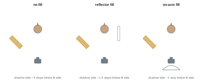
- On-axis fill, placed close to the camera, at or near lens height, lights shadows evenly from the viewer's point of view without creating new shadows that the camera can see. A large umbrella or softbox behind the camera, or a ring light, provides efficient on-axis fill.
- Off-axis fill, placed on the opposite side of the subject from the key, fills the shadow side more directly but can create a second set of shadows and catchlights, flattening the pattern if too strong.
- Overhead or broad fill, from a large bounce surface or a ceiling bounce, gives soft, general fill to a whole set.
Fill should be the larger, softer source in most cases, so that it fills without competing with the key. Watch for double nose shadows and multiple catchlights, signs that fill is creating its own pattern.
Reflectors as fill
Reflectors provide fill without another light and are often preferred for their simplicity and natural look. A white reflector placed on the shadow side, close to the subject and just out of frame, bounces a portion of the key light back into the shadows. The amount of fill depends on the reflector's surface, size, angle and distance: moving it closer increases fill; angling it toward the key and the face maximizes the bounce. Silver reflectors give stronger, more specular fill; gold warms; black surfaces subtract (negative fill). Because reflectors depend on the key light, their fill changes automatically when the key moves, which makes them convenient but less independently adjustable than a fill light.
Negative fill and room fill
In many studios, especially small rooms with white or light walls, light bounces around the room and fills shadows even without a fill light, a phenomenon called room fill or ambient bounce. This can make it impossible to achieve dramatic ratios. Negative fill, using black flags, V-flats or fabric placed close to the shadow side, absorbs this bounced light and deepens shadows (Lesson 6). Painting studio walls a neutral dark grey, using black curtains, and gridding modifiers to reduce spill give more control over contrast. Conversely, a white room can be used deliberately as a giant reflector for soft, low-contrast work.
Ratios and mood
Ratios contribute strongly to the mood of a portrait. Low ratios, around 2:1 or less, produce bright, open, approachable images associated with commercial, corporate, family, beauty and children's portraits. Medium ratios, around 3:1 to 4:1, create natural modelling that suits most editorial and personal portraits. High ratios, 8:1 and above, create drama, mystery and intensity suited to character studies, film noir styles and artistic portraits. Ratios also interact with the key pattern: a split light at 2:1 looks quite different from a split light at 16:1. Decide the mood first, then choose a pattern and ratio to support it.
Ratios, skin tone and genre
The same numerical ratio can look different on different skin tones and in different genres. On darker skin, high ratios can make the shadow side fall into deep shadow with little detail, while well-placed fill and larger sources with controlled highlights reveal form and the warmth and variety of skin colour; photographers often use lower ratios or slightly more exposure on the shadow side for darker skin, while keeping shape. On very light skin, low ratios can make faces look flat and washed out, and slightly higher ratios add definition. When photographing several people with different skin tones together, light each so that both lit and shadow sides look natural, rather than applying one ratio to all. Genre conventions also matter: corporate headshot clients usually expect gentle ratios, while editorial and fine art portraits can be bolder.
Background and subject ratios
Ratios also describe the relationship between the subject and the background. A background metered two stops below the key appears noticeably darker than the subject; a background metered at the same value as the key appears similar in brightness to the face; a white background must be metered about one to one-and-a-half stops brighter than the key to render pure white (Lesson 9). Similarly, hair and rim lights are often set equal to or slightly brighter than the key, depending on hair colour and the desired effect: dark hair may need a rim light one stop brighter than the key to show, while blonde or grey hair may need it a stop below to avoid blowing out.
| Light | Typical setting relative to key | Notes |
|---|---|---|
| Fill | 1–3 stops below key | Sets shadow depth |
| Hair light | 0 to +1 stop (dark hair), −1 stop (light hair) | Avoid blowing out light hair |
| Rim light | 0 to +1 stop | Flag to prevent lens flare |
| Background (grey) | 1–2 stops below key | Separation and tone |
| Background (white) | +1 to +1.5 stops | Pure white without excessive spill |
Lighting contrast and the final image
Lighting ratios on set interact with processing. Raw files from modern cameras capture a wide dynamic range, so a 4:1 ratio on set can be made to look like 2:1 or 8:1 in editing by changing contrast and shadows, and many photographers light with slightly lower ratios than the final look, then add contrast in post. However, lighting contrast cannot be entirely recreated in editing: shadows created by light have shape and gradation that global contrast adjustments cannot replicate, and lifting very dark shadows adds noise. Getting the ratio close to the intended look on set produces the best results and saves editing time.
Reading ratios in images
Ratios can be judged directly in images. In a raw processor, sample the brightness of the lit and shadow cheeks with a colour sampler: if the lit cheek reads about 70 % and the shadow cheek about 35 %, the difference is roughly one stop in display terms, though the tone curve compresses the relationship slightly. A more reliable method is to compare with a reference series shot at known ratios. Building a reference sheet of the same face at 1:1, 2:1, 4:1, 8:1 and 16:1 is a valuable exercise that trains the eye to recognize ratios quickly in any image.
Fill and catchlights
Fill lights create their own catchlights, which may compete with the key's catchlight. On-axis fill from a large umbrella behind the camera produces a large, dim catchlight near the centre of the eye, which can look unnatural if bright. Reflectors placed below the face create catchlights in the lower part of the iris, which is normal in clamshell lighting and generally accepted. Many retouchers reduce or remove secondary catchlights so that the key's catchlight dominates. When using strong fill, check the eyes closely and consider whether the fill's catchlight helps or distracts.
Contrast for different outputs
The appropriate contrast can depend on where the image will be seen. Images for small screens often benefit from slightly more contrast to remain clear at small sizes; images for print, especially on matte papers, lose some contrast, so a slightly higher ratio or contrast in editing may be needed. Black-and-white portraits often use higher ratios to create tonal separation that colour would otherwise provide. Corporate and e-commerce clients may require low contrast for consistency and clarity. Discuss the intended use with clients to set ratios appropriately.
Practising ratios
A practical exercise is to set up a single key light for loop lighting and photograph the same subject with no fill, a black flag on the shadow side, a white reflector at 1.5 m, the reflector at 0.5 m, a fill light at one stop under the key and a fill light at two stops under. Meter each and record the ratio. Comparing the six images side by side shows how much control fill provides, and how small changes in reflector distance can alter the mood of a portrait.
Fill and editing
Some photographers light with modest fill and then adjust shadow depth in editing, giving a choice of moods from one capture. This works well within about a stop, but beyond that, lifted shadows look flat and noisy.
Common mistakes
MistakeMixing ratio conventions without noticing.
InsteadState ratios as stop differences or specify the convention.
MistakeUsing fill so strong it creates its own shadows.
InsteadKeep fill softer, dimmer and near the camera axis.
MistakeFighting white walls with more key light.
InsteadUse negative fill and grids.
MistakeApplying one ratio to all skin tones.
InsteadLight each person for natural shadow detail.
MistakeRelying on editing to create all contrast.
InsteadLight close to the intended ratio on set.
Summary and key terms
- Lighting ratios compare the lit and shadow sides of a subject.
- Express ratios as stop differences: ratio equals 2 to the power of the stops.
- Meter each side consistently to set and reproduce ratios.
- Fill lights should be soft and near the camera axis; reflectors give simple, natural fill.
- Negative fill and dark surroundings deepen shadows.
- Ratios shape mood and should suit the face, skin tone and genre.
- Hair, rim and background lights are also set relative to the key.
- Lighting ratio
- Relationship between lit and shadow side brightness.
- Fill light
- Light that lightens shadows.
- On-axis fill
- Fill placed near the camera.
- Off-axis fill
- Fill placed opposite the key.
- Reflector
- Surface that bounces light into shadows.
- Room fill
- Fill from light bouncing off room surfaces.
- Negative fill
- Black surface that subtracts fill.
- High key
- Bright image with low contrast.
- Low key
- Dark image with strong contrast.
- Hair light
- Light that illuminates the hair from above or behind.
Practice problems
Work each problem on paper first, then reveal the answer to check.
What is a 2:1 ratio in stops?
Show answer
One stop.
What ratio is three stops?
Show answer
8:1.
In the key-plus-fill convention, equal key and fill give?
Show answer
2:1.
Lit side f/11, shadow f/5.6: ratio?
Show answer
4:1.
Why place fill near the camera axis?
Show answer
It fills without creating visible new shadows.
How do you increase reflector fill?
Show answer
Move it closer or angle it better.
What ratio suits corporate headshots?
Show answer
About 2:1 to 3:1.
How might ratios differ for darker skin?
Show answer
Often lower ratios or more shadow exposure to keep detail.
White background setting relative to key?
Show answer
About +1 to +1.5 stops.
Why light close to the final ratio?
Show answer
Shadow shape cannot be fully created in editing.
Lesson quiz · 5 questions
Score 60% or more to complete this lesson.
Create a free account to save your progress, take quizzes and earn a certificate.