
PHOT-301 · Lesson 8 of 12 · 25 min
Soft proofing, gamut and print preparation
Soft proofing uses the monitor to simulate how an image will look when printed on a specific printer and paper. Done well, it saves paper, ink and time, and lets you make printing adjustments in advance rather than discovering problems in the print. It also teaches you how different papers behave, so that you can choose the right paper for each image. This lesson explains how soft proofing works, setting up a soft proof, simulating paper white and black, gamut warnings, comparing rendering intents, making proof adjustments with proof copies, visualizing gamuts in three dimensions, the limitations of soft proofing, and hard proofs and test strips.
How soft proofing works
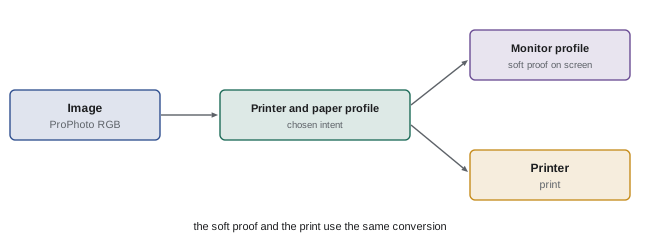
When you soft proof, the application converts the image from its working space to the printer profile, using the chosen rendering intent, exactly as it would when printing, and then converts the result back from the printer profile to the monitor profile for display. The image you see represents the printed colours as reproduced on screen. Out-of-gamut colours appear as the printer would render them; with paper simulation enabled, the screen also shows the paper's white and the reduced density of its black, using the absolute colorimetric relationship to the paper. The quality of the soft proof depends on an accurate printer profile, a calibrated and profiled monitor with a gamut large enough to show the printer's colours, and appropriate viewing conditions.
Setting up a soft proof
In Photoshop, soft proofing is set under proof setup, choosing the device to simulate (the printer and paper profile), the rendering intent, black point compensation, and the display options for simulating paper colour and black ink. In Lightroom Classic, the soft proofing panel offers the profile, intent and a simulate paper and ink option, and creates proof copies. Capture One uses proof profiles in its output recipes and viewer. Before relying on a soft proof, check that the monitor is calibrated to a brightness similar to paper under your viewing light, ideally view prints in a booth beside the monitor, and use the same profile and settings that you will use to print.
Simulating paper white and black
With paper simulation on, the screen white becomes the paper white, which is usually slightly warmer and less bright than the monitor white, and the darkest values become as light as the printer's maximum black on that paper. On matte papers, blacks may lighten noticeably, and the whole image looks flatter. Many people find the first view disappointing, because the eye has adapted to the bright monitor white; the image seems to lose its sparkle. Viewing the soft proof against a neutral grey or white surround that is also simulated, or hiding interface elements, reduces this effect. The simulation is useful precisely because it shows the real limitations of the paper, prompting adjustments such as opening shadows or adding contrast.
Gamut warnings
Gamut warnings highlight colours in the image that the printer cannot reproduce, usually by overlaying them with a flat colour. In Photoshop, the gamut warning marks out-of-gamut areas; in Lightroom, destination gamut warnings show colours that are out of the printer's gamut, and monitor gamut warnings show colours the monitor cannot display. Gamut warnings tend to be conservative and sometimes flag colours that print acceptably after perceptual rendering, so use them as a guide rather than a rule. They are most useful for identifying where saturated colours, such as flowers, sunsets, clothing and neon, will be compressed or clipped, so that you can decide whether to adjust them locally.
Comparing rendering intents
Soft proofing is the best way to choose between perceptual and relative colorimetric rendering. For each image, toggle between the two and watch saturated areas and shadows. If relative colorimetric looks better overall but some saturated areas lose detail, try reducing saturation slightly in those areas. If perceptual preserves gradation but makes the whole image look slightly dull, it may be the better choice for images with large areas of out-of-gamut colour. Some profiles' perceptual tables also lighten shadows or change contrast; compare carefully. The intent can be chosen per image, so a portfolio might mix both.
Worked problem
Deciding between intents
A landscape has a deep blue lake and green forest. In the soft proof on a lustre paper, relative colorimetric shows the lake slightly flattened in its most saturated part, but everything else looks accurate. Perceptual shows full detail in the lake but makes the forest and sky look a little duller. What should the photographer do?
Show solution
- The out-of-gamut area is limited to part of the lake.
- Relative colorimetric keeps the rest of the image accurate and saturated.
- Create a proof copy and reduce saturation or adjust hue slightly in the lake with a local mask until detail returns in the soft proof.
- Print with relative colorimetric and black point compensation, and compare a test strip of the lake under D50 light.
Answer: Use relative colorimetric with BPC and a small local adjustment to the lake, confirmed with a test strip.
Proof copies and proof adjustments
Adjustments made to compensate for a particular paper should not change the master image, which may be printed on other papers or used for screens. The usual practice is to create a proof copy, a virtual copy in Lightroom or a duplicate layered file in Photoshop, named for the paper, and make paper-specific adjustments to it. Common adjustments include lifting shadows slightly to compensate for dark tones that print heavier than on screen, especially on matte papers; increasing contrast or clarity a little to offset the flatter look of matte papers; small saturation increases for perceptual rendering; local hue and saturation changes to control out-of-gamut areas; and lightening for dim display conditions. Keep the adjustments as small as possible and keep notes, so that future prints on the same paper can start from the same corrections.
| Problem seen in soft proof | Typical adjustment |
|---|---|
| Shadows block up on matte paper | Lift shadows or blacks slightly |
| Image looks flat | Add a gentle tone curve or midtone contrast |
| Saturated colours lose detail | Reduce saturation locally or try perceptual |
| Overall dullness with perceptual | Add a little global vibrance |
| Print for a dim room | Lighten midtones slightly |
Visualizing gamuts
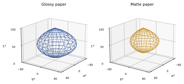
Colour gamuts are three-dimensional: a printer may reproduce saturated colours only at certain lightness levels, for example deep blues only in dark tones and bright yellows only in light tones. Two-dimensional chromaticity plots hide this. Tools such as ColorSync Utility on macOS, ColorThink and online gamut viewers plot gamuts as three-dimensional solids in CIELAB, allowing comparison of papers, printers and working spaces, and even plotting an image's colours against a printer gamut. Such visualizations show why glossy papers reproduce deeper, more saturated shadows than matte papers, why some image colours are out of gamut, and how much of Adobe RGB a printer actually covers. Gamut volume, measured in cubic Delta E units, is a useful single number for comparing papers.
Limitations of soft proofing
Soft proofing cannot be perfect. A monitor cannot show the texture, sheen, bronzing and surface of a paper, or how ink sits on rough watercolour fibres. It shows emitted light rather than reflected light, so adaptation differs. A monitor may not cover the printer's gamut in some areas, such as saturated cyans and yellows, especially standard-gamut monitors. Profiles are approximations, and their accuracy varies across the gamut. Paper simulation depends on the profile's measurement of paper white, which for papers with optical brighteners depends on UV conditions. Soft proofing therefore narrows the gap between screen and print but does not replace a test print for important work.
Hard proofs and test strips
A hard proof is a physical print made to check colour and tone before final printing, either on the final paper or, in commercial printing, on a proofing system that simulates the press. For fine art printing, the most economical approach is test strips: printing narrow strips of the most critical areas of an image, such as a face, a gradient and a saturated detail, at final size on the final paper, perhaps with small variations in brightness or saturation, and comparing them under the viewing light. Strips save paper and ink while revealing problems that soft proofing missed. Some photographers make small full-image proofs on the same paper as a final check before large prints. Label every proof with the file, settings and date on the back.
Soft proofing for labs and presses
Soft proofing is also useful when sending files to labs and commercial printers. Many labs publish ICC profiles for their printers and papers, which you can use to soft proof, even if the lab asks you to send files in sRGB or Adobe RGB. For books and magazines printed on offset presses, designers soft proof with standard press profiles such as FOGRA, GRACoL or SWOP characterizations, or profiles supplied by the printer, which show how much smaller the gamut of uncoated or coated press stock is than photo paper. Photographers delivering images for print publications should soft proof with the publisher's profile and avoid relying on colours that will not reproduce.
Comparing papers with soft proofing
Soft proofing is an efficient way to choose papers. Open several proof views of the same image with different paper profiles side by side, with paper simulation on, and compare how each renders shadows, saturated colours and highlights. The comparison shows, for example, that a dark, saturated night scene will lose much of its depth on a matte paper, while a soft, foggy landscape changes very little. Narrow the choice to one or two papers, then make test strips.
Soft proofing black-and-white images
For black-and-white images printed through a colour profile, soft proofing works as for colour images, showing paper white and black and any slight colour tint the profile may introduce. For images printed with manufacturer black-and-white modes, which bypass ICC colour management, standard paper profiles do not apply. Custom greyscale profiles, which can be built by printing and measuring a grey step wedge in the black-and-white mode, allow soft proofing of tone. Otherwise, test strips are the main tool.
Building a soft-proof routine
An efficient routine might be: open the image, enable soft proofing with the chosen paper profile, compare perceptual and relative colorimetric with paper simulation on, check gamut warnings, create a proof copy, make small adjustments to tone and saturation, compare the proof copy and the master side by side, and print a test strip. Keep notes of typical adjustments for each paper, which speeds up future prints and builds your understanding of each material.
Monitors and paper white simulation
The accuracy of paper simulation depends on the monitor's black and white. If the monitor's black is much deeper than the paper's, the simulated black lifts noticeably; if the monitor is much brighter than the paper under the viewing light, the simulation looks dim. Calibrating the monitor to a sensible luminance, and viewing prints in a booth dimmed to match, makes the soft proof a closer guide to the print.
When the print does not match the proof
If a print differs noticeably from the soft proof, check settings before editing the image: confirm the profile, media type, quality and black ink in the driver, that driver colour management was off, that the monitor is calibrated and that the print has dried. Then compare under the correct viewing light. Systematic differences across many images point to a profile or monitor problem rather than individual images.
Common mistakes
MistakeSoft proofing on an uncalibrated or overly bright monitor.
InsteadCalibrate and match brightness to paper under the viewing light.
MistakeMaking paper-specific changes to the master.
InsteadUse proof copies named for each paper.
MistakeTreating gamut warnings as absolute.
InsteadUse them as guides and judge the proof visually.
MistakeAlways using the same rendering intent.
InsteadCompare intents for each image.
MistakeSkipping test prints for important work.
InsteadPrint test strips of critical areas.
Summary and key terms
- Soft proofing simulates the printer conversion on screen.
- Paper simulation shows paper white and maximum black.
- Gamut warnings mark colours the printer cannot reproduce.
- Compare perceptual and relative colorimetric for each image.
- Make paper-specific adjustments to proof copies, not masters.
- Three-dimensional gamut views explain paper and printer differences.
- Soft proofs have limits; test strips confirm critical areas.
- Soft proof
- On-screen simulation of printed output.
- Proof setup
- Settings defining the simulated output.
- Paper simulation
- Showing paper white and black on screen.
- Gamut warning
- Overlay marking out-of-gamut colours.
- Proof copy
- Duplicate or virtual copy adjusted for a paper.
- Gamut volume
- Size of a gamut in CIELAB.
- Hard proof
- Physical print made to check output.
- Test strip
- Small print of critical image areas.
- Bronzing
- Metallic sheen on dark areas of some prints.
- Destination gamut
- Gamut of the output device.
Practice problems
Work each problem on paper first, then reveal the answer to check.
What does soft proofing simulate?
Show answer
The printed result on a specific printer and paper.
Which conversions does a soft proof perform?
Show answer
Working space to printer profile, then to monitor profile.
Why does paper simulation look disappointing at first?
Show answer
The eye is adapted to the bright monitor white.
What do gamut warnings show?
Show answer
Colours the printer cannot reproduce.
Why compare intents per image?
Show answer
The best choice depends on the image's colours.
Where should paper-specific edits go?
Show answer
In a proof copy.
Name a common adjustment for matte papers.
Show answer
Lift shadows or add contrast.
Why view gamuts in 3D?
Show answer
Colours are reproducible only at certain lightness levels.
Name two limits of soft proofing.
Show answer
No texture or sheen, monitor gamut, emitted light, profile accuracy.
What is a test strip?
Show answer
A small print of critical areas at final size.
Lesson quiz · 5 questions
Score 60% or more to complete this lesson.
Create a free account to save your progress, take quizzes and earn a certificate.