
CINE-401 · Lesson 3 of 12 · 27 min
Developing the look: references, look books and visual grammar
Once the script is broken down, the DP and director develop the look: the set of visual rules that give the film its identity. A look is more than a color grade. It includes the aspect ratio, the capture format, the lens family, the way the camera moves, the lighting philosophy, the palette and the texture of the image. Together these choices form a visual grammar, a consistent language the audience learns to read. This lesson covers how DPs gather and use references, how they build a look book, and how they choose each element of the visual grammar. Film examples are described in words; you should watch the films themselves to see the techniques.
Why a film needs a defined look
A defined look does three jobs. It expresses the story's tone, so a bleak drama and a romantic comedy feel different before a word is spoken. It aligns departments, so the production designer, costume designer, colorist and VFX team all work toward the same image. And it speeds up decisions on set, because when the rules are clear, many questions answer themselves: "We don't use zooms in this film," or "Night scenes are always motivated by practical sources."
A look should be specific enough to guide decisions but flexible enough to survive locations, weather and schedules. "Moody and cinematic" is not a look. "Long lenses, shallow focus, cool and desaturated exteriors, warm practicals at night and a mostly static camera that moves only when Maya takes control" is.
Gathering references
References are images, films and other art that capture something about the intended look. They are a communication tool: words like "gritty" or "lush" mean different things to different people, while a still image is unambiguous.
- Film stills: frames from films with a similar tone, lighting or composition. Use them to discuss specific qualities, not to copy whole films.
- Photography: documentary, fine art and fashion photographers are rich sources for light, color and framing.
- Painting: centuries of painters solved the problems of light, composition and color that cinematographers face. The chiaroscuro of Baroque painters, the window light of Dutch interiors and the flat color fields of modern painters all appear in cinema.
- Real life: photographs of actual locations at the right time of day, the color of street lights in the city where the film is set, how a hospital at 3 a.m. actually looks.
- The director's personal references: music, a memory, a novel, a place.
Be careful with references from famous films. They are useful shorthand, but a look built entirely from other films tends to feel derivative. The best look books mix film references with photography, painting and real places.
The look book
A look book (sometimes called a visual bible or mood book) is a document, usually a deck or PDF, that organizes references and visual rules. It is shared with the director, producers, heads of department and often the colorist and VFX supervisor.
- An opening statement of the film's visual idea in one or two sentences.
- The visual rules: aspect ratio, format, lenses, movement, lighting, palette and texture.
- Sections for each major location or story section, with references and notes.
- Character notes: how key characters are framed and lit, and how that changes across the film.
- Key scenes: specific references and ideas for the A scenes from the breakdown.
- Technical notes: camera, lens set, LUT approach and any special equipment.
Look books are working documents. Update them after tests and scouts. A look book that still shows a forest location after the production moved to a city park is worse than none.
Aspect ratio
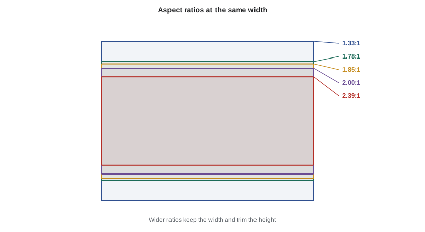
The aspect ratio is the width of the frame divided by its height. It shapes composition and, through it, how the audience feels a space.
| Ratio | Typical use | Compositional character |
|---|---|---|
| 1.33:1 (4:3) | Early cinema, period pieces, some art films | Tall frame, good for single figures and vertical spaces; can feel intimate or confining |
| 1.66:1 | European theatrical, some art films | Between 4:3 and widescreen |
| 1.78:1 (16:9) | Television and streaming default | Fills modern screens; flexible |
| 1.85:1 | North American theatrical widescreen | Slightly wider than television |
| 2.00:1 | Some streaming series | Wide but tall enough for close-ups |
| 2.39:1 | Anamorphic or wide theatrical | Wide frame, emphasises landscapes, isolation, groups and negative space |
Some films change aspect ratio between sections to signal a change in time, place or state of mind. If you do this, decide in prep how the change will be delivered: letterboxing within a single delivery frame, or a deliberate change on screen.
Worked problem
Extracting a 2.39:1 frame from a 16:9 capture
A series is captured in 4K UHD (3840 by 2160 pixels) and delivered with a 2.39:1 extraction for some flashback sequences. How tall is the extracted frame, and what share of the sensor height is used?
Show solution
- Height = width ÷ ratio = 3840 ÷ 2.39 ≈ 1607 pixels.
- Share of height: 1607 ÷ 2160 ≈ 0.744, or about 74 %.
- Frame lines for 2.39:1 must be loaded into the camera and monitors so operators compose for the extraction, with the rest of the frame as protection.
Answer: The extraction is 3840 by about 1607 pixels, using about 74 % of the sensor height. Operators must frame for it on set, and the top and bottom of the sensor become safety margin.
Capture format
The capture format is the camera, sensor size and recording format. Course CINE-202 covered sensors, codecs and log recording; here the question is creative.
- Sensor size: larger sensors (full frame and large format) give shallower depth of field at the same field of view and a different relationship between lens and space. Super 35 remains common and cost-effective, with a vast range of lenses.
- Spherical or anamorphic: anamorphic lenses squeeze a wide image onto the sensor and produce oval bokeh, horizontal flares and a characteristic falloff. They can also be heavier, slower and harder to focus.
- Film or digital: some productions still shoot 35 mm or 16 mm film for its texture, color response and the discipline it imposes. Film needs a lab, scanning and a different workflow and budget.
- Recording resolution and codec: driven by delivery requirements (many streamers specify minimum resolutions and approved cameras), VFX needs and data budgets.
Worked problem
Matching field of view across sensor sizes
The director loves the look of a 35 mm lens on a Super 35 camera, about 25 mm wide. The production will shoot on a full-frame camera about 36 mm wide. What focal length gives the same horizontal field of view?
Show solution
- Field of view depends on sensor width divided by focal length. To match, keep that ratio constant.
- Scale the focal length by the ratio of sensor widths: \( f_{FF} = f_{S35} \times \frac{w_{FF}}{w_{S35}} = 35 \times \frac{36}{25} \approx 50 \) mm.
- The horizontal field of view in both cases is \( 2\arctan\left(\frac{25}{2 \times 35}\right) \approx 39^\circ \).
Answer: About 50 mm on full frame matches a 35 mm lens on Super 35. The perspective from the same camera position is the same, but depth of field at the same stop will be shallower on full frame.
The lens family
The choice of lens set is one of the most important look decisions. Lenses differ in sharpness, contrast, flare, color rendering, bokeh, distortion and how they render skin.
- Modern high-performance primes: sharp, clean, consistent across the set; a neutral starting point.
- Vintage or rehoused vintage glass: lower contrast, softer edges, warmer or cooler color casts, more flare; character that can soften digital sensors.
- Anamorphics: as above, with distinctive flare and falloff.
- Zooms: flexible and fast to work with, often used on television and documentary-style dramas; a deliberate zoom move has its own visual meaning.
Lens choice also means choosing a focal length strategy. Some films use a narrow range of focal lengths for consistency; others assign wide lenses to one character or world and long lenses to another. A common approach is to shoot close-ups on wider lenses closer to the actor for intimacy, or on longer lenses from further away for observation and compression.
Camera movement philosophy
How and when the camera moves is part of the grammar. Course CINE-302 covered dollies, cranes, Steadicam and gimbals; here the question is meaning.
- Locked-off frames suggest observation, control and stillness; they can also create tension by refusing to follow action.
- Motivated movement follows characters or reveals information, staying invisible because it feels natural.
- Expressive movement, such as slow push-ins, drifting or circling, signals emotion or a shift in perception.
- Handheld suggests immediacy, documentary realism or instability; its intensity can be scaled from subtle breathing to aggressive.
A movement philosophy might state: "The camera is still unless a character moves it." The rule then becomes a tool: when the camera does move without a character, the audience feels it.
Lighting philosophy
The lighting philosophy describes how light behaves in the film's world. Course CINE-301 covered lighting craft; the look book sets the rules.
- Naturalistic: light appears to come from real sources (windows, practicals, the sun) and obeys their behavior.
- Stylized: light expresses emotion or genre more than realism, as in noir, horror or heightened drama.
- Contrast level: low contrast for gentle, open moods; high contrast for tension, secrecy or danger.
- Source quality: hard, directional light versus soft, wrapping light, and how that changes across the story.
- Color temperature strategy: for example, mixing warm practicals and cool moonlight at night, or keeping a neutral daylight balance throughout.
Palette and texture
The palette is agreed with the production designer and costume designer (Lesson 1) and carried through the grade (Course CINE-310). Texture covers grain, sharpness, halation, diffusion and how much detail the image shows.
- Grain can be organic (film) or added in the grade; it adds a sense of materiality and can help blend VFX.
- In-camera diffusion filters soften highlights and skin; strength must be tested because effects change with focal length and exposure.
- Sharpness is a choice: very sharp images can feel clinical; slightly softened images can feel nostalgic or dreamlike.
Writing the visual rules
A concise statement of rules is the core of the look book. Here is an example for a fictional drama.
- Aspect ratio 2.39:1, spherical lenses on a large-format sensor.
- Lenses: rehoused vintage primes, 24 mm to 85 mm. No zooms.
- Movement: static frames in Act 1; slow dolly pushes at revelations; handheld only after the accident in Act 2.
- Light: naturalistic, motivated by windows and practicals. Daylight cool and soft; night warm practicals against blue ambience.
- Palette: muted greens and grays; the only saturated red is Maya's coat.
- Texture: light diffusion on close-ups, fine grain added in the grade.
Rules like these are short enough for every head of department to remember and specific enough to answer questions on set.
Presenting the look
DPs present the look book to the director first, then to producers and heads of department. Producers look for confidence that the look is achievable on the budget; heads of department look for what the look asks of them. Be ready to explain the cost implications of choices such as anamorphic lenses, large lighting packages for night exteriors or a film workflow, and to offer alternatives that keep the spirit of the look at lower cost.
Common mistakes
MistakeDefining the look with vague adjectives such as "cinematic"
InsteadWrite specific rules for aspect ratio, lenses, movement, light, palette and texture
MistakeBuilding a look book only from famous films
InsteadMix film references with photography, painting and real locations
MistakeChoosing anamorphic lenses only because they look impressive
InsteadChoose lenses for what they say about the story and test their practical demands
MistakeChanging aspect ratio without a delivery plan
InsteadDecide in prep how the change will be framed, monitored and delivered
MistakeTreating the look book as finished after the first draft
InsteadUpdate it after tests, scouts and script changes
Summary and key terms
- A look is a set of visual rules covering aspect ratio, format, lenses, movement, light, palette and texture.
- References from film, photography, painting and real life communicate the look more clearly than words.
- The look book organizes references, rules, locations, characters and key scenes for all departments.
- Aspect ratio shapes composition; extractions must be framed for on set with loaded frame lines.
- Sensor size, spherical or anamorphic lenses and film or digital capture are creative as well as technical choices.
- Movement and lighting philosophies give the camera and light consistent meaning across the film.
- Short, specific visual rules speed up decisions on set and keep departments aligned.
- Look
- The set of visual rules that give a film its identity
- Visual grammar
- The consistent visual language a film uses, which the audience learns to read
- Look book
- A document organizing references and visual rules for a production
- Aspect ratio
- The width of the frame divided by its height
- Extraction
- A smaller frame taken from a larger capture area for delivery
- Anamorphic lens
- A lens that squeezes a wide image horizontally onto the sensor
- Lens family
- The set of lenses chosen for a film, with a shared character
- Motivated movement
- Camera movement that follows a character or action and feels natural
- Palette
- The range of colors chosen for sets, costumes and the grade
- Texture
- The grain, sharpness, diffusion and detail of the image
Practice problems
Work each problem on paper first, then reveal the answer to check.
Rewrite "dark and moody" as a specific visual rule.
Show answer
For example: high contrast, motivated low-key light, warm practicals against cool ambience, with faces often half in shadow
How tall is a 2.00:1 extraction from a 3840-pixel-wide frame?
Show answer
3840 ÷ 2 = 1920 pixels
What full-frame focal length matches a 50 mm lens on a 25 mm wide Super 35 sensor?
Show answer
50 × 36 ÷ 25 = 72 mm, so about 75 mm
Give two reasons painting is a useful reference source.
Show answer
Painters solved problems of light, composition and color; references from painting help avoid derivative looks
What does a locked-off camera often suggest?
Show answer
Observation, control or stillness, and sometimes tension when it refuses to follow action
Why update the look book after tests?
Show answer
Tests reveal what actually works on camera, so the rules and references should reflect them
Name two practical drawbacks of anamorphic lenses.
Show answer
Weight, slower apertures, harder focus or higher rental cost
What is a lighting philosophy?
Show answer
A statement of how light behaves in the film's world, such as naturalistic or stylized, contrast level and source quality
Why should producers see the look book?
Show answer
To understand the cost implications and gain confidence that the look is achievable
Why use a single saturated color sparingly?
Show answer
So it stands out and carries meaning as a motif
Lesson quiz · 5 questions
Score 60% or more to complete this lesson.
Create a free account to save your progress, take quizzes and earn a certificate.