
CRE-110 · Lesson 8 of 12 · 25 min
Visual identity
In a crowded feed, viewers decide in a fraction of a second whether to stop, and much of that decision is visual. A consistent visual identity lets returning viewers spot your work instantly, signals quality and personality to newcomers, and ties together everything you publish across platforms. Visual identity includes the obvious elements, such as a logo, colors and fonts, but for creators it extends to thumbnails, on-camera settings, wardrobe, graphics, editing style and even sound. This lesson explains the elements of a creator's visual identity, the principles that make them effective, how to design thumbnails and templates that stay consistent without becoming repetitive, how to make visuals accessible, and how to document everything in a simple style guide.
Elements of visual identity
- Name mark or logo: a wordmark (the name set in a distinctive font), a symbol, or both. Many creators use a simple wordmark or their own face as the profile image; faces are recognized faster than abstract symbols, especially at small sizes.
- Color palette: a small set of colors used consistently, usually one or two main brand colors, one accent color, and neutrals for backgrounds and text.
- Typography: one or two typefaces for titles, thumbnails and graphics, chosen for legibility and personality.
- Imagery style: the look of photographs and video: lighting, color grading, framing, and what typically appears in frame.
- Thumbnails and cover images: the most important visual asset for discovery on most video platforms.
- Graphic elements: lower thirds, title cards, icons, shapes, borders and transitions.
- Set and wardrobe: the recognizable environment and personal appearance on camera.
- Motion and sound: intro stings, transitions, music style and sound effects that become associated with the brand.
Principles
- Simplicity: identities that are simple are easier to recognize at small sizes and easier to apply consistently. A profile image is often viewed at well under a centimeter across on a phone.
- Consistency: the same few colors, fonts and layouts, applied every time, build recognition faster than variety.
- Distinctiveness: visual choices should separate you from others in your niche. If every channel in your niche uses red and yellow with shocked faces, a calm palette and clean layout may stand out.
- Fit with voice and position: a calm, practical brand should not look like an energy-drink advertisement. Colors, type and imagery should express the same personality as the voice chart (Lesson 7).
- Flexibility: the system must work in many formats: vertical and horizontal video, square posts, banners, newsletters, merchandise and sponsor decks.
Color
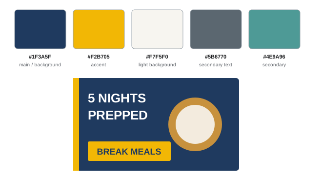
Colors carry associations that vary by culture and context, but some are broadly recognized: blues often suggest calm, trust and technology; greens suggest nature, health and money; reds and oranges suggest energy and urgency; yellows suggest optimism and attention; dark, desaturated palettes suggest seriousness or luxury; pastels suggest softness. Choose a palette that fits your position, test it against competitors' thumbnails, and limit it to three to five colors.
A common rule of thumb for balance is 60-30-10: about 60 % of a design in a dominant (often neutral) color, 30 % in a secondary color, and 10 % in an accent used to draw the eye to the most important element.
Typography
For thumbnails and graphics, choose a bold, highly legible typeface for headlines, often a sans serif, and, if needed, a second complementary typeface for body text. Avoid thin, decorative or script fonts for anything that must be read quickly at small sizes. Limit thumbnail text to a few words (three to five is common) that add to the image rather than repeating the title. Check font licenses: many fonts are free for personal use but require a commercial license for business use, including monetized content and merchandise. Open-license font libraries provide many typefaces that are free for commercial use.
Contrast and accessibility
Text must contrast enough with its background to be readable by people with low vision and on small or dim screens. The Web Content Accessibility Guidelines (WCAG) define a contrast ratio from 1:1 (no contrast) to 21:1 (black on white), and recommend at least 4.5:1 for normal text and 3:1 for large text. Do not rely on color alone to convey meaning (for example, red and green labels), because many people have color vision deficiencies. Captions, readable on-screen text and described visuals extend accessibility further.
Worked problem
Checking contrast
Night Shift Kitchen considers three combinations for thumbnail text: white on deep navy (#1F3A5F), white on warm yellow (#F2B705), and navy on yellow. A contrast checker gives ratios of 11.5:1, 1.8:1 and 6.3:1. Which pass WCAG for large text (3:1) and normal text (4.5:1)?
Show solution
- White on navy: 11.5:1 passes both large (3:1) and normal (4.5:1) text.
- White on yellow: 1.8:1 fails both; it would be hard to read for many viewers, especially at thumbnail size.
- Navy on yellow: 6.3:1 passes both.
- So yellow works as a background for navy text or as an accent shape, but not behind white text.
Answer: Use white on navy or navy on yellow. Avoid white text on yellow. Contrast checkers built into design tools or available free online calculate these ratios.
Thumbnails and cover images
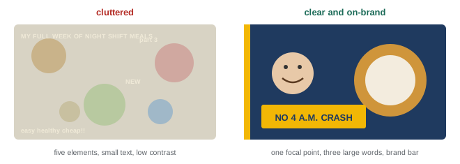
On many platforms, the thumbnail and title together determine whether someone clicks. Effective thumbnails usually have:
- One clear focal point: a face with a readable expression, an object, or a before-and-after, not a cluttered collage.
- High contrast and saturation that stand out against the platform's interface in both light and dark modes.
- Few words, large enough to read on a phone.
- Consistency with the brand: the same palette, fonts and layout family, so returning viewers recognize your work.
- Honesty: the thumbnail must represent what the content actually delivers. Misleading thumbnails may win a click but lose trust and retention, which platforms also measure.
Series benefit from a thumbnail template: a fixed layout and color coding for each series, with only the image and a few words changing. Test thumbnail variations where platforms allow it, and review click-through rate together with retention, since a high click-through rate followed by early drop-off suggests the thumbnail over-promised.
On-camera identity
For creators who appear on camera, the set and personal presentation are part of the visual identity. A recognizable setting (a particular kitchen, workshop, desk or outdoor location), a consistent lighting style and color grade, and a characteristic framing make content identifiable within the first frame. Wardrobe can also become part of the brand, such as a signature color or item, but it should be comfortable and sustainable to maintain. Keep privacy in mind: sets can reveal location details, and backgrounds should be checked for personal information such as addresses, documents or windows showing identifiable surroundings (Lesson 9).
Templates and the style guide
Templates in design and editing software save time and enforce consistency: thumbnail layouts for each series, title cards, lower thirds, end screens, social post frames and a sponsor deck. Store brand assets (logo files in several formats, color codes, fonts, templates, music and sound files with their licenses) in one organized folder.
A visual style guide, often just a few pages, documents: the logo and how to use it, the color palette with codes and roles, typefaces and sizes, thumbnail rules and templates, photography and video style, examples of correct and incorrect use, and accessibility rules. Like the voice guide, it becomes essential when editors, designers or collaborators work on your brand.
Designing on a budget
A professional visual identity does not require an expensive designer at the start. Free and low-cost design tools provide templates, but customize them so you do not look like everyone else using the same template. Hire a designer for a logo or thumbnail system once the niche is validated and you know what you need; provide them with your positioning statement, voice chart and examples of styles you like and dislike. Ensure any contract transfers or licenses the rights you need to use the work commercially.
Sound as identity
Visual identity has an audio counterpart. Recurring music, a short intro sound, consistent background ambience or a recognizable way of speaking at the start of each video all help audiences identify a creator, sometimes even when they are not looking at the screen. Choose music and sound effects that match the voice and position: calm acoustic music suits a relaxed cooking channel, while energetic electronic tracks may suit a fast-paced gaming channel. Licensing matters as much for audio as for fonts and images. Use music from libraries that grant commercial rights for online video, keep records of licenses, and avoid popular songs unless you have the rights, since copyright claims can remove income or content.
Testing your visual identity
Visual decisions should be tested, not just admired. Place your thumbnail designs in a mock-up of the platform feed, alongside competitors' thumbnails, and view them on a phone at normal size. Do yours stand out? Can you read the text? Ask a few people in your target audience which thumbnails they would click and why. Look at your designs in grayscale to check that they still work without color, which helps viewers with color vision deficiencies and reveals weak contrast. Repeat these checks whenever you update templates.
Consistency should be checked across platforms too. Gather your profile images, banners, recent thumbnails and posts on one page and look at them together. Do they look like they come from the same creator? Inconsistent colors, fonts or styles often creep in over time, especially when several tools or people are involved. A quick audit every few months keeps the identity coherent.
Evolving the visual identity
Visual identities age. Styles that look fresh today can look dated in a few years, and a creator's own taste and skills change. Small, regular refinements, adjusting thumbnail layouts, refreshing a banner, updating fonts, keep the identity current without losing recognition. Larger redesigns should be planned like rebrands (Lesson 11): keep the most recognizable elements, introduce changes consistently across platforms at the same time, and explain the change if it is significant. Avoid frequent, dramatic redesigns, which reset the recognition you have built.
Whatever your budget, remember that the visual identity serves the content and the audience. A modest but consistent, legible and honest identity supports a brand far better than an elaborate design that is hard to maintain or that promises more polish than the content delivers. Start with the essentials, a profile image, a palette, a font and a thumbnail template, and refine them as you learn what your audience responds to.
Finally, document decisions as you make them. Each time you settle a color, a font size or a thumbnail rule, add it to the style guide with an example. A guide built gradually from real decisions is more useful than one written all at once before you have published anything, and it captures the reasons behind each choice for anyone who helps you later.
Common mistakes
MistakeUsing many colors and fonts for variety.
InsteadLimit the palette and typefaces and apply them consistently.
MistakePlacing white text on light colors.
InsteadCheck contrast against WCAG ratios.
MistakeCluttered thumbnails with long text.
InsteadUse one focal point and a few large words.
MistakeMisleading thumbnails that over-promise.
InsteadRepresent the content honestly; check retention with click-through rate.
MistakeUsing fonts and music without checking licenses.
InsteadConfirm commercial use rights for all assets.
Summary and key terms
- Visual identity includes logo, colors, type, imagery, thumbnails, graphics, set, wardrobe, motion and sound.
- Effective identities are simple, consistent, distinctive, on-voice and flexible.
- Use a limited palette with roles and a 60-30-10 balance.
- Choose legible typefaces and check commercial licenses.
- Meet WCAG contrast of 4.5:1 for normal and 3:1 for large text; do not rely on color alone.
- Thumbnails need one focal point, contrast, few words, brand consistency and honesty.
- Templates and a short style guide keep the identity consistent as you grow.
- Visual identity
- The consistent visual elements of a brand.
- Wordmark
- A logo formed by a name in a distinctive typeface.
- Color palette
- The small set of brand colors and their roles.
- 60-30-10 rule
- A color balance of dominant, secondary and accent colors.
- Typeface
- A family of fonts sharing a design.
- Contrast ratio
- A measure of luminance difference between text and background.
- WCAG
- Web Content Accessibility Guidelines.
- Thumbnail
- The preview image that represents a piece of content.
- Template
- A reusable layout for consistent assets.
- Style guide
- A document describing how to apply the visual identity.
Practice problems
Work each problem on paper first, then reveal the answer to check.
List six elements of a creator's visual identity.
Show answer
Logo, palette, typography, imagery style, thumbnails, graphics, set, wardrobe, motion and sound.
Why is simplicity important for profile images?
Show answer
They are viewed at very small sizes.
Describe the 60-30-10 rule.
Show answer
60 % dominant color, 30 % secondary, 10 % accent.
Why avoid script fonts on thumbnails?
Show answer
They are hard to read quickly at small sizes.
What WCAG contrast ratio is recommended for normal text?
Show answer
At least 4.5:1.
A combination has 2.5:1 contrast. Is it suitable for large text?
Show answer
No; large text needs at least 3:1.
Why should color not carry meaning alone?
Show answer
Many people have color vision deficiencies.
High click-through rate but early drop-off suggests what?
Show answer
The thumbnail or title over-promised.
What privacy checks apply to a filming set?
Show answer
Remove addresses, documents and identifiable views.
What should a designer receive before creating a logo?
Show answer
Positioning statement, voice chart and style examples.
Lesson quiz · 5 questions
Score 60% or more to complete this lesson.
Create a free account to save your progress, take quizzes and earn a certificate.