
VIS-110 · Lesson 9 of 12 · 24 min
Describing and reproducing colour: models, spaces and gamuts
Once light has been captured, colour must be represented as numbers, processed, stored, transmitted and finally reproduced on a screen or a print. Each step uses a particular way of describing colour, and each device can reproduce only a limited range of colours. Mismatches between these descriptions are the cause of familiar problems: images that look dull when uploaded, prints that do not match the screen, skies that band into steps, and footage that looks washed out in one program and correct in another. This lesson explains additive and subtractive colour, the RGB and CMYK models, hue-saturation-lightness descriptions, the CIE system and chromaticity diagram, colour spaces and gamuts such as sRGB, Display P3 and Rec. 2020, transfer functions and gamma, bit depth and banding, perceptual colour difference, and the basics of colour management and calibration.
Additive and subtractive colour
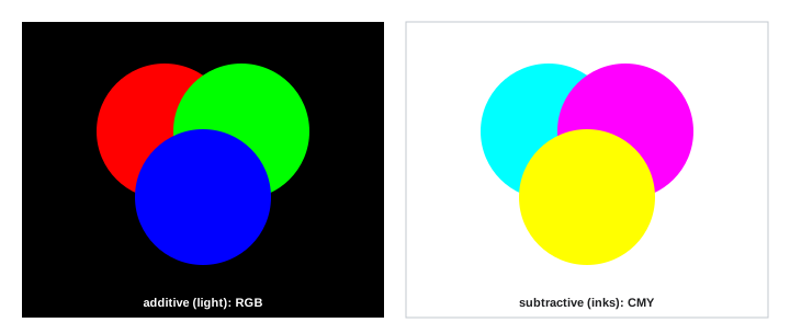
Additive colour mixes light. Red, green and blue light combine to make white; red and green make yellow, green and blue make cyan, and blue and red make magenta. Screens, projectors, LED walls and camera sensors work additively. Subtractive colour mixes inks, dyes or filters that absorb light. Cyan absorbs red, magenta absorbs green and yellow absorbs blue, so mixing all three ideally absorbs everything, giving black. Printing uses cyan, magenta, yellow and black (CMYK), with black ink (K) added because real CMY inks make a muddy dark brown rather than a clean black and because black ink is cheaper and sharper for text. Painters' traditional red-yellow-blue wheel is a historical subtractive approximation.
Hue, saturation and lightness
RGB and CMYK values describe how devices make colours, not how people think about them. Perceptual descriptions use three attributes:
- Hue: the colour family, such as red, orange, yellow, green, blue or purple, arranged around a colour wheel.
- Saturation (or chroma): the purity or intensity of the colour, from grey to vivid.
- Lightness (or value, brightness): how light or dark the colour is.
Models such as HSL and HSV (HSB) rearrange RGB values into these attributes for colour pickers and editing tools, though they are not perceptually uniform: a fully saturated yellow and a fully saturated blue with the same HSL lightness look very different in brightness. Colour grading and photo editing software often provides hue-saturation-luminance controls that let image makers adjust, for example, only the saturation of greens or the luminance of oranges (skin tones).
The CIE system
To describe colour independently of any device, the International Commission on Illumination (CIE) defined in 1931 a set of colour-matching functions based on experiments with human observers, from which any spectrum can be converted to three values, X, Y and Z. Y corresponds to luminance. Normalizing X and Y by the total gives chromaticity coordinates (x, y), which can be plotted on the CIE chromaticity diagram: a horseshoe-shaped region containing every colour humans can see, with pure spectral colours along the curved edge and white near the middle. The blackbody curve runs through the diagram, marking colour temperatures (Lesson 7), and standard white points such as D65 (about 6,500 K, used for displays and video) and D50 (about 5,000 K, used in printing) are marked on it.
Later CIE models such as CIELAB (L*, a*, b*) were designed to be more perceptually uniform: equal distances represent roughly equal perceived differences. L* is lightness, a* runs from green to red and b* from blue to yellow, echoing the opponent channels of vision (Lesson 8). Colour differences are expressed as ΔE; a ΔE around 1 is about the smallest difference a trained observer can notice side by side, and values under 2 to 3 are often acceptable for product colour matching.
Colour spaces and gamuts
A colour space defines exactly what RGB numbers mean: the chromaticities of its three primaries, its white point and its transfer function. The range of colours it can represent, shown as a triangle on the chromaticity diagram, is its gamut. Common spaces include:
| Colour space | White point | Typical use |
|---|---|---|
| sRGB | D65 | Web, most computer displays and consumer images |
| Rec. 709 (BT.709) | D65 | HD video; same primaries as sRGB |
| Adobe RGB (1998) | D65 | Photography for print, wider greens and cyans |
| DCI-P3 and Display P3 | DCI white / D65 | Digital cinema projection; modern phones and laptops |
| Rec. 2020 (BT.2020) | D65 | UHD and HDR video; very wide gamut |
| ProPhoto RGB and ACES | D50 / about D60 | Editing and archiving with very large gamuts |
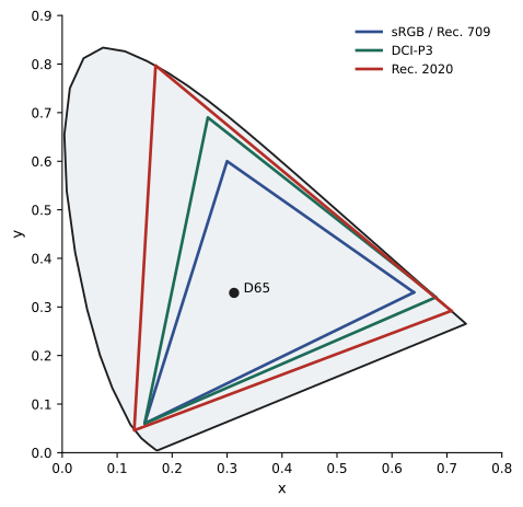
Colours outside a device's gamut cannot be reproduced exactly and must be mapped into it, which can shift or desaturate them. A vivid cyan sky or saturated orange flower captured by a camera may be outside sRGB, so it looks less vivid on the web than on a wide-gamut display, and may print differently again.
Transfer functions and gamma
Camera sensors respond linearly to light: twice the photons give twice the signal. Human perception of lightness is not linear (Lesson 3), and storing linear values efficiently would waste most of the available codes on bright tones. Video and image formats therefore apply a transfer function that allocates more code values to darker tones. Traditional displays use a gamma curve, with an exponent of about 2.2 to 2.4 (sRGB uses a piecewise curve close to 2.2; BT.1886 specifies 2.4 for HD video viewing). Cameras also offer log encodings, curves that record a wide dynamic range in a flat-looking image for later grading, and high dynamic range video uses curves such as PQ (Perceptual Quantizer, SMPTE ST 2084) and HLG (Hybrid Log-Gamma), which represent much higher brightness levels, up to thousands of nits.
Mismatched transfer functions cause many visible errors: log footage viewed without a conversion looks grey and flat; an image tagged with the wrong gamma looks too dark or washed out.
Bit depth and banding
Bit depth determines how many levels each channel can represent: 8 bits give 256 levels per channel (about 16.7 million combinations), 10 bits give 1,024 and 12 bits give 4,096. Smooth gradients such as skies, studio backdrops and shadows can show visible steps (banding) when too few levels are available, especially after strong grading or compression. Higher bit depths, 10-bit or more for professional video and 16-bit for photographic editing, allow heavy adjustments without banding; adding a small amount of noise (dithering) also hides banding.
Worked problem
Levels across a gradient
A sky gradient spans only 30 % of the luminance range across 3,000 pixels of an image. How many distinct levels per channel are available in 8-bit and 10-bit, and how wide is each band in pixels?
Show solution
- 8-bit: 30 % of 256 ≈ 77 levels; 3,000 ÷ 77 ≈ 39 pixels per step.
- 10-bit: 30 % of 1,024 ≈ 307 levels; 3,000 ÷ 307 ≈ 10 pixels per step.
- Steps 39 pixels wide can become visible bands after grading or compression; 10-pixel steps are far less noticeable.
Answer: About 77 levels in 8-bit versus 307 in 10-bit. Higher bit depth keeps gradients smooth.
Colour management
Colour management keeps colours consistent from capture to output. Each device is characterized by a profile (in photography, usually an ICC profile) that describes its colour behaviour; software converts colours between profiles so that, for example, an image edited on a calibrated display prints with predictable colours. Key practices include:
- Calibrate and profile displays regularly with a hardware calibrator, setting the white point (usually D65), brightness and gamma appropriate to the work.
- Edit in a controlled environment with neutral surroundings and consistent, moderate lighting.
- Keep track of colour spaces: tag files with their colour space and convert deliberately when delivering (for example to sRGB for the web).
- For print, soft-proof with the printer's profile and choose a rendering intent (perceptual or relative colorimetric) to handle out-of-gamut colours.
- In video, follow the delivery specification (Rec. 709, P3 or Rec. 2020 with a given transfer function) and use colour-managed pipelines such as ACES for complex productions.
Colour pipelines in practice
A typical photography workflow captures raw files, processes them in a wide-gamut working space such as ProPhoto RGB or Adobe RGB at 16 bits, edits on a calibrated display, and exports to sRGB for the web or to a printer's profile for print. A typical video workflow captures in a camera log format, views through a LUT that converts to Rec. 709 for monitoring, grades in a colour-managed environment (often ACES or the grading software's own managed space), and delivers in the specified format, Rec. 709 for standard broadcast or Rec. 2020 with PQ or HLG for HDR streaming.
Most problems arise at the hand-offs: a file exported without a colour space tag, a LUT applied twice, footage interpreted with the wrong transfer function, or a display set to the wrong mode. A short checklist at each hand-off, confirming colour space, transfer function, bit depth and LUT status, prevents most of them.
Choosing settings for delivery
Before starting a project, find out where the images will be seen: social media, websites, broadcast, cinema, print, or several of these. The delivery requirements determine the colour space, bit depth, transfer function and file format needed, and therefore influence capture settings. Capturing in a wider gamut and higher bit depth than the delivery requires keeps options open, as long as conversions are done carefully at the end.
Understanding these technical foundations does not require memorizing every standard. The essential habits are to know what colour space and transfer function each file uses, to keep wide gamut and high bit depth through editing, to view on calibrated displays, and to convert deliberately for each delivery. With those habits, colour remains predictable from capture to audience.
When problems do occur, a systematic check of each stage, capture settings, file tags, software interpretation, display mode and export settings, usually reveals the cause quickly.
Common colour space mistakes
Several mistakes recur so often that they deserve a checklist. Uploading a wide-gamut image without converting to sRGB can make it look dull or oversaturated, depending on the viewer's software. Exporting video with mismatched colour tags can make it look washed out or too contrasty on some players, a long-standing problem with certain editing and playback combinations. Editing on a wide-gamut laptop display without colour management can make colours look more saturated than they will appear to most viewers. Applying a LUT designed for one camera's log curve to another camera's footage produces incorrect colours. And grading HDR footage on a standard display gives no accurate view of highlights.
Avoiding these mistakes requires little more than awareness and consistent habits: check the colour settings at each stage, keep reference images, and test the final output on several typical devices before delivery.
Calibration in practice
Display calibration uses a colorimeter or spectrophotometer placed against the screen while software displays test patches. The software measures the display's actual colours and builds a profile, or adjusts the display's internal settings, so that it shows colours accurately according to the chosen standard. Professional displays for colour grading are recalibrated regularly, often monthly or more, and checked against reference patterns. Even for students, a basic calibrator greatly improves consistency between editing and final viewing.
Common mistakes
MistakeAssuming RGB numbers mean the same thing everywhere.
InsteadKnow and tag the colour space of every file.
MistakeViewing log footage without a conversion.
InsteadApply the correct transform or LUT for viewing.
MistakeGrading skies heavily in 8-bit files.
InsteadUse 10-bit or higher for heavy grading.
MistakeEditing on an uncalibrated monitor.
InsteadCalibrate and profile displays regularly.
MistakeExpecting wide-gamut colours to survive sRGB delivery unchanged.
InsteadPreview and adjust for the delivery gamut.
Summary and key terms
- Additive RGB mixes light; subtractive CMYK mixes inks that absorb light.
- Hue, saturation and lightness describe colours perceptually; HSL and HSV are convenient but not uniform.
- CIE XYZ and the chromaticity diagram describe colour independently of devices; CIELAB and ΔE measure differences.
- Colour spaces define primaries, white point and transfer function; gamuts range from sRGB to Rec. 2020.
- Transfer functions (gamma, log, PQ, HLG) allocate code values efficiently.
- Bit depth controls levels and banding; 10-bit and above suit heavy grading.
- Colour management uses profiles, calibration and controlled viewing for consistent results.
- Additive colour
- Colour produced by mixing light.
- Subtractive colour
- Colour produced by inks or filters absorbing light.
- Hue
- The colour family.
- Saturation
- The purity or intensity of a colour.
- Chromaticity diagram
- A plot of all visible colours by chromaticity.
- White point
- The colour defined as white in a colour space.
- Gamut
- The range of colours a space or device can reproduce.
- Transfer function
- The curve relating code values to light levels.
- Bit depth
- The number of bits per channel, setting the number of levels.
- ICC profile
- A file describing a device's colour behaviour.
Practice problems
Work each problem on paper first, then reveal the answer to check.
What do red and green light make additively?
Show answer
Yellow.
Why does printing use black ink?
Show answer
CMY make muddy dark brown; black is cleaner and cheaper.
Name the three perceptual attributes of colour.
Show answer
Hue, saturation and lightness.
What does the CIE chromaticity diagram show?
Show answer
All colours visible to humans by chromaticity.
What ΔE is about the smallest noticeable difference?
Show answer
About 1.
Which colour space is used for the web?
Show answer
sRGB.
Which space is used for UHD and HDR video?
Show answer
Rec. 2020.
Why does log footage look flat?
Show answer
It uses a log transfer function for later grading.
How many levels does 10-bit provide per channel?
Show answer
1,024.
Name three colour management practices.
Show answer
Calibrate displays, tag colour spaces, soft-proof prints.
Lesson quiz · 5 questions
Score 60% or more to complete this lesson.
Create a free account to save your progress, take quizzes and earn a certificate.