
PHOT-210 · Lesson 9 of 12 · 25 min
Backgrounds and separation
The background is half of most portraits. It sets the mood, the color palette and the style, and it determines whether the subject stands out clearly or merges into their surroundings. In the studio, backgrounds are chosen and lit deliberately: a pure white for clean commercial images, a mottled canvas for classic portraits, a deep black for drama, a bold color for fashion. This lesson covers background materials, background tone and color, controlling background brightness with distance and light, lighting pure white backgrounds, black and low-key backgrounds, gray backgrounds and their versatility, gradients and spots, separation with hair, rim and background lights, and practical setups.
Background materials
Studio backgrounds come in several forms:
- Seamless paper: rolls typically 1.35 m, 2.72 m or 3.55 m wide, in dozens of colors, hung from a support system or wall-mounted rollers and pulled down to sweep onto the floor, giving a seamless transition with no visible horizon line. Paper is inexpensive, uniform and replaceable; soiled sections are cut off.
- Vinyl backgrounds: washable and durable, popular for children and pets, and available in solid colors and printed textures such as wood, marble and brick.
- Muslin and canvas: fabric backgrounds, often hand-painted with mottled, textured patterns, used for classic portraits; they can be crumpled for texture or stretched for smoothness.
- Collapsible backgrounds: pop-up discs or frames with fabric, quick to set up on location.
- Painted walls and cycloramas: permanent curved walls, called cycs or infinity coves, in large studios, painted white, gray, black or chroma green, used for full-length fashion, groups and video.
- Sets and environments: real or constructed spaces that place the subject in context.
Tone and color
Background tone and color communicate as much as the lighting. White suggests clean, modern, bright and commercial; black suggests drama, elegance and focus; mid-gray is neutral and versatile; colors carry associations and can complement or contrast with the subject's clothing and skin. Color theory helps: complementary colors, opposite each other on the color wheel, create strong contrast, such as a teal background with warm skin; analogous colors create harmony, such as warm brown or ochre backgrounds with warm skin and earth-toned clothing. Muted, desaturated colors tend to look sophisticated; saturated colors look energetic and fashionable. Consider brand colors for corporate and commercial clients, and avoid colors that clash with skin tones or reflect strongly onto the subject.
Controlling background brightness
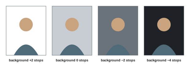
The brightness of a background in the image depends on the light reaching it relative to the light on the subject, not just on its color. A gray background can appear white, gray or black depending on how it is lit:
- Lit with its own light, metered brighter than the key, it appears lighter; lit well above the key, it can turn white.
- Lit only by spill from the key, its brightness depends on distance: moving the subject away from the background, or the key closer to the subject, makes the background darker, following the inverse square law (Lesson 5).
- With no light reaching it, flagged from the key, it can appear nearly black.
This makes a single mid-gray paper one of the most versatile backgrounds: with a background light and gels, it can become white, black, any shade of gray or almost any color.
Worked problem
Darkening a gray background
A subject sits 1 m in front of a gray background, with the key softbox 1.5 m from the subject. The background appears light gray, too bright for the desired moody look. Without adding equipment, how can it be darkened by about two stops?
Show solution
- The key is about 2.5 m from the background and 1.5 m from the subject: the background receives (1.5 ÷ 2.5)² ≈ 0.36 of the subject's light, about 1.5 stops less.
- Move the subject and key forward so the subject is 3 m from the background: the background is now about 4.5 m from the key, receiving (1.5 ÷ 4.5)² ≈ 0.11, about 3.2 stops less.
- Feather the softbox toward the camera side, away from the background, and add a black flag between key and background if needed.
Answer: Increase the subject-to-background distance to about 3 m and feather or flag the key, darkening the background by roughly two more stops.
Pure white backgrounds
Pure white backgrounds, common in commercial, e-commerce and fashion photography, require lighting the background brighter than the subject: about one to one-and-a-half stops above the key reading, so that it records at or just above pure white. Typical setups use two lights aimed at the background from either side, often with umbrellas or softboxes for evenness, placed behind the subject or behind flags so they do not light the subject directly. Common problems include gray or uneven patches where the background is underlit; flare and loss of contrast when the background is overexposed too much and light bounces back onto the subject and into the lens; and bright, glowing edges that eat into hair and clothing, called wraparound. Keeping the subject at least 2 m from the background, flagging the background lights, and using a lens hood help. Check pure white with the camera's highlight warning or RGB values of 255, 255, 255 in editing, and use the floor sweep for full-length shots, lighting it too if needed.
Black and low-key backgrounds
Black backgrounds create drama and focus attention on the subject. Black paper or velvet absorbs most light, but even black surfaces reflect some light and can appear gray when spill from the key reaches them. To keep backgrounds black, place the subject well in front of the background, at 2 to 3 m or more; use gridded softboxes or strip boxes to keep light off the background; flag the key from the background; and expose for the subject so that the background falls several stops below. A background metered four or more stops below the key usually records as black. Low-key portraits often combine a black background with rim lights to separate dark hair and clothing from the darkness.
Gradients, spots and patterns
A single light aimed at the background can create a pool or gradient of light behind the subject, a classic portrait look that adds depth and draws attention to the head. Place a small light, often with a grid or snoot, low behind the subject and aimed up at the background, or to one side for a diagonal gradient. Grids of different angles change the size and softness of the pool. Projected patterns, created with optical spotlights and gobos, or with simple cut-out cards and branches in front of a hard light, add texture such as window frames, blinds or foliage. Gels on background lights add color (Lesson 10).
Separation
Separation means making the subject stand out from the background, so that their outline is clear. It matters most when the subject and background are similar in tone, such as dark hair against a dark background or a white shirt against white. Techniques include:
- Tonal separation: making the background lighter or darker than the subject's edges.
- Hair lights: a small light above and slightly behind the subject, often on a boom with a grid or strip box, lighting the top of the head and shoulders.
- Rim or kicker lights: lights behind and to the side, outlining the edges of the face, hair and body.
- Background lights: lighting the background behind the subject to create a lighter area around their head and shoulders.
- Color separation: contrasting colors between subject and background.
- Depth of field: blurring the background with a wider aperture and greater subject-to-background distance.
| Situation | Separation technique |
|---|---|
| Dark hair on dark background | Hair light or rim light; background spot |
| Light hair on white background | Darker background or reduced background light |
| Dark clothing on black | Rim lights from behind both sides |
| Busy textured background | Greater distance and wider aperture |
| Similar colors | Contrasting background color or gel |
Practical background setups
A few reliable setups cover many needs. A classic portrait uses a mottled gray or brown canvas, with a small gridded background light creating a gentle glow behind the head, a key softbox and a reflector. A clean commercial headshot uses white or light gray paper lit with two background lights to pure or near white, a large soft key and fill. A dramatic low-key portrait uses black paper or velvet far behind the subject, a gridded key, and two strip-box rim lights. A fashion look uses a colored paper with a gelled background light to deepen or change the color, combined with crisp beauty-dish key light. Practice each and note the distances and readings in lighting diagrams for reuse.
Working with paper and floor
Seamless paper is fragile: it creases, tears and marks easily, especially on the floor. Roll down only what you need, tape the end to the floor, ask subjects to remove shoes or wear clean covers, and cut away damaged sections. Lay a sheet of clear acrylic or hardboard on the floor portion for durability and reflections. For full-length shots on white, the floor reflects light upward and may need cleaning in editing; on black, scuffs show as gray marks. Keep spare rolls of the most used colors, and store rolls vertically or on racks to prevent crushing.
Painted and textured backdrops
Hand-painted canvas and muslin backdrops, with mottled tones and soft textures, have been a staple of portrait photography for more than a century and remain popular for classic and fine art portraits. Painters create them with layered washes of color that give depth when lit and when thrown out of focus. Their appearance changes dramatically with lighting: a backdrop lit evenly shows its full texture, while lighting only the center creates a natural vignette; moving the subject farther away and using a wider aperture softens the texture into a gentle blur. Textured backdrops can be expensive, but they give a distinctive, painterly look that plain paper cannot achieve, and they reflect a personal style.
Background color spill and bounce
Brightly colored backgrounds reflect colored light onto the subject, especially when the subject is close to the background or the background is strongly lit. This can tint skin, hair and clothing edges with unwanted color, for example a green tinge from a green background. Keeping the subject farther from the background, flagging background light from the subject, and correcting color casts locally in editing reduce the problem. The same effect can be used deliberately, for example a warm background bouncing a subtle glow onto the subject's edges.
Green screen in the studio
Studios sometimes use green or blue backgrounds for compositing, allowing the background to be replaced in editing or video. For clean keys, light the background evenly and separately from the subject, at a level around middle gray to a stop below the key; place the subject at least 2 to 3 m in front to reduce color spill on edges; add a rim or hair light to separate edges; and avoid green clothing. Photographers increasingly use AI-based background removal on ordinary backgrounds, but green screens remain useful for complex hair and transparent elements and for video.
Background stands and safety
Background support systems carry heavy paper rolls high above the floor. Use sturdy stands with sandbags, keep crossbars secured, and never let anyone stand under a roll being changed. Wall- or ceiling-mounted roller systems are safer and faster in permanent studios, letting several colors be pulled down by chain or motor.
Changing backgrounds between setups is quicker when the support system holds several rolls at once; plan the order of colors so that changes happen during natural breaks in the session, such as wardrobe changes.
Common mistakes
MistakePlacing subjects close to the background.
InsteadKeep 1.5–3 m for control and separation.
MistakeOverlighting white backgrounds.
InsteadAim for about +1 to +1.5 stops to avoid flare and wraparound.
MistakeLetting key light spill onto black backgrounds.
InsteadUse grids, flags and distance.
MistakeDark hair disappearing into dark backgrounds.
InsteadAdd a hair or rim light.
MistakeWalking on paper in shoes.
InsteadProtect the floor sweep and cut away damage.
Summary and key terms
- Backgrounds set mood, palette and style; paper, vinyl, canvas and cycs are common.
- Background brightness depends on light relative to the subject, not just color.
- A mid-gray background can become white, gray or black with light.
- Pure white needs background light about 1–1.5 stops over the key.
- Black backgrounds need distance, grids and flags.
- Gradients, spots and patterns add depth and interest.
- Hair, rim and background lights, tone, color and depth of field create separation.
- Seamless paper
- Roll of paper swept onto the floor without a horizon.
- Cyclorama
- Permanent curved studio wall, also called an infinity cove.
- Muslin
- Fabric background, often painted.
- Background light
- Light aimed at the background.
- Wraparound
- Bright background light eating into subject edges.
- Separation
- Distinguishing the subject from the background.
- Hair light
- Light from above and behind on the hair.
- Kicker
- Side-back light outlining the subject.
- Gobo
- Cut-out used to project patterns.
- Sweep
- The curve of background paper onto the floor.
Practice problems
Work each problem on paper first, then reveal the answer to check.
Name three background materials.
Show answer
Seamless paper, vinyl, muslin, canvas, cyclorama.
What does white suggest?
Show answer
Clean, modern, commercial.
How can gray paper appear white?
Show answer
Light it well above the key.
How can it appear black?
Show answer
Flag it from all light and increase distance.
Background light for pure white?
Show answer
About +1 to +1.5 stops over the key.
What is wraparound?
Show answer
Background light eating into subject edges.
Background reading for black?
Show answer
About 4 stops or more below the key.
How do you create a background gradient?
Show answer
A gridded light low behind the subject aimed at the background.
Name three separation techniques.
Show answer
Hair light, rim light, background light, tone, color, depth of field.
How should paper be protected?
Show answer
Shoes off, tape, cut damaged sections, acrylic floor.
Lesson quiz · 5 questions
Score 60% or more to complete this lesson.
Create a free account to save your progress, take quizzes and earn a certificate.