
SLS-251 · Lesson 5 of 12 · 19 min
Display principles
▶ Video coming soon A video version of this lesson is on the way.
On the first Tuesday of October, Noura asked Aiden to style the feature table just inside the main entrance with throws, cushions and a few candles. He did what most beginners do: he lined everything up neatly in rows, the way it arrived in the boxes, and stood back pleased. Noura looked at it for a moment and said, "It's tidy. Now make me want to sit down." She took away half the products, stacked three folded throws at one end, leaned two cushions against a small basket, added a lantern and a tray with a mug, and turned the table so its longest side faced the door. It took her six minutes. Over the next two weeks, throws and cushions from that table sold half again as fast as they had from the old layout.
Display principles are the rules of thumb that turn a group of products into a display that catches the eye and invites people to buy. They come from art and design, from photography and from generations of store practice. Some have research behind them; many are simply what experienced merchandisers have found works. This lesson explains the main principles, shows how they apply to a home store, and ends with a way to test whether a display actually sells better.
Start with the story
Every good display answers the question "what is this for?" In a home store the answer is usually a moment of life: a cozy evening on the sofa, a Sunday breakfast, a guest room ready for visitors. Noura calls this the display's story, and she writes it down before choosing products, just as she writes a brief for a window. The October table's story was "Cozy layers for the first cold nights". Every item on it had to belong in that moment. The candles stayed; a set of outdoor planters that had been on the table did not.
Stories also help associates sell. A vignette that shows how products work together gives associates an easy opening ("Everything on this table goes together; the throws come in four colours") and gives shoppers an idea they can copy at home. SLS-250 called this selling the finished room.
Focal point and hierarchy
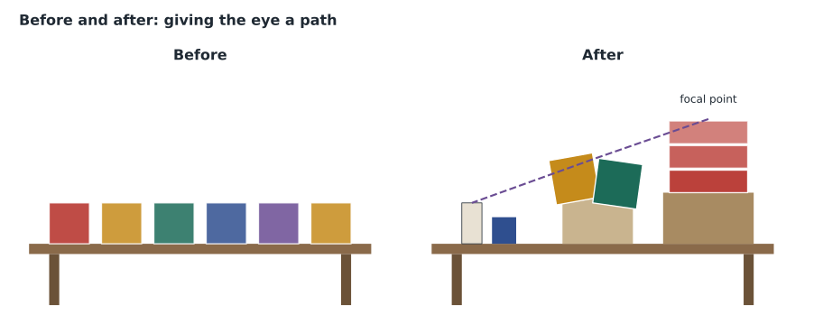
Every display needs one place where the eye goes first. The focal point is usually the most important product, made prominent by its size, its height, its colour, extra light or its position. Around it, other items create a hierarchy: secondary pieces that support the focal point, and small accents that reward a closer look. A display without a clear focal point looks busy, because every item competes for attention.
On the feature table, the focal point was the stack of three throws in a deep rust colour at the right-hand end, raised on a wooden crate so it stood above everything else. The cushions were secondary. The candles, mug and lantern were accents.
The triangle
The most common way to arrange items in a display is a triangle or pyramid: the tallest element at the top or to one side, and lower elements stepping down. A triangle gives the eye a path from the high point down through the display. It can be symmetrical, with the peak in the centre, or asymmetrical, with the peak at one side, which usually looks more natural and modern. Several small triangles can be combined in a large vignette.
Balance
Balance is the sense that a display is stable and not about to tip. Symmetrical balance mirrors the two sides: a bed centred with matching lamps and night tables on each side. It feels formal, calm and traditional. Asymmetrical balance uses different items that carry similar visual weight: a tall lamp on one side balanced by a wide stack of books and a plant on the other. It feels relaxed and modern. Visual weight comes from size, darkness, colour strength and texture: a small dark object can balance a larger pale one.
Neither is better; they suit different products and stories. Juniper & Pine's traditional bedroom collection is shown symmetrically, and its modern collection asymmetrically.
Groups and repetition
Merchandisers often group small items in odd numbers, usually three or five, because odd groups tend to look more natural and less rigid than pairs or fours. This is a design convention rather than a research finding, and it is a guideline, not a law. A single striking item, or a long repeated row, can be just as effective.
Repetition means showing the same item, or the same colour or shape, several times. It creates rhythm, makes a display easier to read from a distance and signals that the product is available in quantity. A wall of the same lamp in six colours repeats the shape while varying the colour, which shows the range at a glance.
Colour and contrast
Colour is usually the first thing shoppers notice, before shape or detail. Merchandisers use it in several ways. Colour blocking groups items of one colour together, so that a shelf of cushions reads as bands of colour rather than a random mix. Arranging colours from light to dark, or in the order of the colour wheel, makes a range look organized. Contrast between a product and its background makes the product stand out: pale ceramics against a dark wall, a bright throw on a grey sofa. Lesson 7 returns to colour, together with lighting and sound.
Proportion and scale
Items in a display should be in proportion to each other and to the space. A tiny vase on a large dining table disappears; an oversized lamp on a small side table looks wrong. Large spaces, such as a window or the end of the main aisle, need large elements or grouped items to read from a distance. Small spaces, such as a shelf at eye level, can show detail.
Abundance versus space
There are two competing ideas about how full a display should be. Abundance, or mass display, shows a large quantity of one product, stacked high or filling a table. It signals value, popularity and "plenty for everyone", and it suits low-priced items, promotions and seasonal goods. Space, or a curated display, shows only a few items with plenty of room around them. It signals quality, care and exclusivity, and suits higher-priced and design-led products.
Research on this is mixed. Some studies suggest that full shelves increase purchases because products look popular and available; others find that when only a few items are left, shoppers infer that the product is popular and buy it more. The effect depends on the product and the shopper. In practice, stores choose deliberately: Juniper & Pine uses abundance for candles at the holidays and space for its premium leather chairs. What every display must avoid is the in-between state of half-empty, disordered shelves, which signals neither value nor quality, only neglect.
Cross-merchandising
Cross-merchandising means showing products from different categories together because they are used together. A dining table set with dishes, napkins and a centrepiece from décor is cross-merchandised; so is a bed made up with sheets, a throw and cushions. Cross-merchandising helps shoppers picture the finished room and is one of the main reasons home stores build vignettes rather than rows of furniture. It also creates natural add-on sales, which SLS-250 called completing the solution.
It needs some planning. Every cross-merchandised item should be clearly available, either on the display or nearby, with a small sign telling shoppers where to find it. A customer who loves the lamp on a night table and then cannot find it anywhere else in the store has been shown a product the store will not sell them. At Juniper & Pine each vignette carries a small card listing the main items in it and the department where each one lives, and associates know that any item on a vignette can be sold from stock.
Displays and the people who sell from them
A display that associates do not understand is half wasted. When Noura finishes a new display, she gives the associates in that zone a two-minute walk-through: the story, the hero product, what is cross-merchandised and where it is stocked, and any price or promotion attached. Aiden noticed the difference on the main floor. Associates who had been told the story of the holiday sectional display used it in their openings ("This is how we set it up for a big family Christmas"), and those who had not tended to walk past it. Merchandising and selling work best when they are planned together.
Maintaining displays
A display looks its best on the morning it is built. By Saturday evening, shoppers have unfolded throws, moved cushions and left a coffee cup on the side table. Displays need regular maintenance, which retailers call recovery or "shopping the display". At Juniper & Pine, associates recover the displays in their zone at opening, after lunch and before closing, and fill gaps from the stockroom. A recovered display looks deliberate and full; an unrecovered one looks like the end of a garage sale.
Testing whether a display sells
The sales jump after Noura restyled the feature table was encouraging, but it raised an obvious question: was the new display the reason, or would sales have risen anyway as the weather turned cold? To separate the effect of the display from everything else, merchandisers compare the change at the display with the change somewhere similar that was not changed, called a control. Juniper & Pine has a second, unchanged rack of the same throws and cushions in the décor department, which served as the control.
Worked problem
Measuring the lift from the restyled table
In the two weeks before the restyle, the feature table sold 28 throws and cushions. In the two weeks after, it sold 42. Over the same periods, the unchanged rack in décor sold 30 and then 31 of the same products. What was the raw increase at the table, and what was the increase after allowing for the general change shown by the control?
Show solution
- Raw change at the table:
- \[42 \div 28 = 1.50\]
- That is an increase of 50 in 100.
- Change at the control rack:
- \[31 \div 30 \approx 1.033\]
- Adjust the table's change for the general trend:
- \[1.50 \div 1.033 \approx 1.45\]
Answer: Sales at the table rose by 50 in 100, but sales at the control rose by about 3 in 100 over the same weeks. After allowing for that general change, the restyled display sold about 45 in 100 more than it otherwise would have. The numbers are small, so Noura treated the result as a strong hint rather than proof, and planned to repeat the comparison with the holiday table.
Lesson 11 develops this method further. For now, the point is that the effect of a display should be measured against something, not just before and after, because the season, a promotion or a busy weekend can easily make a display look better or worse than it is.
Finally, every display should be judged from where shoppers actually see it. Noura steps back to the main aisle, then to the far side of the department, then to the spot where a seated shopper would rest, and looks again from each. A display that looks balanced from the front can show its ugly side to shoppers coming from the other direction, with price tags facing the wall and the backs of boxes in view. Turning one item, or adding a small accent on the hidden side, usually fixes it.
Common mistakes
MistakeLine products up in neat rows, as they come in the box.
InsteadBuild a display around a story and a focal point, and arrange items so the eye has a path.
MistakeMore products always sell more.
InsteadChoose abundance or space on purpose. A crowded display can hide the hero; a half-empty one looks neglected.
MistakeAlways group items in threes.
InsteadOdd groups often look natural, but this is a convention, not a rule. Use whatever makes the story clear.
MistakeOnce a display is built, it is finished.
InsteadRecover displays several times a day so they keep looking deliberate and full.
MistakeSales went up after the change, so the display worked.
InsteadCompare with a control to separate the display's effect from the season or other changes.
Summary and key terms
- Start every display with a story: the moment of life the products are for.
- Give each display a focal point and a hierarchy of secondary items and accents.
- Triangles lead the eye; symmetrical balance feels formal, asymmetrical balance relaxed.
- Odd-numbered groups, repetition, colour blocking and contrast make displays easier to read.
- Choose abundance for value and seasonal items and space for premium items, and never leave displays half empty.
- Recover displays regularly, and measure their effect against a control.
- Story
- The moment of life or idea a display is built to show.
- Focal point
- The place in a display where the eye goes first.
- Asymmetrical balance
- Balance achieved with different items of similar visual weight on each side.
- Colour blocking
- Grouping items of one colour together so they read as a band of colour.
- Mass display
- A display of a large quantity of one product, signalling value and availability.
- Recovery
- Tidying and refilling a display so it looks as it did when it was built.
- Control
- A comparable area that is not changed, used to measure the effect of a change elsewhere.
Practice problems
Work each problem on paper first, then reveal the answer to check.
Write a story for a dining table display in spring.
Show answer
For example: "Sunday brunch with friends", with the table set for four, a light cloth, bright dishes and flowers.
A display's sales rise from 40 to 50 while a control rises from 40 to 44. What is the adjusted lift?
Show answer
50 divided by 40 is 1.25; 44 divided by 40 is 1.10; 1.25 divided by 1.10 is about 1.14, so about 14 in 100.
When would you choose a curated display with space rather than abundance?
Show answer
For higher-priced or design-led products, where the aim is to signal quality.
What does a half-empty, disordered display tell shoppers?
Show answer
That the store is not looking after its products; it signals neglect rather than value or quality.
Lesson quiz · 5 questions
Score 60% or more to complete this lesson.
Create a free account to save your progress, take quizzes and earn a certificate.