
VIS-101 · Lesson 10 of 12 · 27 min
Typography and graphic layout
Many images do not stand alone. Photographs become posters, magazine spreads and web banners; video frames carry titles and lower thirds; social media posts combine pictures with headlines; thumbnails depend on a few large words. The moment text enters a frame, it becomes the strongest element in it, because viewers cannot help reading words. This lesson introduces the basics of typography and layout that every image maker needs: how typefaces differ and what they communicate, how to set type for legibility and hierarchy, how grids organize a layout, how to combine text with images, and how to design titles and thumbnails that work on small screens.
Anatomy and classification of type
A typeface is a designed set of letterforms; a font is a particular size, weight and style of it (in digital practice the words are often used interchangeably). A few anatomical terms help describe type:
- Baseline: the line letters sit on. Cap height: the height of capital letters. x-height: the height of lower-case letters such as x, which largely determines how big type looks at a given size.
- Ascenders and descenders: the parts of letters such as h and p that rise above the x-height or fall below the baseline.
- Serifs: small strokes at the ends of letter strokes. Typefaces without them are sans serif.
- Weight: the thickness of strokes, from thin and light through regular to bold and black.
- Counter: the enclosed or partly enclosed space inside letters such as o, e and a.
| Category | Characteristics | Typical impression and use |
|---|---|---|
| Serif (old style and transitional) | bracketed serifs, moderate stroke contrast | traditional, literary, trustworthy; books, newspapers |
| Modern or didone | thin hairline serifs, high stroke contrast | elegant, fashionable; fashion magazine mastheads |
| Slab serif | heavy rectangular serifs | sturdy, mechanical, bold; posters, branding |
| Sans serif (grotesque, neo-grotesque, geometric, humanist) | no serifs, often even stroke weight | clean, modern, neutral; interfaces, signage, video titles |
| Script | flowing, handwriting-like | personal, formal or playful; invitations, accents |
| Display | decorative, designed for large sizes | expressive; headlines, logos, film titles |
| Monospace | every character the same width | technical, code, typewriter feel |
Typefaces carry personality as surely as colours do (Lesson 6). A condensed bold sans serif feels urgent and newsy; a light geometric sans feels airy and contemporary; a classic serif feels established. Choose type whose voice matches the message, then use it consistently.
Legibility and readability
Legibility is how easily individual letters can be distinguished; readability is how comfortably a block of text can be read. Both depend on choices the designer controls:
- Size. On screens, body text below about 16 CSS pixels becomes tiring; on video, broadcast guidelines suggest captions and titles no smaller than about 1/20 to 1/25 of the picture height for comfortable reading on television.
- x-height and openness. Typefaces with large x-heights and open counters remain legible at small sizes and at a distance, which is why signage and interface typefaces have them.
- Line length. Comfortable reading needs about 45 to 75 characters per line; longer lines make it hard to find the start of the next line.
- Line spacing (leading). Body text usually needs line spacing of about 1.3 to 1.5 times the type size; headlines can be set tighter.
- Letter spacing (tracking) and kerning. All-capital text and very small text benefit from slightly wider tracking; large headlines often need tighter tracking and manual kerning of awkward pairs such as AV and To.
- Contrast. Text needs strong value contrast with its background: at least 4.5:1 for normal text and 3:1 for large text under the WCAG guidelines (Lessons 1 and 6).
- Case. Long passages in all capitals are slower to read because word shapes are lost; reserve capitals for short headings and labels.
Worked problem
Sizing a title for video
A designer is creating a title card for a 1920 × 1080 video that will also be watched on phones. The guideline is that the smallest important text should be at least 1/20 of the frame height. How tall should the capital letters be, and what font size does that suggest if cap height is about 70% of the font size?
Show solution
- Minimum text height: \(1{,}080/20 = 54\) pixels of cap height.
- Font size: \(54/0.70 \approx 77\) pixels; round to 80 pixels.
- The main title can be two or three times larger for hierarchy, for example 160 to 200 pixels.
Answer: Capitals at least 54 pixels tall, about an 80-pixel font for the smallest important text. On a phone held vertically, a 16:9 video appears only about 6 cm wide, so text that looks large on a desktop monitor can become unreadable; designing to this minimum keeps it legible.
Hierarchy
A layout communicates in order: first the most important message, then supporting information, then details. Typographic hierarchy makes this order visible through contrasts of size, weight, colour, case, position and space. A common rule of thumb is that each level should differ clearly from the next, for example by a factor of about 1.5 to 2 in size, rather than by small increments that look accidental. Many designers use a modular scale, multiplying sizes by a constant ratio such as 1.25, 1.333 or 1.5:
With a base of 16 px and ratio 1.5, the sizes are 16, 24, 36, 54 and 81 px, giving a harmonious set for body text, subheadings, headings and display titles. Hierarchy also comes from restraint: two typefaces (often a display face and a text face) and two or three weights are usually enough. Too many typefaces, sizes and colours destroy hierarchy because everything competes.
Grids and alignment
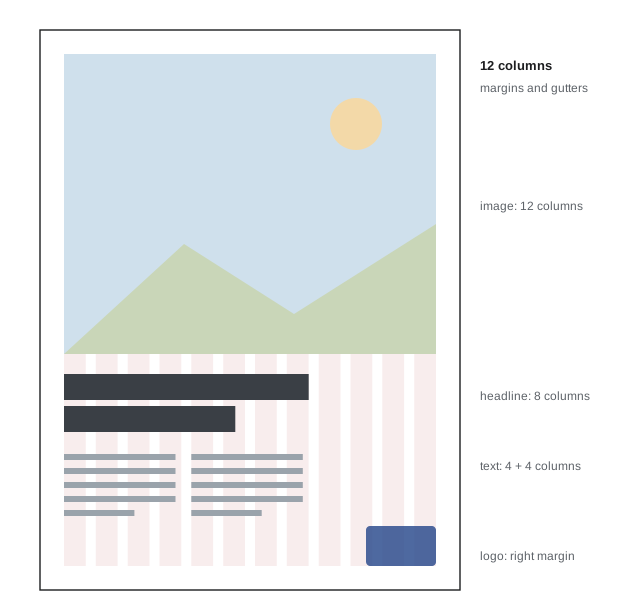
A grid is an invisible structure of columns, rows, margins and gutters that organizes a layout. Grids were developed by Swiss designers in the mid-twentieth century and are now built into web and app design. They make layouts orderly, consistent across pages, and quicker to design. Common grids include:
- Single-column (manuscript) grids for books and simple pages.
- Multi-column grids, often 12 columns for web layouts because 12 divides into halves, thirds, quarters and sixths.
- Modular grids of columns and rows, for complex pages such as magazines and dashboards.
- Baseline grids that align lines of text across columns.
Alignment connects elements visually even when they are far apart (the Gestalt principle of continuity, Lesson 1). Left-aligned text gives a strong edge and is easiest to read in most Western languages; centred text suits short, formal, symmetrical layouts such as invitations and title cards but is hard to read in long passages; right-aligned text is useful for captions next to images and in right-to-left languages. Every element should align with something; elements placed "by eye" with slight misalignments look careless.
White space
White space (or negative space, Lesson 2) is the empty area around and between elements. It is not wasted space: it separates groups of information (proximity, Lesson 1), gives the eye places to rest, and signals quality and confidence. Luxury brands and art galleries use generous white space; discount flyers fill every corner. A common beginner's error is to enlarge everything to fill the available area; usually the layout improves when elements are made smaller and given room.
Combining text and images
When text is placed over or beside a photograph, the two must work together rather than compete:
- Plan for text at the shoot. Photographers shooting for covers, posters and banners leave negative space where the headline will go, often in a sky, a plain wall or a blurred background, and shoot both horizontal and vertical versions.
- Place text in calm areas. Text over a busy, high-contrast background is hard to read. If no calm area exists, add a semi-transparent panel, a gradient overlay that darkens part of the image, or a subtle shadow behind the text.
- Avoid covering faces and key details, and respect safe areas: in video, keep titles inside the title-safe area, and in social media, avoid areas covered by interface elements such as profile names, buttons and captions (Lesson 1 introduced safe areas).
- Relate type to the image's lines and colours. Aligning a headline with a horizon or a building edge, or picking a text colour sampled from the image, creates unity.
- Use the image's gaze and leading lines to point to the text, or the text to point back to the image (Lesson 9).
Worked problem
Text on a busy photograph
A white headline on a festival poster sits over a photograph of a crowd with many bright spots and dark gaps. It is hard to read in places. Propose three solutions, from least to most intrusive.
Show solution
- Add a subtle drop shadow or dark outline to the letters, improving edge contrast without changing the image.
- Apply a gradient overlay that darkens the bottom third of the photograph, where the headline sits, keeping the top unchanged.
- Place the headline in a solid colour band or panel, or choose a different photograph with a calm area such as sky above the crowd.
Answer: Start with a shadow or outline, move to a gradient overlay if needed, and use a solid panel or a different image if legibility still suffers. The gradient is often the best balance, keeping the photograph's energy while giving the text a consistent, darker background.
Thumbnails, covers and small screens
Much visual content is first seen as a thumbnail: a video preview, a podcast cover, a streaming tile, a search result. A thumbnail may be shown only 100 to 200 pixels wide, so it must communicate in a fraction of a second. Effective thumbnails usually have:
- One clear subject, often a face with a readable expression, large in the frame.
- Strong value and colour contrast so the subject separates at small size (Lessons 1 and 6).
- At most a few large words, in a heavy, simple typeface, adding information the image does not show rather than repeating the title.
- Consistency across a series, using the same layout, typeface and colours, so viewers recognize the brand.
- Honesty: thumbnails that promise content the video does not deliver erode trust and are penalized by platforms.
Test thumbnails at their real display size, on a phone, and next to competitors' thumbnails, because a design that looks fine at full size on a monitor may disappear among others in a feed.
Type in motion
In video, titles and captions move and appear over time. Lower thirds, the name and title labels used in interviews, sit in the lower part of the frame within the title-safe area, opposite the side the subject faces so they do not block the face. Titles should stay on screen long enough to be read at least twice, roughly 0.3 seconds per word plus a second. Animation should support reading, not fight it: simple fades, slides and builds in the direction of reading work best. Captions for accessibility, required for much broadcast and online content in Canada under CRTC policies and provincial accessibility laws, need consistent placement, high contrast and readable size.
Common mistakes
MistakeUsing many typefaces and sizes in one design.
InsteadUse one or two typefaces and a clear size scale.
MistakePlacing text over busy parts of an image.
InsteadUse calm areas, gradients, panels or shadows.
MistakeSetting long passages in all capitals or centred.
InsteadUse sentence case and left alignment for reading text.
MistakeDesigning thumbnails at full size only.
InsteadTest at actual display size on a phone.
MistakeFilling every part of a layout.
InsteadLeave white space to group elements and let the design breathe.
Summary and key terms
- Typeface categories such as serif, sans serif, slab, script and display carry different personalities.
- Legibility depends on size, x-height, line length, spacing, case and contrast.
- Hierarchy uses clear differences in size, weight and position; modular scales give harmonious sizes.
- Grids and alignment organize layouts; every element should align with something.
- White space groups information and signals quality.
- Text over images needs calm areas, overlays or panels, and respect for faces and safe areas.
- Thumbnails need one clear subject, strong contrast, few large words and testing at real size.
- Typeface
- A designed family of letterforms.
- Serif
- A small stroke at the end of a letter stroke.
- x-height
- The height of lower-case letters such as x.
- Leading
- The vertical spacing between lines of text.
- Tracking
- Uniform adjustment of spacing between letters.
- Kerning
- Adjustment of spacing between specific letter pairs.
- Hierarchy
- The visible order of importance in a layout.
- Modular scale
- A set of sizes related by a constant ratio.
- Grid
- A structure of columns, rows, margins and gutters for layout.
- Lower third
- A text label in the lower part of a video frame.
Practice problems
Work each problem on paper first, then reveal the answer to check.
What is the difference between legibility and readability?
Show answer
Legibility is distinguishing letters; readability is comfort reading text.
Comfortable line length for body text?
Show answer
About 45 to 75 characters.
Sizes in a modular scale from 18 px with ratio 1.333?
Show answer
18, 24, 32, 42.6, 56.8 px.
Why do 12-column grids suit web layouts?
Show answer
12 divides into halves, thirds, quarters and sixths.
Minimum cap height for text at 1/20 of a 2160-pixel-high frame?
Show answer
108 pixels.
How long should a six-word title stay on screen?
Show answer
About 0.3 × 6 + 1 = 2.8 s or more.
Where should a lower third go relative to a subject's face?
Show answer
On the side opposite the direction the subject faces, low in the frame.
Name two ways to make text readable on a busy photo.
Show answer
Shadow or outline, gradient overlay, solid panel.
Why avoid long text in all capitals?
Show answer
Word shapes are lost, slowing reading.
What makes an effective thumbnail?
Show answer
One clear subject, strong contrast, few large words, consistency.
Lesson quiz · 5 questions
Score 60% or more to complete this lesson.
Create a free account to save your progress, take quizzes and earn a certificate.