
VIS-101 · Lesson 9 of 12 · 32 min
Leading the eye
A well-composed image does not just contain a subject; it guides the viewer's attention, telling them where to look first, where to go next and where to rest. Eye-tracking research has shown that viewers do not scan images evenly. Their eyes jump between a few points of interest, pausing on faces, contrasts and text, and the path they follow is strongly shaped by the image. This lesson covers how the eye moves, how to create a focal point and a visual hierarchy, how lines and shapes direct attention, how gaze and gesture point, and how these ideas apply to sequences, screens and small thumbnails. It closes the course by bringing the principles together into a practical process for composing.
How the eye moves
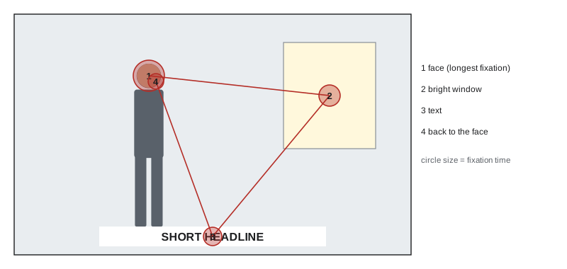
The eye does not glide smoothly over an image. It makes rapid jumps called saccades, separated by fixations of about 200 to 300 milliseconds in which it takes in detail from a small central area (the fovea covers only about 2° of the visual field). Peripheral vision, which is blurry but sensitive to contrast, colour and movement, picks the next target. In the first second or so a viewer makes three to five fixations, enough to grasp the gist of an image; the rest of the viewing time is spent on details the first glance found interesting.
Two kinds of factors steer fixations. Bottom-up (stimulus-driven) factors are properties of the image itself: contrast, colour, edges, faces and text attract the eye automatically. Top-down (goal-driven) factors come from the viewer: what they are looking for, their culture and their expectations. Composition works mainly with bottom-up factors but must anticipate top-down ones, such as reading direction.
Worked problem
Fixations in a thumbnail glance
A viewer scrolling a feed pauses on a thumbnail for 0.8 seconds. With fixations averaging 250 ms and saccades taking about 30 ms, how many elements of the image can they look at?
Show solution
- Each fixation plus saccade takes about \(250 + 30 = 280\) ms.
- \(800/280 \approx 2.9\), so about three fixations.
Answer: About three elements. A thumbnail should therefore present one dominant focal point, perhaps a face, and at most one or two supporting elements such as a short word or object; anything more will not be seen before the viewer moves on.
Creating a focal point
A focal point is the place the eye goes first. Most strong images have one dominant focal point, sometimes supported by secondary ones. The eye is drawn to:
- The area of greatest contrast, especially value contrast (Lesson 1).
- Faces, and above all eyes. Viewers look at faces in an image almost immediately and spend a large share of their viewing time on them, even when the face is small.
- Readable text, which viewers cannot help reading.
- Saturated or warm colour against muted or cool surroundings.
- Sharp detail against blur (Lesson 7).
- Isolation: an element alone in negative space.
- The element that breaks a pattern (Lesson 5).
- In moving images, motion: the eye follows movement and is drawn to anything that starts to move.
When several of these coincide on the subject, such as a sharp, well-lit face against a dark, blurred background, the focal point is unmistakable. When they are spread across different elements, such as a bright sky, a red car and a person in shadow, they compete, and the image feels confused. Composing often means removing or subduing the competing attractors rather than adding emphasis.
Worked problem
Competing attractors
A street portrait shows the subject in shade in the left third; in the background on the right, a sunlit red sign carries large white text. Viewers report looking at the sign first. Using focal point principles, explain why and suggest three fixes.
Show solution
- The sign combines high value contrast (sunlit), saturated warm colour (red) and readable text, three strong attractors.
- The subject, in shade with low contrast, has only the face working for it.
- Fixes: change the angle to remove the sign from the frame; use a wider aperture so the sign blurs and the text becomes unreadable; move the subject into light or add fill light to the face; convert to black and white to remove the colour attraction.
Answer: The sign wins because it stacks several bottom-up attractors. Removing it, blurring it or making the subject brighter restores the face as the dominant focal point.
Visual hierarchy
Beyond the first fixation, a composition can establish a hierarchy: a primary element, secondary elements and background. The viewer's eye moves from the most to the least emphasized, so the hierarchy sets the order in which the story is read. In a news photograph, the order might be the face of a person reacting, then what they are reacting to, then the setting. Hierarchy is created by graduating the attractors: the primary element gets the most contrast, size, sharpness or colour; secondary ones less; background least. Graphic designers apply the same idea to layouts with type size, weight and position, and image makers apply it to thumbnails and posters that combine pictures and text.
Leading lines and shapes
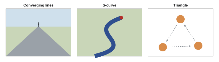
Lines in an image, real or implied, guide the eye along them (the Gestalt principle of continuity, Lesson 1). Roads, rivers, fences, shorelines, rows of trees, architectural edges and the converging lines of perspective (Lesson 7) lead the eye through the frame, ideally towards the subject. Effective leading lines:
- Start near an edge or corner, usually at the bottom, where the eye enters, and lead into the frame.
- End at or point to the subject; lines that lead out of the frame take the viewer's attention with them.
- Converge on the focal point, which is especially powerful in one-point perspective.
Curves, especially S-curves such as a winding road or river, lead the eye gently through the depth of a scene and add grace. Triangles formed by three elements (three people, or a person's head and two hands) create stable groups and move the eye around a closed loop. Diagonals add energy (Lesson 5).
Gaze, gesture and direction
People look where other people look. A subject's gaze is one of the strongest implied lines: viewers follow it to whatever it rests on, which is why a gaze towards the open side of the frame (lead room, Lesson 3) or towards a second subject creates a path through the image. A gaze straight at the camera engages the viewer directly and holds attention on the face. Pointing hands, the direction a vehicle or animal faces, and arrows or signs work in the same way. Advertising and thumbnail design use this deliberately: a face looking towards a product or headline draws more attention to it than a face looking at the camera.
Reading direction
Viewers who read left to right tend to enter an image at the left and scan towards the right, and to read movement from left to right as forward, natural progress and right to left as returning, resistance or conflict. Filmmakers use this: in many films, heroes travel left to right on their outward journey and right to left as they return. Viewers whose languages read right to left (such as Arabic and Hebrew) show the opposite tendencies in some studies. The effect is modest compared with contrast and faces, but it influences where to place a subject that should be seen first and which way a figure should move.
On screens, eye-tracking studies of web pages found that text-heavy layouts are scanned in an F-shaped pattern: across the top, then a shorter line lower down, then down the left side. Image-led layouts with a clear focal point are scanned much less predictably, following the image's attractors, which is why strong images can redirect attention on a page.
Designing for small screens
Much imagery is now first seen as a small thumbnail on a phone. A frame that works on a cinema screen or a gallery wall may become illegible at 2 to 4 centimetres wide. Principles from this course become critical:
- Simplify to one clear subject, large in the frame.
- Use strong value and colour contrast; fine detail and subtle tones disappear.
- Make faces large and expressive; they are recognized at very small sizes.
- Keep any text short and large, with sufficient contrast (Lesson 1).
- Account for interface elements (buttons, captions, progress bars) that cover the edges, especially in vertical video.
Worked problem
Text size in a thumbnail
A video thumbnail is designed at 1280 × 720 pixels but appears about 360 pixels wide on a phone feed. Title text in the design is 48 pixels tall. How tall does it appear on the phone, and is it readable if text below about 12 phone pixels is hard to read at a glance?
Show solution
- Scale factor \(= 360/1280 = 0.281\).
- Displayed text height \(= 48 \times 0.281 = 13.5\) px.
- For 18 px on the phone, the design text must be \(18/0.281 = 64\) px tall.
Answer: The 48-pixel text appears only 13.5 pixels tall, barely readable at a glance. Thumbnail text is usually much larger, often 100 pixels or more in a 1280 × 720 design, with a few words at most. Previewing designs at their real display size is essential.
Guiding attention in sequences
In film, comics, photo essays and carousels, attention must flow from one frame to the next. Editors use eye-trace: they note where the viewer's eye is at the end of one shot and place the point of interest in the next shot near the same spot, so the cut feels smooth; placing it on the opposite side creates a jolt that can be used for impact. Consistent screen direction keeps the audience oriented: if a character exits frame right, they should enter the next shot from frame left. In a photo sequence, alternating wide and close frames, and varying the position of the focal point, sustains interest.
Worked problem
Planning a cut by eye-trace
Shot A ends with the audience looking at an actor's face on the right third of the frame. Shot B is a close-up of a letter in the actor's hand. Where should the letter be placed for a smooth cut, and where for a deliberately abrupt one?
Show solution
- Smooth cut: place the letter near the right third, where the eye already is, so no search is needed.
- Abrupt cut: place it on the left third, forcing the eye to jump across the frame.
Answer: On the right third for a smooth, invisible cut; on the left for a jarring effect that can emphasize a revelation. Most continuity editing chooses the smooth option, saving abrupt jumps for moments that should feel sudden.
Putting it together: a composing process
The principles from this course can be applied as a practical sequence when composing a photograph or shot:
- Decide what the image is about and what the viewer should notice first (subject and focal point).
- Choose the frame shape and orientation for the subject and delivery format (Lessons 1 and 3).
- Choose a camera position: distance for perspective, height for the horizon and the relationship to the subject (Lesson 7).
- Place the subject: thirds, centre or another position, with lead room and headroom (Lesson 3).
- Balance or deliberately unbalance the frame with secondary elements (Lesson 5).
- Use light, shadow and colour to separate the subject and set the mood (Lessons 6 and 8).
- Build depth with foreground, middle ground and background, and choose depth of field (Lesson 7).
- Guide the eye: lines, light and contrast towards the subject; remove or subdue competing attractors (this lesson).
- Check the edges for distractions and tangents, and review the image at its real display size.
With practice, these steps merge into a single act of seeing. Studying the work of strong photographers, painters and cinematographers, and analyzing why their images hold attention, is one of the best ways to develop that eye.
Lessons 10 and 11 extend these ideas to typography and layout and to moving images and sequences, and Lesson 12 to critique and a portfolio project.
Common mistakes
MistakeLetting several strong attractors compete.
InsteadChoose one focal point and subdue the others.
MistakeLeading lines that run out of the frame.
InsteadMake lines lead into the frame and towards the subject.
MistakeIgnoring where the subject is looking.
InsteadUse gaze to direct attention into the frame or towards a second subject.
MistakeDesigning thumbnails only at full size.
InsteadPreview at real display size; simplify and enlarge key elements.
MistakeBreaking screen direction between shots accidentally.
InsteadKeep exits and entrances consistent, or break them deliberately.
Summary and key terms
- The eye moves in saccades and fixations of about 200–300 ms; first glances take in three to five points.
- Contrast, faces, text, saturated colour, sharpness, isolation, pattern breaks and motion attract the eye.
- One dominant focal point with graduated secondary elements creates a clear visual hierarchy.
- Leading lines, S-curves, triangles and diagonals guide the eye through the frame.
- Gaze and gesture are powerful implied lines.
- Reading direction modestly influences scanning and the meaning of movement.
- Small screens demand simplicity, large faces and text, and strong contrast.
- Eye-trace and screen direction guide attention across sequences.
- Saccade
- A rapid jump of the eye between fixations.
- Fixation
- A pause of the eye on a point, typically 200–300 ms.
- Focal point
- The element that draws the eye first.
- Visual hierarchy
- The order of emphasis among elements in an image.
- Leading line
- A real or implied line that guides the eye.
- S-curve
- A flowing curve that leads the eye through a scene.
- Eye-trace
- The position of the viewer's attention used to plan cuts.
- Screen direction
- The consistent direction of movement across shots.
- F-pattern
- The F-shaped scanning pattern found for text-heavy web pages.
Practice problems
Work each problem on paper first, then reveal the answer to check.
How long is a typical fixation?
Show answer
About 200–300 ms.
A viewer looks at a poster for 1.5 s with 300 ms per fixation and saccade. About how many fixations?
Show answer
Five.
List four bottom-up attractors.
Show answer
Any four: contrast, faces, text, saturated colour, sharpness, isolation, pattern breaks, motion.
Why do faces dominate attention even when small?
Show answer
People are strongly tuned to detect and look at faces and eyes.
Where should leading lines usually start and end?
Show answer
Start near the bottom or a corner and lead into the frame towards the subject.
What does a subject's gaze towards a product do in an advertisement?
Show answer
It leads viewers' attention to the product.
A 1920-pixel design is displayed 480 pixels wide. How tall does 60-pixel text appear?
Show answer
15 pixels.
What text height is needed in a 1920-pixel design to appear 20 pixels tall at 480 pixels wide?
Show answer
80 pixels.
A character exits frame right. From which side should they enter the next shot?
Show answer
Frame left.
Name the eight steps of the composing process in order.
Show answer
Subject and focal point, frame shape, camera position, placement, balance, depth, guiding the eye, checking edges and display size.
Lesson quiz · 5 questions
Score 60% or more to complete this lesson.
Create a free account to save your progress, take quizzes and earn a certificate.