
VIS-101 · Lesson 3 of 12 · 35 min
Framing and the rule of thirds
Once the subject is chosen, the next decision is where to put it. The position of a subject within the frame changes how stable, dynamic or intimate an image feels, and where the viewer's eye travels. This lesson covers the most widely used placement guide, the rule of thirds, its relatives based on the golden ratio, central and symmetrical framing, the space a subject needs around it, shot sizes, and framing devices within the image. These are guidelines, not laws: the aim is to understand what each placement does so that you can choose deliberately, including when to break the rule.
The rule of thirds
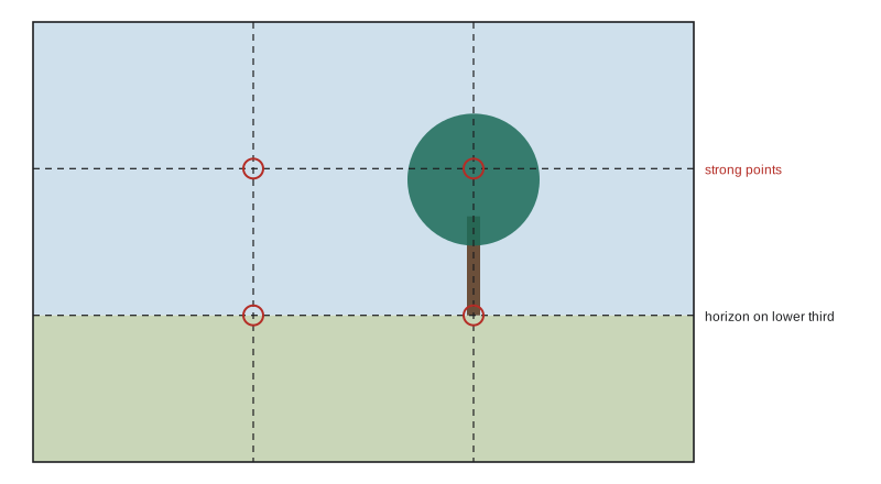
The rule of thirds divides the frame into nine equal parts with two horizontal and two vertical lines. Placing important elements along these lines, or at the four points where they intersect, tends to produce compositions that feel balanced but more dynamic than placing the subject dead centre. Horizons are placed on the upper or lower third line rather than across the middle, giving more weight to the sky or the land; a portrait subject's eyes are often placed on the upper third line; a single subject in a landscape sits on one of the intersections.
The rule was named in 1797 by the English painter and engraver John Thomas Smith, who generalized advice about dividing landscapes into unequal parts. It works for several reasons: an off-centre subject creates a relationship with the space around it, giving the eye somewhere to travel; it avoids splitting the frame into two equal halves, which can feel static and ambiguous; and it leaves room for secondary elements to balance the main one (Lesson 5).
Worked problem
Thirds positions in pixels
A camera produces 6000 × 4000 pixel images. Where are the thirds lines and the four intersection points?
Show solution
- Vertical lines at \(x = 2000\) and \(x = 4000\).
- Horizontal lines at \(y = 1333\) and \(y = 2667\) (measured from the top).
- Intersections: (2000, 1333), (4000, 1333), (2000, 2667), (4000, 2667).
Answer: The thirds lines are at 2000 and 4000 px horizontally and 1333 and 2667 px vertically. Most cameras and phones can overlay this grid in the viewfinder, and editing software overlays it when cropping.
The golden ratio and related grids
The golden ratio \(\varphi\) is the number for which a line divided into a larger part \(a\) and smaller part \(b\) satisfies \((a+b)/a = a/b\):
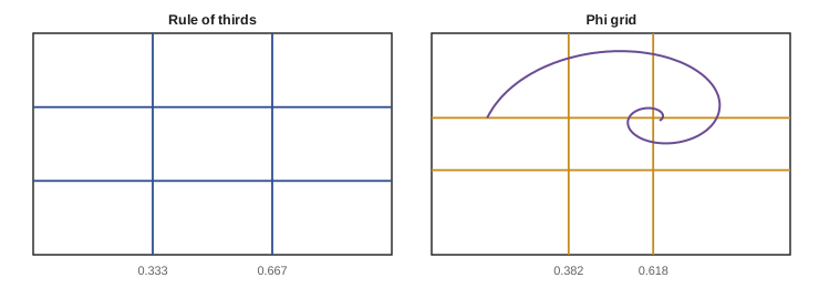
It has fascinated artists and mathematicians since antiquity. A "phi grid" divides the frame at fractions \(1/(1+\varphi) \approx 0.382\) and \(\varphi/(1+\varphi) \approx 0.618\) of its width and height, placing the lines slightly closer to the centre than thirds (0.333 and 0.667). The golden spiral, built from nested golden rectangles, suggests a curving path into the frame towards a focal point.
Claims that famous artworks were deliberately designed on golden proportions are often overstated: with enough lines on a picture, some will fall near any feature, and the difference between thirds and phi positions is small. The useful point is shared by both: unequal divisions of the frame tend to be more interesting than equal ones.
Worked problem
Thirds versus phi grid
For a 1920-pixel-wide frame, where are the left vertical lines of the thirds grid and of the phi grid? How far apart are they?
Show solution
- Thirds: \(1920/3 = 640\) px.
- Phi: \(1920 \times 0.382 = 733\) px.
- Difference: 93 px, under 5% of the frame width.
Answer: The lines are 93 pixels apart. In practice either grid guides the eye to an off-centre placement; neither is a precise formula.
Central and symmetrical framing
Placing the subject in the centre is not wrong. Central composition gives an image stability, formality and directness: it suits symmetrical subjects (architecture, reflections, faces looking straight at the camera), confrontational portraits and images about order or isolation. Some filmmakers, such as Wes Anderson and Stanley Kubrick, are known for strongly symmetrical, centred framing that feels deliberate and slightly uncanny. Vertical short-form video also favours central placement, because interface elements cover the edges and viewers' attention is concentrated in the middle of the phone screen.
The key is commitment: an almost-centred subject looks like a mistake, while a precisely centred one looks intentional. Similarly, a horizon slightly off the middle looks accidental; place it clearly on a third, or exactly in the middle for a symmetrical reflection.
Space around the subject
The space a subject needs depends on where it is looking or moving:
- Lead room (or nose room, looking room): a subject looking or moving towards one side needs more space in front of them than behind. A runner placed at the leading edge of the frame seems about to leave it; placed at the trailing edge with space ahead, they seem to have somewhere to go. Deliberately reversing this, with the subject close to the edge they face, creates tension or claustrophobia.
- Headroom: the space between the top of the head and the top of the frame. Too much makes the subject sink in the frame; too little cramps it. In close-ups it is common to crop the top of the head while keeping the eyes on the upper third line.
- Cropping at joints: when cutting people at the frame edge, avoid cropping exactly at joints (ankles, knees, elbows, wrists), which looks like amputation; crop between joints instead.
Worked problem
Lead room for a moving subject
In a 16:9 frame 1920 pixels wide, a cyclist moving left to right is 300 pixels wide. Where should the cyclist be placed so that about two thirds of the frame width lies ahead of their front edge?
Show solution
- Two thirds of 1920 \(= 1280\) px ahead, so the front edge is at \(1920 - 1280 = 640\) px from the left, on the left thirds line.
- The cyclist then occupies \(x = 340\) to 640 px.
Answer: Place the cyclist with their front edge on the left thirds line, around x = 640, leaving 1280 pixels of space ahead. The open space in the direction of travel gives the image a sense of movement and anticipation.
Shot sizes
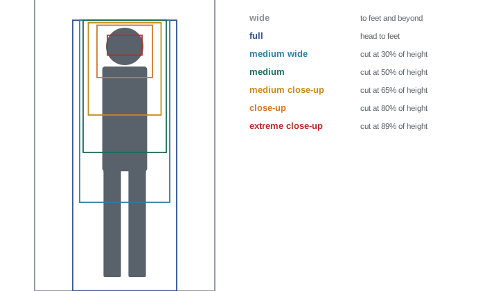
Film and video use a standard vocabulary for how much of a person the frame includes. Each size has typical uses:
| Shot | Framing | Typical use |
|---|---|---|
| Extreme wide (establishing) | Landscape or setting; people small or absent | Establish location and scale |
| Wide (long) shot | Whole body with surroundings | Show action and relationships to the setting |
| Full shot | Head to feet, filling the frame height | Body language, movement |
| Medium wide (cowboy) | Mid-thigh up | Groups, people interacting with surroundings |
| Medium shot | Waist up | Conversation, gesture |
| Medium close-up | Chest up | Interviews, dialogue |
| Close-up | Face, perhaps shoulders | Emotion, reaction |
| Extreme close-up | Part of the face or a detail | Intensity, key details |
Moving closer increases intimacy and emotional intensity but removes context; moving wider gives context and can express isolation or scale. Editors cut between sizes to control the rhythm and intensity of a scene, and photographers think in the same terms when covering a subject from wide to detail.
Framing within the frame
A frame within the frame, such as a doorway, window, arch, branches, a mirror or the gap between two people, surrounds the subject with a secondary border. It focuses attention, adds depth by placing layers in front of the subject, and can carry meaning: a figure seen through bars or a narrow doorway can suggest confinement, while a view through a window suggests a viewer looking in or out. Foreground framing elements are often darker or out of focus, so they enclose the subject without competing with it.
Worked problem
Area of a frame within a frame
A photographer frames a subject through a doorway that occupies the middle 40% of the frame's width and 70% of its height. What fraction of the image area is the "inner" frame, and why is this effective?
Show solution
- Inner area \(= 0.40 \times 0.70 = 0.28\), so 28% of the frame.
- The other 72% is the surrounding wall, which acts as a border.
Answer: The doorway occupies 28% of the image; the surrounding 72% darkens or simplifies the edges and funnels attention inward, so the subject reads strongly even though it is small.
Camera height and angle
Framing is not only about where the subject sits in the rectangle but also about the viewpoint from which it is seen. Camera height and angle change how powerful, vulnerable or ordinary a subject appears:
- Eye level: the camera at the subject's eye height feels neutral and equal, the default for interviews and most dialogue.
- Low angle: looking up at a subject makes it appear taller, stronger and more imposing, which is why heroes, leaders and monumental buildings are often shot from below.
- High angle: looking down makes a subject seem smaller, weaker or more vulnerable, and shows the ground and surroundings, useful for showing someone lost in a crowd.
- Bird's-eye (overhead) view: looking straight down flattens the scene into patterns and shapes, popular for food, flat-lay product photography and drone images.
- Worm's-eye view: from ground level looking up, exaggerating height and drama.
Children and pets photographed from adult standing height look small and distant; crouching to their eye level brings the viewer into their world. Small changes of height also control the background: lowering the camera can place a subject against plain sky, while raising it can hide a cluttered horizon behind the ground.
Worked problem
How far to tilt the camera
A photographer stands 20 m from a building 30 m tall, with the camera at 1.5 m height. What upward tilt is needed to aim at the top of the building, and what does this do to the building's vertical edges?
Show solution
- Height above the camera: \(30 - 1.5 = 28.5\) m.
- Angle to the top: \(\arctan(28.5/20) = 54.9°\); aiming midway up requires about \(\arctan(13.5/20) = 34°\).
Answer: Tilting the camera by tens of degrees makes the building's vertical edges converge strongly towards the top (Lesson 7). Standing farther away, using a shift lens, or correcting perspective in editing keeps verticals parallel; a strong deliberate tilt instead dramatizes the building's height.
Orientation and cropping
Choosing between horizontal (landscape) and vertical (portrait) orientation is a framing decision in itself. Match the orientation to the subject's dominant direction and to where the image will be seen: a tall waterfall in a vertical frame, a wide panorama in a horizontal one, and content for phone feeds in vertical or 4:5. Cropping after capture can improve a composition, removing distracting edges or shifting the subject towards a third, but every crop discards pixels and therefore resolution. Leaving a little extra space around the subject when shooting gives flexibility to crop for different formats later.
Worked problem
Resolution after cropping
A 24-megapixel (6000 × 4000) photograph is cropped to the central half of its width and height. How many megapixels remain, and is that enough for a 30 × 20 cm print at 300 pixels per inch?
Show solution
- Cropped size: 3000 × 2000 = 6 megapixels.
- Print needs: \(30\ \text{cm} = 11.8\) in, \(20\ \text{cm} = 7.9\) in; at 300 ppi, \(3543 \times 2362\) pixels \(= 8.4\) MP.
Answer: Only 6 megapixels remain, less than the 8.4 MP needed for 300 ppi at that size; the print would have about 254 ppi, still acceptable at normal viewing distance but not ideal. Halving the width and height of a crop removes three quarters of the pixels.
Lesson 4 applies these framing tools to people, from portraits to groups.
Common mistakes
MistakePutting the horizon across the middle of the frame by default.
InsteadPlace it on a third unless symmetry is the point.
MistakeLeaving the subject almost but not exactly centred.
InsteadEither commit to the centre or move clearly to a third.
MistakeCutting people off at joints.
InsteadCrop between joints, such as mid-thigh or mid-forearm.
MistakeGiving a moving or gazing subject no lead room.
InsteadLeave space in the direction of movement or gaze, unless tension is intended.
MistakeTreating the rule of thirds or golden ratio as a strict law.
InsteadUse them as starting points; choose placement by its effect.
Summary and key terms
- The rule of thirds places key elements on lines and intersections dividing the frame into nine parts.
- Phi grids at 0.382 and 0.618 are similar; the useful idea is unequal division.
- Central framing gives stability and formality when deliberate and precise.
- Lead room, headroom and cropping between joints keep subjects comfortable in the frame.
- Shot sizes from extreme wide to extreme close-up control context and intimacy.
- Frames within the frame focus attention and add depth and meaning.
- Orientation and cropping are framing choices; cropping costs resolution.
- Rule of thirds
- Guideline placing key elements on lines dividing the frame into thirds.
- Golden ratio
- The proportion φ ≈ 1.618.
- Phi grid
- A grid dividing the frame at 0.382 and 0.618.
- Lead room
- Space in front of a subject in the direction it faces or moves.
- Headroom
- Space between the top of a subject's head and the frame edge.
- Shot size
- How much of a subject the frame includes, from wide to extreme close-up.
- Establishing shot
- A wide shot showing the location of a scene.
- Frame within a frame
- An element inside the image that borders the subject.
- Orientation
- Whether a frame is horizontal or vertical.
Practice problems
Work each problem on paper first, then reveal the answer to check.
Thirds lines for a 1080 × 1920 vertical frame?
Show answer
x = 360 and 720; y = 640 and 1280.
Phi lines for a 3000-pixel-wide frame?
Show answer
About 1146 and 1854 px.
When is a centred subject a good choice?
Show answer
For symmetry, formality, direct confrontational portraits, isolation, or vertical video.
A person looks to the left of the frame. Where should most of the empty space be?
Show answer
On the left, in front of their gaze.
Name the shot that frames a person from the waist up.
Show answer
A medium shot.
Why avoid cropping exactly at knees or wrists?
Show answer
It looks like amputation; cropping between joints looks natural.
A window occupies 30% of the frame width and 50% of its height. Fraction of the frame?
Show answer
15%.
A 4000 × 3000 image is cropped to 2000 × 1500. Fraction of pixels kept?
Show answer
25%.
Pixels needed for a 20 × 25 cm print at 300 ppi?
Show answer
About 2362 × 2953 = 7.0 MP.
Give two meanings a frame within a frame can carry.
Show answer
Confinement or entrapment; looking in or out; intimacy; observation.
Lesson quiz · 5 questions
Score 60% or more to complete this lesson.
Create a free account to save your progress, take quizzes and earn a certificate.