
VIS-101 · Lesson 12 of 12 · 28 min
Critique, style and a portfolio project
The previous lessons built a toolkit: elements, framing, people, balance, colour, depth, light, eye movement, type and sequence. This final lesson is about using that toolkit with judgement. It covers how to analyse and critique images, your own and others', in a way that leads to better work; when and how to break compositional rules; how a personal visual style develops; the ethical questions raised by editing, generative AI and representation; and how to plan, shoot, edit and present a portfolio project that brings together everything in the course.
A method for analysing images
Critique begins with careful looking, not with judgement. A structured method, adapted from the approach art educators often attribute to Edmund Feldman, works in four stages:
- Describe: what is literally in the frame? Subjects, setting, format and aspect ratio, light, colour palette, lines, shapes and text. Describing first forces you to look before deciding what you think.
- Analyse: how is it organized? Where is the subject placed, and why does the eye go there first? What creates balance or tension? How is depth built? What path does the eye follow? Use the vocabulary of this course.
- Interpret: what does it mean or make the viewer feel, and which choices create that meaning? A low angle and hard light might make a figure heroic; a small figure in a vast empty frame might suggest isolation.
- Evaluate: does it succeed at what it is trying to do? What is strongest, and what single change would most improve it?
Analysing the work of skilled photographers, cinematographers and designers this way is one of the fastest routes to improvement. Studying a film with the sound off, or recreating a painting's composition with a camera, makes the structure visible.
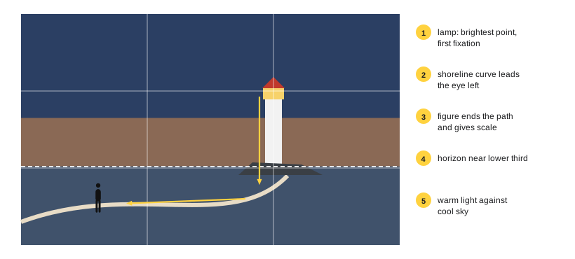
Giving and receiving critique
Group critique is a standard part of visual education and professional practice. It works best with a few ground rules:
- Start with the maker's intention. Ask what the image is for and what they were trying to achieve, and judge it against that.
- Be specific. "The composition is weak" is useless; "the bright sign in the top left corner pulls my eye away from the face" is actionable.
- Describe your experience as a viewer. "My eye goes first to..." and "I feel..." statements are hard to argue with and give the maker real information.
- Balance strengths and suggestions, and limit suggestions to the most important one or two.
- When receiving critique, listen, take notes, and ask questions rather than defending the work. You do not have to accept every suggestion, but every reaction is data about how viewers see your image.
Worked problem
Turning vague feedback into useful critique
A classmate shows a street portrait of a vendor at a market stall. The first comment is "It's nice, but something feels off." Rewrite this as specific, useful critique using the course vocabulary.
Show solution
- Describe: the vendor is centred, looking frame left; the stall's bright awning fills the top third; a pole rises behind her head.
- Analyse: my eye goes first to the bright awning, then to the face; the pole merges with her head; with her gaze to the left and her placement in the centre, there is little look room.
- Suggest: step a little to the right to separate the pole from her head, place her on the right third so she looks into the open left side, and lower the camera slightly to reduce the awning's area.
Answer: "My eye goes to the awning before her face, and the pole behind her head distracts me. Moving right would fix the merger and give her look room, and a slightly lower angle would reduce the awning." The feedback is specific, explains the viewer's experience and offers concrete changes.
Rules and when to break them
The guidelines in this course, such as the rule of thirds, lead room, level horizons and avoiding mergers, describe what usually works for most viewers. They are not laws, and many celebrated images break them. The difference between a broken rule and a mistake is intention and effect:
- Centring a subject breaks the rule of thirds but creates stability, formality and confrontation, used powerfully in symmetrical cinematography and in portraits that stare back at the viewer (Lesson 3).
- Placing a subject at the edge of the frame facing out, with no look room, creates unease, confinement or the sense of leaving.
- Tilting the horizon deliberately (the Dutch angle) creates disorientation.
- Cutting off part of a face, or filling the frame with negative space and a tiny subject, can concentrate attention or create isolation.
- Low-key underexposure or high-key overexposure can be expressive rather than technical errors (Lesson 8).
A rule broken by accident usually looks like a mistake, because it is weak or ambiguous: a horizon tilted by 2° looks careless, a horizon tilted by 20° looks deliberate. A useful principle is that if you break a rule, break it decisively and for a reason the image communicates.
Developing a visual style
Style is the recognizable consistency in a body of work: recurring choices of subject, framing, light, colour, lens and editing. Wes Anderson's symmetrical, pastel, centred frames, the high-contrast black-and-white street photographs of Daido Moriyama, and the vast, carefully lit tableaux of the Canadian photographer Jeff Wall are instantly recognizable. Style is not chosen in advance like a filter; it emerges from:
- Interests: the subjects you return to and care about.
- Repeated decisions: the focal lengths, light and palettes you find yourself preferring.
- Constraints: limiting yourself to one lens, black and white, a square format or a single location for a period forces deeper exploration and often reveals a voice.
- Influences: studying and absorbing the work of others, then combining influences in your own way.
- Editing: choosing which images to show, and which to leave out, defines a style as much as shooting does.
For commercial work, style must flex to a client's brand and audience, but a consistent approach to quality, light and composition still distinguishes an image maker.
Ethics: editing, manipulation and generative images
Composition is always a selection from reality: choosing what to include, what to crop and when to press the shutter. Editing extends those choices. Most viewers accept adjustments of exposure, contrast, colour balance and cropping that do not change what an image represents, but many contexts set firm limits on more:
- Photojournalism and documentary: codes of ethics, such as that of the National Press Photographers Association and the policies of news agencies such as The Canadian Press and Reuters, prohibit adding, removing or moving elements, and staging news events. Cropping must not change the meaning, and composites must be clearly labelled as illustrations.
- Advertising: images must not mislead about a product. Canadian advertising standards and the Competition Act prohibit misleading representations, and retouching that changes what a product does or looks like can mislead consumers. Some jurisdictions and platforms require labelling of retouched body images.
- Generative AI: images made or heavily altered with generative tools raise questions of authenticity, consent (especially for images resembling real people), copyright in training data and outputs, and disclosure. Many publishers, competitions and platforms now require disclosure of AI-generated or AI-altered content, and content credentials (such as the C2PA standard) record how an image was made and edited.
- Representation: framing, angle and cropping can dignify or demean, include or exclude (Lesson 4). Consider who is shown, how, and with what consent, especially for vulnerable people and communities.
A practical test: would a reasonable viewer feel deceived if they knew exactly how the image was made? If so, either do not make the change or disclose it clearly.
The portfolio project
The course culminates in a project: a cohesive set of 10 to 15 images (or a short sequence of 60 to 90 seconds of video, or a set of designed layouts) on a single theme, demonstrating the principles of the course. The project follows the same stages professional work does.
1. Concept and research
Choose a theme you care about and can access repeatedly: a neighbourhood, a trade or workplace, a season, a person or family, a colour, a type of light. Write a one-paragraph statement of intent: what you want viewers to understand or feel. Collect references: images by others that show approaches you admire, and analyse them with the method above.
2. Planning
Make a shot list of the kinds of images you need: an establishing image, environmental portraits, details, images at different times of day, and images exploring specific techniques such as leading lines, patterns, frames within frames and silhouettes. Scout locations and plan light (Lesson 8), and arrange consent for any people (Lesson 4). For video, storyboard key shots and check screen direction (Lesson 11).
3. Shooting
Shoot more than you need, varying distance, height, angle and timing. Work a scene: when you find a promising subject, make many frames, moving around it and refining the composition, rather than one frame and moving on. Review images on location, asking the questions of the composing process (Lesson 9): where does the eye go, what can be removed, and is the structure clear at thumbnail size?
4. Editing and sequencing
Editing, in the sense of selecting, is where a set of photographs becomes a project. Make a first pass marking every image with promise, then narrow down ruthlessly: keep only images that are strong individually and contribute something different to the whole. Avoid near-duplicates. Then sequence the selection (Lesson 11): open with a strong establishing or intriguing image, vary shot size and placement, pair images that rhyme in shape or colour, build to a peak and close with an image that resolves or echoes the opening. Print small versions and arrange them on a table or wall; seeing the whole set at once reveals gaps, repetitions and the strongest order.
5. Finishing and presentation
Apply consistent processing so the set looks unified in tone and colour (Lesson 6). Present it in a format suited to the audience: a printed portfolio or zine, a web gallery, a social media carousel with a strong first frame, or a projected sequence. Add a title and a short statement, and, for designed layouts, apply the grid and typographic hierarchy of Lesson 10.
| Criterion | What assessors look for | Lessons |
|---|---|---|
| Concept and cohesion | a clear theme; images belong together; a statement that matches the work | 12 |
| Composition | deliberate framing, balance, depth and eye path in every image | 1 to 9 |
| Use of light and colour | light and palette chosen to support mood and structure | 6, 8 |
| People and ethics | respectful, consented, fair representation | 4, 12 |
| Sequencing and editing | a strong opening and close; variety without repetition | 11, 12 |
| Presentation | consistent processing; clear layout and typography where used | 10, 12 |
| Reflection | a short critique of your own work using the analysis method | 12 |
Worked problem
Editing a set of 120 frames to 12
A student has 120 frames from a project on a local bakery's early morning shift. How should they narrow the set to 12 and sequence it?
Show solution
- First pass: mark about 30 frames that are technically sound and visually interesting, discarding near-duplicates by keeping the strongest of each group.
- Second pass: group the 30 by role: establishing exteriors, environmental portraits of the bakers, process shots of hands and dough, details of bread and tools, and closing images of the shop opening.
- Choose the best one to three from each group, about 12 in total, checking for variety of shot size, light and placement.
- Sequence by time and rhythm: open on the dark exterior with a lit window; alternate wide and close; build to the bakers pulling bread from the oven; close on the first customer at dawn, echoing the opening window.
Answer: Two passes of selection by quality and then by role, followed by sequencing that follows the morning's time line and alternates scale, turn a large shoot into a tight, cohesive story. The images left out are often good; they are omitted because they repeat something the set already says.
Continuing to learn
Composition improves with deliberate practice: shoot regularly with a specific aim (one week of leading lines, one week of only one focal length), study and analyse the work of others, seek critique, and revisit your own older work to see how your eye has changed. The later courses in the media programs build on this foundation in photography, cinematography, lighting, colour and content creation, applying the same principles with more advanced tools.
Common mistakes
MistakeJudging an image before describing and analysing it.
InsteadDescribe, analyse and interpret before evaluating.
MistakeGiving vague critique such as "something feels off".
InsteadName the specific element, your experience of it and a concrete change.
MistakeBreaking a rule slightly by accident.
InsteadBreak rules decisively and for a reason the image communicates.
MistakeIncluding every good image in a portfolio.
InsteadEdit ruthlessly; keep images that add something different.
MistakeAltering documentary images without disclosure.
InsteadFollow the ethics of the context and disclose composites and AI use.
Summary and key terms
- Critique follows describe, analyse, interpret and evaluate, using precise compositional vocabulary.
- Good critique is specific, based on the viewer's experience and the maker's intention.
- Rules describe what usually works; break them decisively and for a reason.
- Style emerges from interests, repeated decisions, constraints, influences and editing.
- Editing ethics depend on context; disclose composites and AI-generated content where viewers could be misled.
- A portfolio project moves from concept and planning through shooting to ruthless editing, sequencing and presentation.
- Critique
- A structured discussion of the strengths and weaknesses of work.
- Formal analysis
- Analysis of how visual elements and principles are organized.
- Intention
- What the maker set out to achieve with an image.
- Dutch angle
- A deliberately tilted camera.
- Visual style
- Recognizable consistency in a body of work.
- Photo illustration
- A composite or altered image labelled as such.
- Content credentials
- Metadata recording how an image was created and edited.
- Working a scene
- Making many frames of a subject while refining composition.
- Editing (selection)
- Choosing which images to keep and show.
- Sequencing
- Ordering selected images to form a coherent whole.
Practice problems
Work each problem on paper first, then reveal the answer to check.
What are the four stages of the analysis method?
Show answer
Describe, analyse, interpret, evaluate.
Why start critique with the maker's intention?
Show answer
To judge the work against what it aims to do.
Rewrite "the colours are bad" as useful critique.
Show answer
For example: "The bright green sign competes with the red jacket; desaturating the sign would let the jacket lead."
When does a broken rule look like a mistake?
Show answer
When it is slight or unmotivated, such as a horizon tilted by a few degrees.
Name three sources of visual style.
Show answer
Interests, repeated decisions, constraints, influences, editing.
What do photojournalism codes prohibit?
Show answer
Adding, removing or moving elements and staging news events.
What are content credentials?
Show answer
Metadata recording how an image was made and edited.
What is working a scene?
Show answer
Making many frames of a subject while refining the composition.
Why print small versions when sequencing?
Show answer
To see the whole set at once and find gaps, repetition and order.
What ethical test applies to editing?
Show answer
Would a reasonable viewer feel deceived knowing how it was made?
Lesson quiz · 5 questions
Score 60% or more to complete this lesson.
Create a free account to save your progress, take quizzes and earn a certificate.