
VIS-101 · Lesson 5 of 12 · 33 min
Balance, symmetry and tension
Viewers sense whether an image is balanced in much the same way they sense whether an object might tip over. Elements in a frame seem to have weight, and a composition with all its weight on one side feels lopsided unless something counters it. Balance makes an image feel resolved and calm; deliberate imbalance creates tension, energy or unease. This lesson explains what gives elements visual weight, the kinds of balance (symmetrical, asymmetrical and radial), the use of tension through diagonals, tilts and crowding, and the role of rhythm, pattern and repetition.
Visual weight
Visual weight is how strongly an element attracts attention and how much it seems to "pull" on the composition. Several properties add weight:
- Size: larger elements weigh more.
- Value contrast: an element that contrasts strongly with its surroundings weighs more; a small bright light in a dark scene can outweigh a large mid-grey area.
- Colour: saturated and warm colours (reds, oranges) weigh more than muted and cool ones.
- Faces, people and text: humans are drawn to faces, eyes and readable words, so these carry far more weight than their size suggests.
- Sharpness and detail: in-focus, detailed and textured areas weigh more than blurred or plain ones.
- Isolation: an element alone in empty space weighs more than the same element in a crowd.
- Position: elements high in the frame or far from the centre seem heavier, as an object far from a pivot exerts more leverage.
- Implied direction: a subject's gaze or movement adds weight to the area it points towards.
The lever analogy
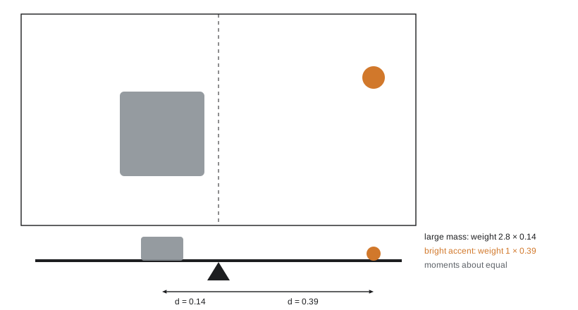
A useful model treats the frame's centre as the pivot of a seesaw. Each element contributes a "moment" equal to its visual weight times its distance from the centre. The composition feels balanced when the moments on the two sides are roughly equal:
This is not a precise measurement, since visual weight cannot be measured on a scale, but it explains a key principle of asymmetrical balance: a small, strong element far from the centre can balance a large element near it.
Worked problem
Balancing with leverage
A large boat with visual weight 4 sits 0.15 of the frame width left of centre. A small bright buoy with weight 1 is to balance it on the right. How far from the centre should it be? What if the boat is 0.30 left of centre?
Show solution
- Boat moment: \(4 \times 0.15 = 0.60\). Buoy distance \(= 0.60/1 = 0.60\), but the frame edge is only 0.50 from the centre.
- The buoy alone cannot balance the boat; it would need weight \(0.60/0.40 = 1.5\) if placed 0.40 from the centre (near the right edge).
- With the boat at 0.30: moment 1.2; even at the edge, the buoy needs weight 2.4.
Answer: Moving the dominant subject towards the centre makes it easier to balance with small accents; moving it out towards a third or the edge requires a heavier counterweight, such as a brighter, more saturated or larger secondary element, or the empty space can be left deliberately unbalanced to create tension.
Kinds of balance
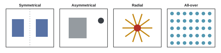
- Symmetrical (formal) balance mirrors elements about a central axis. It feels stable, ordered, calm and often grand: architecture, religious art, formal portraits and reflections in still water. Perfect symmetry can also feel static or artificial, and a small deliberate break in it (one figure in a symmetrical corridor) draws the eye strongly.
- Asymmetrical (informal) balance uses different elements of different weights at different distances, as in the lever analogy. It feels more natural and dynamic, and most documentary, landscape and narrative images rely on it.
- Radial balance arranges elements around a central point, like spokes of a wheel, a spiral staircase seen from above or a flower. The eye is drawn to the centre and circulates around it.
- Crystallographic or all-over balance spreads similar weight evenly across the frame, as in patterns, crowds and textures, with no single focal point.
Worked problem
Diagnosing imbalance
A portrait places the subject's face on the left thirds line looking left, out of the frame, with a plain wall filling the right two thirds. Viewers say it feels "off". Explain using visual weight and suggest two fixes.
Show solution
- The face is the heaviest element and sits left of centre; its gaze adds further weight to the left and leads the eye out of the frame.
- The right two thirds are empty and weightless, so nothing balances the left side, and the gaze leaves no room (Lesson 3).
- Fix 1: have the subject look right, into the space, so the empty area becomes lead room and the gaze carries weight across the frame.
- Fix 2: keep the gaze but add a counterweight on the right, such as a window, light source or object, or reframe with the face on the right third.
Answer: The image is unbalanced because all visual weight, including the direction of gaze, is on the left. Turning the gaze into the frame or adding a secondary element on the right restores balance. If unease is intended, for example in a story about someone trapped or leaving, the imbalance may be exactly right.
Tension and dynamism
Not every image should feel at rest. Tension draws attention and conveys energy, conflict or anxiety. Common techniques include:
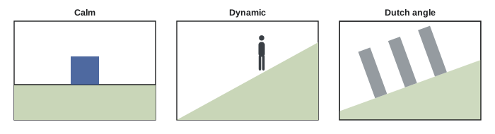
- Diagonals: diagonal lines suggest movement and instability, because a diagonal looks like something falling or climbing. Action photographs and sports images use them constantly.
- Tilted frame (Dutch angle or canted angle): rotating the camera so verticals and horizons tilt creates disorientation. It is used in films to signal madness, danger or a world out of joint. A small tilt looks like a mistake; an intentional one should be clearly visible, often 15° or more.
- Crowding and tight cropping: placing a subject close to the frame edge, or filling the frame so tightly that parts are cut off, creates claustrophobia.
- Imbalance: leaving one side heavy and the other empty, or placing the subject at the very edge.
- Near-tangents: edges that almost touch (a head just touching the horizon, a pole appearing to grow from someone's head) create an uncomfortable tension that is usually unintended and should be avoided by small changes of position.
Worked problem
Is the horizon level?
In a 6000-pixel-wide image, the horizon is 40 pixels higher at the right edge than at the left. What is the tilt angle, and is it likely to look intentional?
Show solution
- Tilt \(= \arctan(40/6000) = \arctan(0.0067) = 0.38°\).
Answer: About 0.4°, too small to look deliberate but large enough for many viewers to notice that the horizon is not quite level, which reads as carelessness. Straighten it in editing (most software rotates by fractions of a degree) or tilt it clearly, by 10° or more, if a Dutch angle is intended.
Rhythm, pattern and repetition
Repeated elements, such as columns, windows, waves, rows of crops or people in a queue, create rhythm that the eye follows across the frame like a beat in music. Regular repetition feels orderly and calm; repetition that grows or shrinks (columns receding into the distance) creates movement and depth; irregular rhythm feels lively. Patterns become most powerful when broken: one different element in a field of identical ones becomes an instant focal point (Lesson 1, similarity).
Designers also observe that odd numbers of elements, especially three, often feel more natural and dynamic than even numbers, because the eye cannot pair them off and the middle element provides a centre. Groups of two can create a dialogue or confrontation; groups of four or more are read as a crowd.
Worked problem
Spacing a repeated element
A product photographer arranges five bottles in a row across a 1.2 m wide set and wants equal gaps between them and at both ends. Each bottle is 8 cm wide. What spacing should be used?
Show solution
- Total width of bottles: \(5 \times 8 = 40\) cm. Remaining: \(120 - 40 = 80\) cm.
- Gaps: 4 between bottles plus 2 at the ends \(= 6\); \(80/6 = 13.3\) cm each.
Answer: About 13.3 cm between bottles and at each end. A perfectly regular row gives order and calm; to create a focal point, the photographer might pull one bottle forward, light it differently or break the rhythm by changing one gap.
Negative space and minimalism
Empty space is a powerful counterweight. A small subject surrounded by large areas of sky, water, snow or plain wall is isolated, so it gains visual weight (it is the only thing to look at) and the image gains mood: calm, solitude, scale or freedom, depending on context. Minimalist compositions reduce the frame to a few elements and large areas of uniform tone, relying on placement and balance rather than detail.
Negative space works best when it is truly simple: even, uncluttered and tonally consistent, so it reads as ground rather than competing detail. Its proportion matters. A subject occupying 1 to 5% of the frame reads as small in a vast setting; the same subject at 20 to 30% reads as the main event with breathing room. Where the space falls also matters: space in front of a moving or gazing subject feels open and hopeful, while space behind them can suggest what they have left or lost.
Worked problem
How much negative space
A kayaker 2 m long is photographed on a still lake. In the frame, the kayak is 120 pixels long in a 6000 × 4000 image, and the kayak and its reflection occupy a region about 120 × 40 pixels. What fraction of the frame does the subject occupy, and how should it be placed?
Show solution
- Subject area: \(120 \times 40 = 4800\) px²; frame area: \(24 \times 10^6\) px².
- Fraction \(= 4800/24{,}000{,}000 = 0.02\%\).
Answer: The kayak occupies about 0.02% of the frame, so it is a point in a vast field of negative space. Placing it on a thirds intersection, with space ahead of its direction of travel, and keeping the water tone even, makes the tiny subject the unmistakable focal point and conveys the scale and stillness of the lake.
Balance in moving images
In film and video, balance changes from moment to moment as people and the camera move. Cinematographers balance each shot within a sequence, and the relationship between shots matters: in a conversation filmed in shot and reverse shot, each person is usually placed on the opposite side of the frame, looking across it towards the other, so the two frames balance each other when cut together. Movement into an empty part of the frame restores balance; movement out of the frame creates expectation. Editors use the changing balance of shots to create rhythm: calm, balanced shots during quiet moments and unbalanced, tilted or crowded framing during conflict.
Lesson 6 adds colour as a source of weight and contrast, and Lesson 11 develops balance across moving shots and sequences.
Common mistakes
MistakePlacing the heaviest element and its gaze on one side with nothing to balance it.
InsteadUse lead room, a counterweight or deliberate imbalance with a reason.
MistakeLeaving a horizon slightly tilted.
InsteadLevel it precisely or tilt it clearly for effect.
MistakeIgnoring near-tangents and mergers.
InsteadCheck where edges touch and move slightly to separate them.
MistakeBreaking symmetry slightly by accident.
InsteadMake symmetry precise, or break it decisively with one strong element.
MistakeAssuming visual weight depends only on size.
InsteadConsider contrast, colour, faces, sharpness, isolation and position.
Summary and key terms
- Visual weight depends on size, contrast, colour, faces, sharpness, isolation, position and direction.
- The lever analogy balances weight times distance from the centre.
- Symmetrical balance is stable and formal; asymmetrical balance is natural and dynamic; radial and all-over balance have their own uses.
- Diagonals, tilted frames, crowding and imbalance create tension.
- Small accidental tilts and near-tangents look like mistakes.
- Repetition creates rhythm; breaking a pattern creates emphasis; odd groups often feel natural.
- In film, balance works across shots and changes with movement.
- Visual weight
- The attention an element attracts and its pull on the composition.
- Symmetrical balance
- Balance by mirroring about an axis.
- Asymmetrical balance
- Balance of different elements by weight and distance.
- Radial balance
- Elements arranged around a central point.
- Dutch angle
- A deliberately tilted camera angle.
- Tangent
- Edges that touch or nearly touch, creating unwanted tension.
- Rhythm
- Repetition of elements that the eye follows across a frame.
- Shot and reverse shot
- Alternating shots of two people facing each other.
Practice problems
Work each problem on paper first, then reveal the answer to check.
List five properties that add visual weight.
Show answer
Any five: size, contrast, saturated or warm colour, faces or text, sharpness, isolation, position, implied direction.
An element of weight 3 is 0.1 of the frame width from centre. Where should an element of weight 1 go to balance it?
Show answer
0.3 of the width on the other side.
Why can a small bright light balance a large dark mass?
Show answer
Contrast and isolation give it weight, and it can be placed far from the centre for leverage.
When is symmetrical balance a good choice?
Show answer
For formal, stable or grand subjects such as architecture, reflections and formal portraits.
A horizon rises 100 px across a 4000 px image. Tilt angle?
Show answer
arctan(0.025) = 1.4°.
What does a Dutch angle convey?
Show answer
Disorientation, unease, danger or a world out of balance.
What is a near-tangent and how is it fixed?
Show answer
Edges almost touching; move the camera or subject slightly to separate or overlap them clearly.
Seven 10 cm objects on a 2 m set with equal gaps including ends. Gap size?
Show answer
(200 − 70)/8 = 16.25 cm.
How does breaking a pattern create emphasis?
Show answer
The exception contrasts with the similarity of the group and becomes the focal point.
How are people usually framed in shot and reverse shot?
Show answer
On opposite sides of their frames, looking across towards each other.
Lesson quiz · 5 questions
Score 60% or more to complete this lesson.
Create a free account to save your progress, take quizzes and earn a certificate.